Skip to case study

Captured Moments / TVC

Client / context
Personal Project
Timeline
2018
Role
Animation & Visual Development
Status
Delivered
Captured Moments color script sequencing the animated story

Visual motion / TVC

At a glance

A 2018 animated commercial concept for an imagined recording contact lens. I translated an invisible capture-and-replay promise into a readable viewer journey through storyboards, color scripts, animation tests, and compositing.

My contribution Illustration, character and environment concept design, storyboarding, animation, video editing, and sound editing.

Status
Completed personal animation concept · 2018.
Watch the final Captured Moments animation48 seconds · Plays inline on this page
Services
  • Illustration
  • Character Design
  • Environment Design
  • Storyboard
  • Animation
  • Video Editing
  • Sound Editing

The product idea / Proposed experience

Make an invisible product promise visible

The brief called for a 30-second commercial built around a distinctive product benefit. I developed an imagined recording contact lens: someone could capture their point of view while keeping their hands free, then revisit the recording on a compatible device. The concept was aimed at people who want to preserve travel and everyday experiences without interrupting them to hold a camera.

That promise creates a communication problem: a lens is almost invisible, and an attractive journey alone does not explain recording. The film needs to connect the eye, the experience being captured, and playback. Reading the work through that sequence makes the product idea, visual decisions, and production tests easier to assess together.

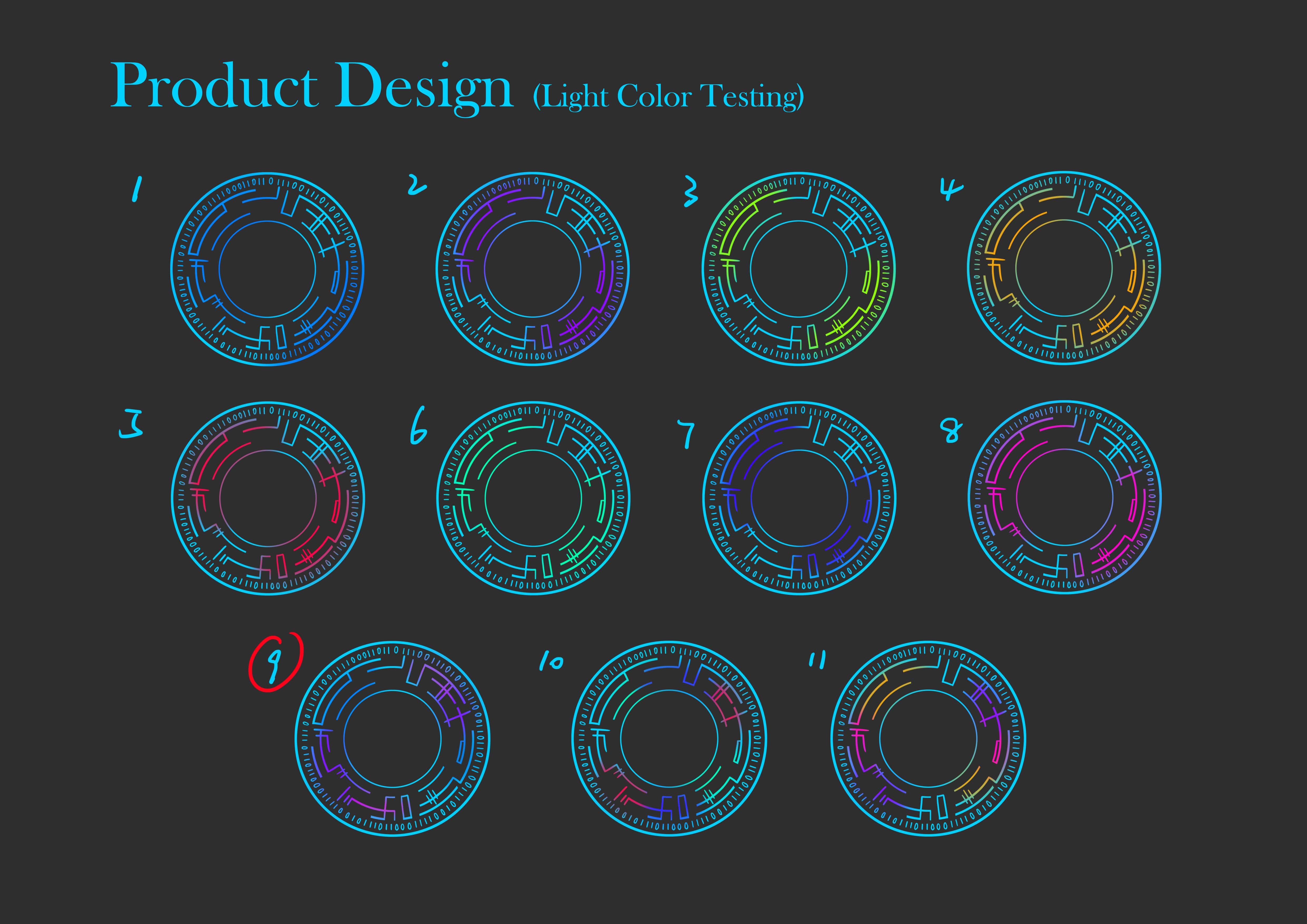
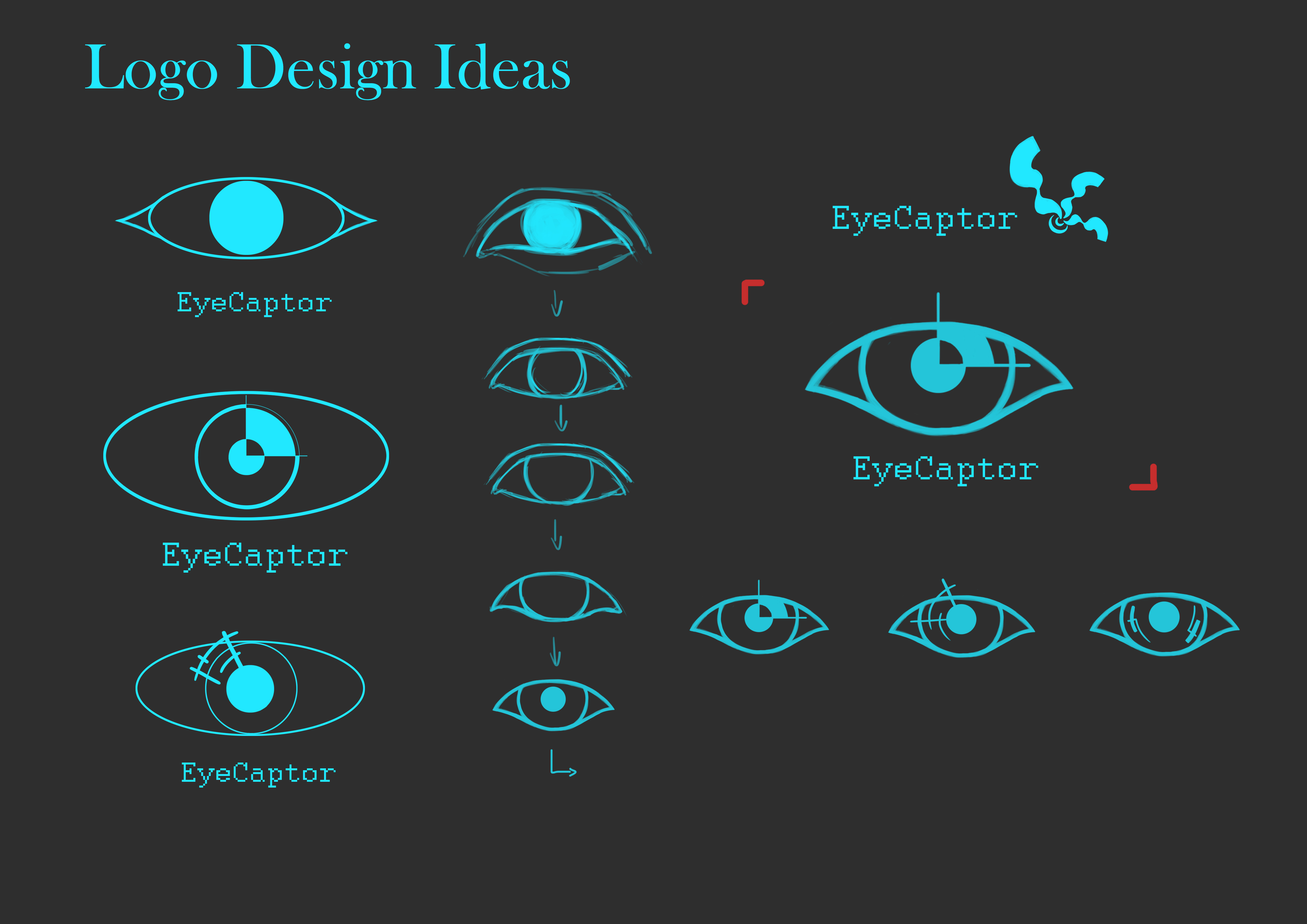
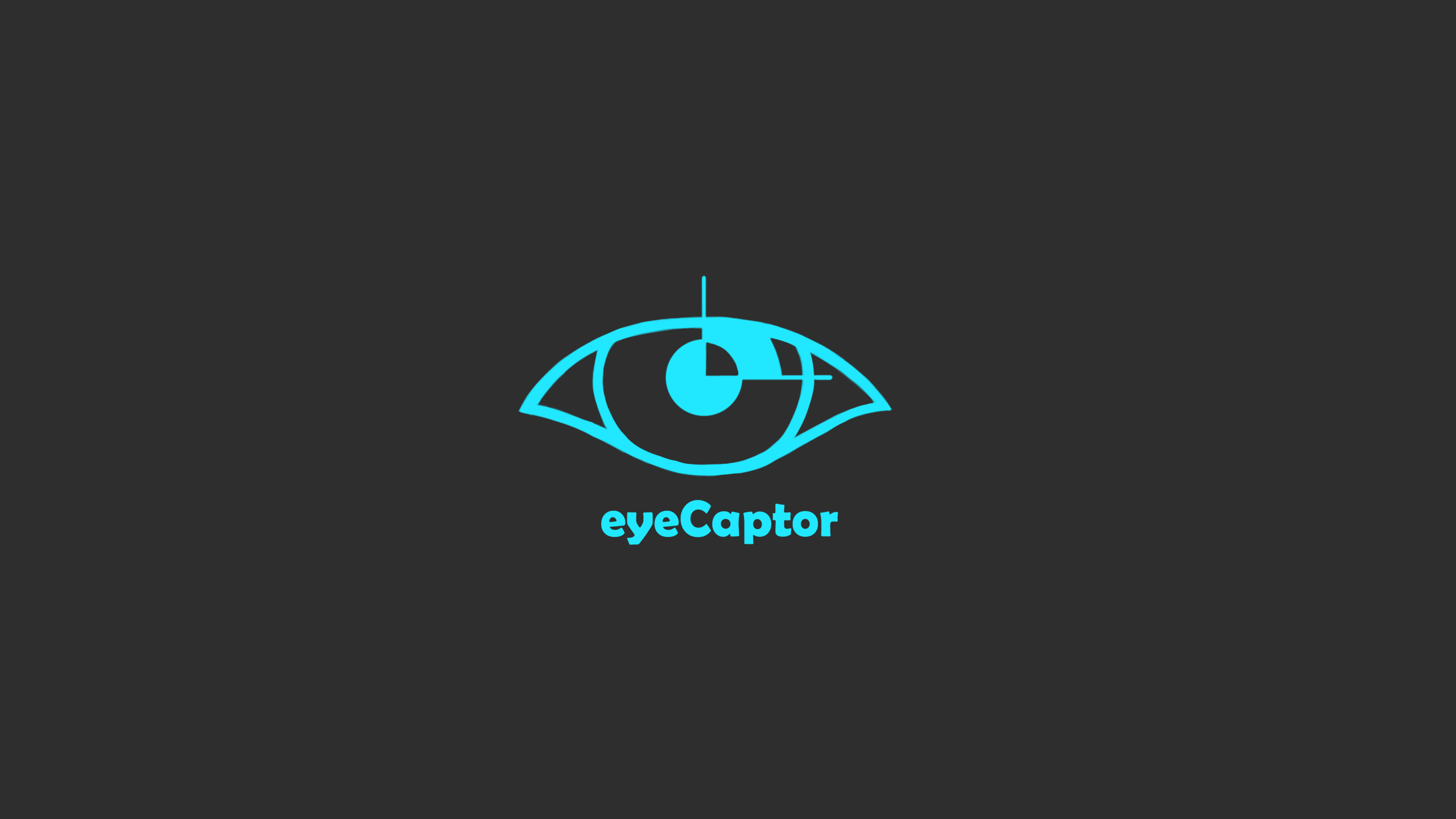
The original light board compares eleven lens treatments. I selected No. 9 for its two-color gradient and cooler technology cue. In the identity studies, I simplified memory, time, and technology ideas into an eye with clock-like details. The chosen lettering follows the mark's contours; a lowercase e softens the wordmark while the capital C preserves the eye relationship. These are concrete choices about recognition and consistency before the story moves into animation.

  1. Capture

    The lens records a point of view while the person remains engaged in the experience. The eye and its light cue make that invisible function visible in the film.

  2. Transfer

    The original concept proposes Bluetooth transfer to a compatible device and a dedicated app. The story moves from a personal viewpoint toward a recording that can be revisited.

  3. Replay

    A recording appears on a nearby device. That playback is the visible payoff: the experience the character just lived has become something she can see again.

Original product light and color test board for the imagined recording contact lens
Eleven original light treatments. No. 9 is marked as the preferred two-color gradient; the comparison concerns visual character and consistency.
Original logo exploration board showing eye and clock-inspired directions
The original eye and clock studies show the mark becoming simpler while keeping its link to recording and memory.
Original final brand mark board showing the stylized eye logo
The final eyeCaptor mark connects the eye symbol and rounded lettering. This is the original identity artwork.

01 / Story and continuity

Make the journey explain the lens

The brief was a 30-second animated commercial for an imagined product. The first storyboard placed flying fish in a fantasy world where sky and ocean merged. I then moved the journey into recognizable settings. The central challenge was to connect what the character sees with what the lens records, while keeping the sequence engaging enough to work as a short commercial.

Version 2 separated the sky from the ocean and introduced a hot-air balloon. The final storyboard replaced the balloon with a flock of birds, adding movement around the character. These changes give the journey a more recognizable setting and a subject that can carry the viewer's attention from one scene to the next.

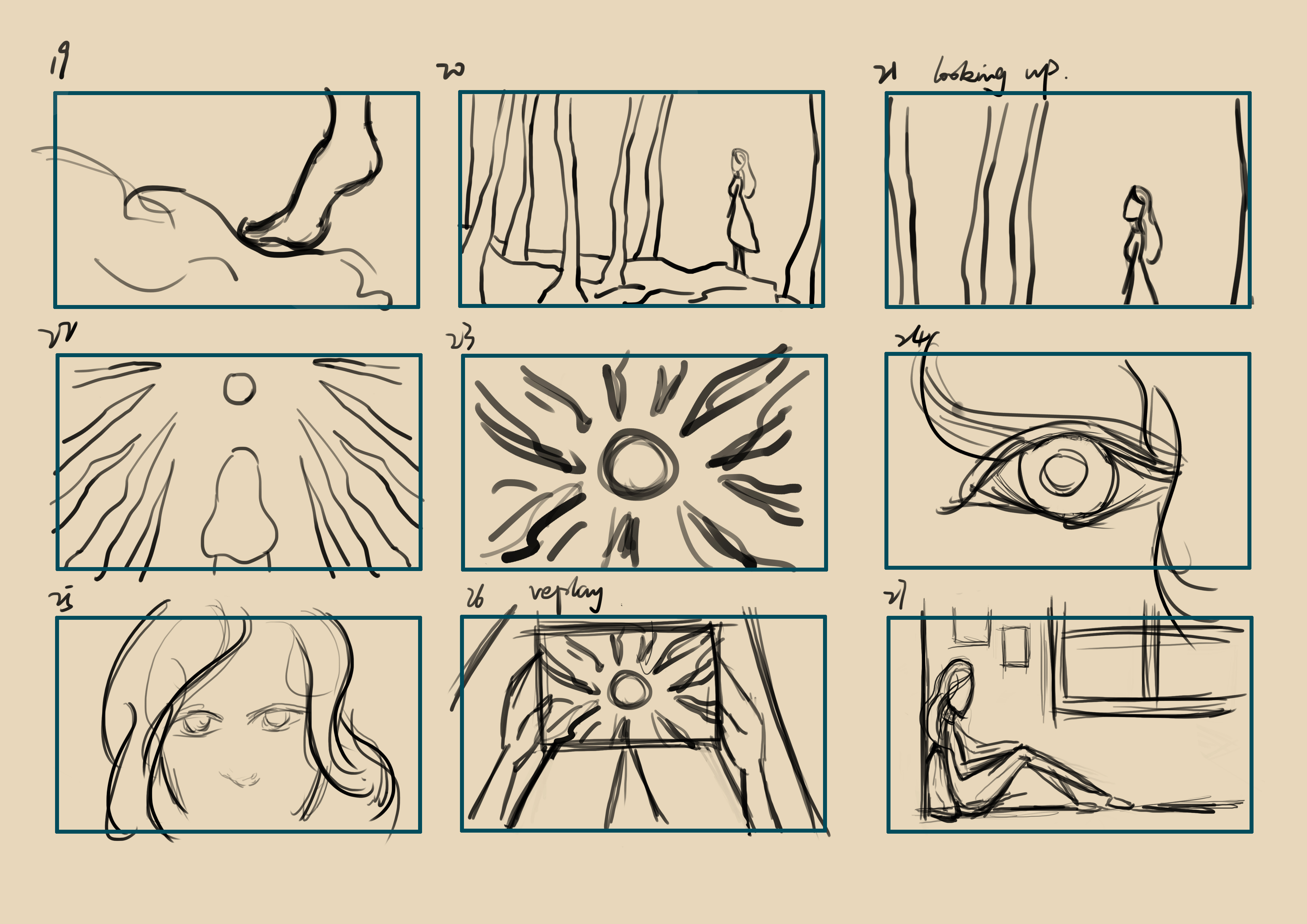
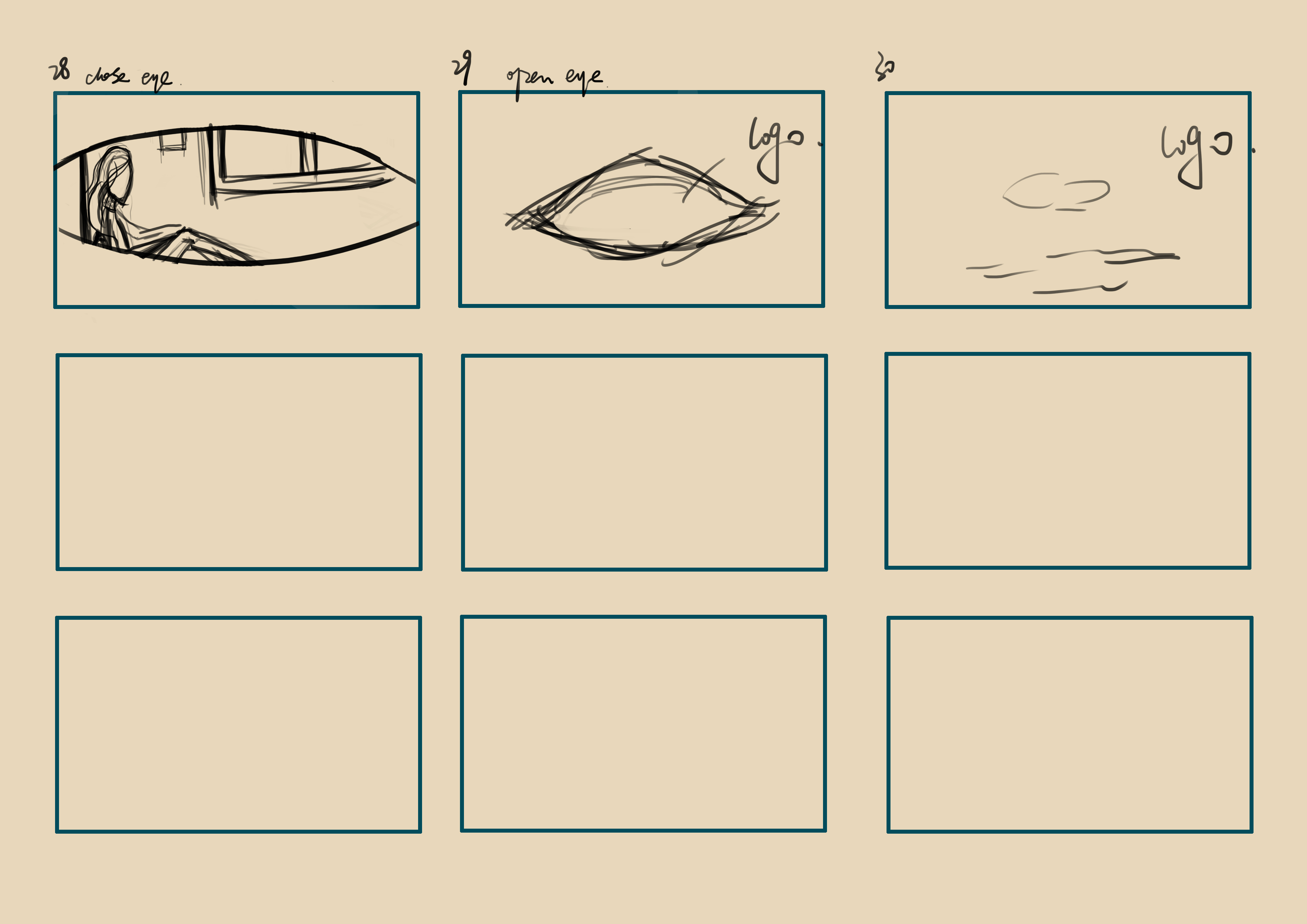
The final storyboard uses connected points of view rather than separate demonstrations of features. An eye leads to climbing; birds fill the character's view and become a flower; an eye reflection closes into a boat, carrying the flower into the water. The underwater scene opens into a forest and moon before the camera returns to the eye and recorded playback on a device. The planned eye-shaped ident supplies the closing brand cue.

Read side by side today, the versions make a useful tradeoff visible: the earliest world offers more surreal freedom, while the later setting makes the relationship between character, viewpoint, and recording easier to trace. Two questions help assess that change: can a viewer locate whose point of view they are seeing, and does each transition make the next scene feel connected? The final sheets provide a more coherent visual answer, with playback giving the journey a clear purpose.
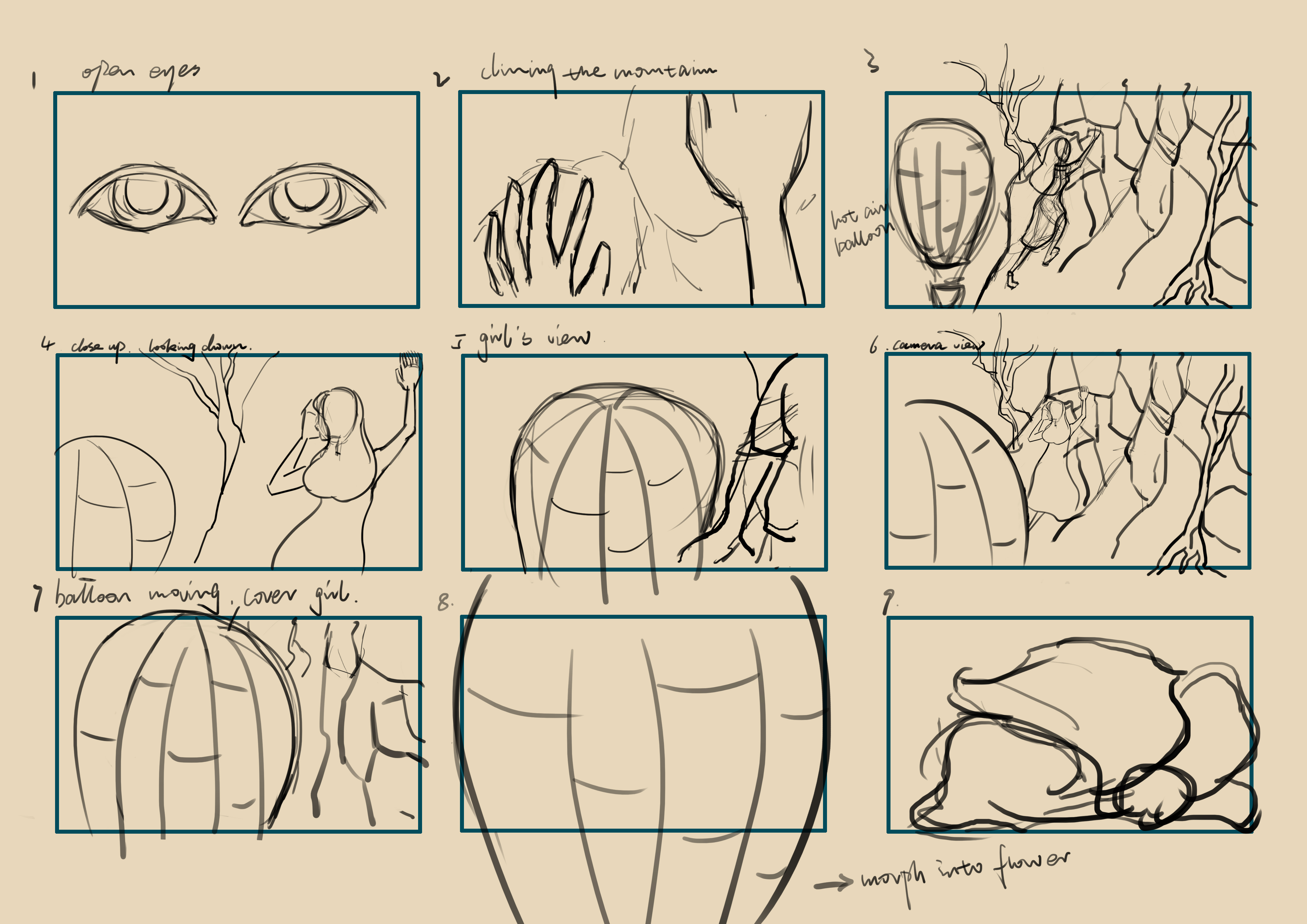
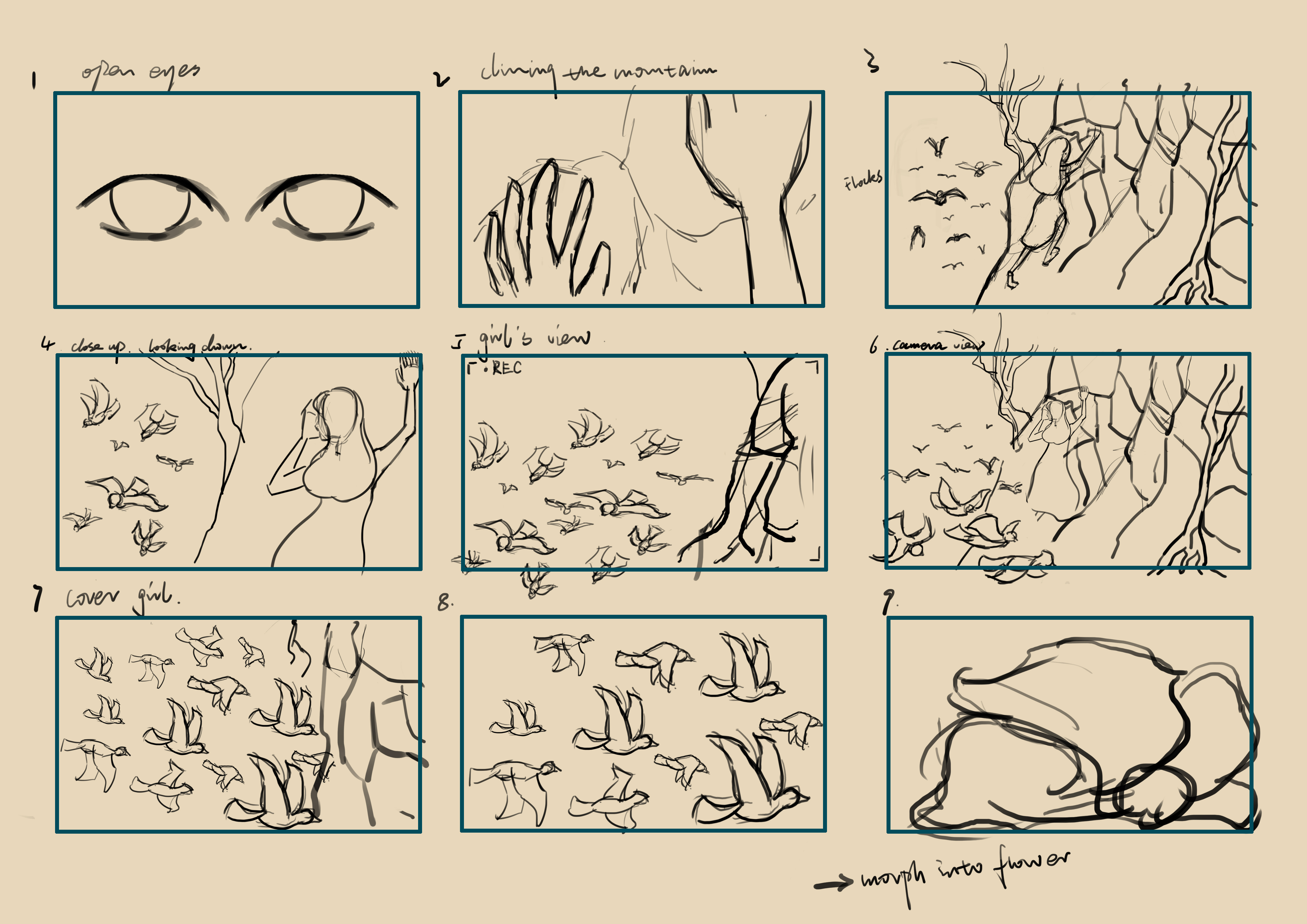
Storyboard version 2 opening sheet with an eye, climbing hands, and a hot air balloon
Version 2: the balloon grounds the journey in a recognizable landscape while preserving a sense of wonder.
Final storyboard opening sheet with an eye, climbing hands, and a flock of birds
Final storyboard, sheet 1: the opening eye, climb, point of view, and birds establish the recording cue before the transition to a flower.
Continue the final storyboard — sheets 2–4
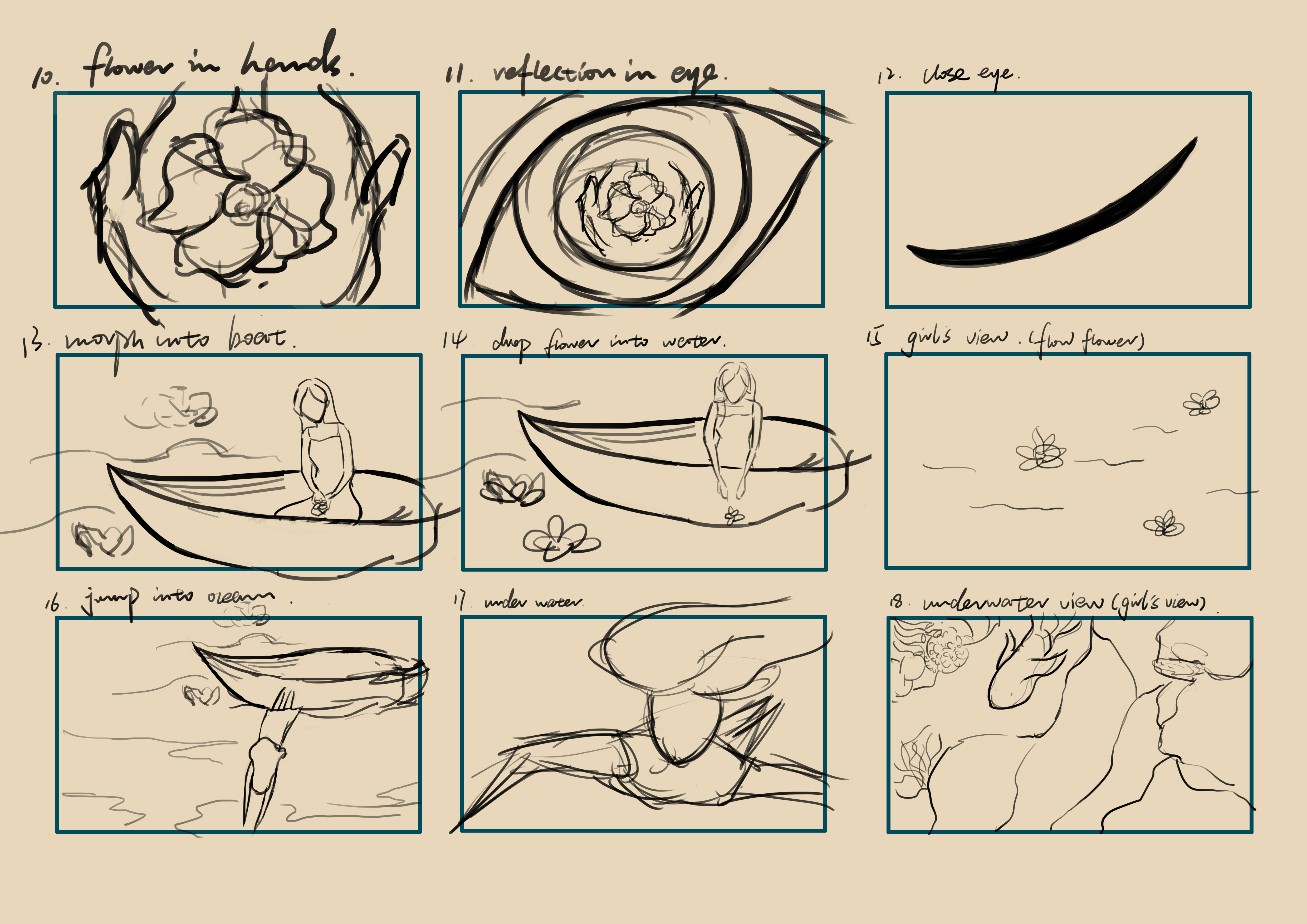
Final storyboard sheet 2 connecting a flower, an eye, a boat, and the underwater sequence
Sheet 2: the flower, eye reflection, and boat turn one scene into the next before the character enters the water.
Final storyboard sheet 3 connecting the forest, moon, eye, and recorded playback
Sheet 3: the underwater journey rises into the forest and moon, then returns to the eye and recorded playback.
Final storyboard closing sheet with playback, an eye, and the logo transition
Sheet 4: recorded playback resolves into the eye-shaped brand ident. Unused panels remain as in the original sheet.

02 / Color and attention

Keep the wonder; control the focus

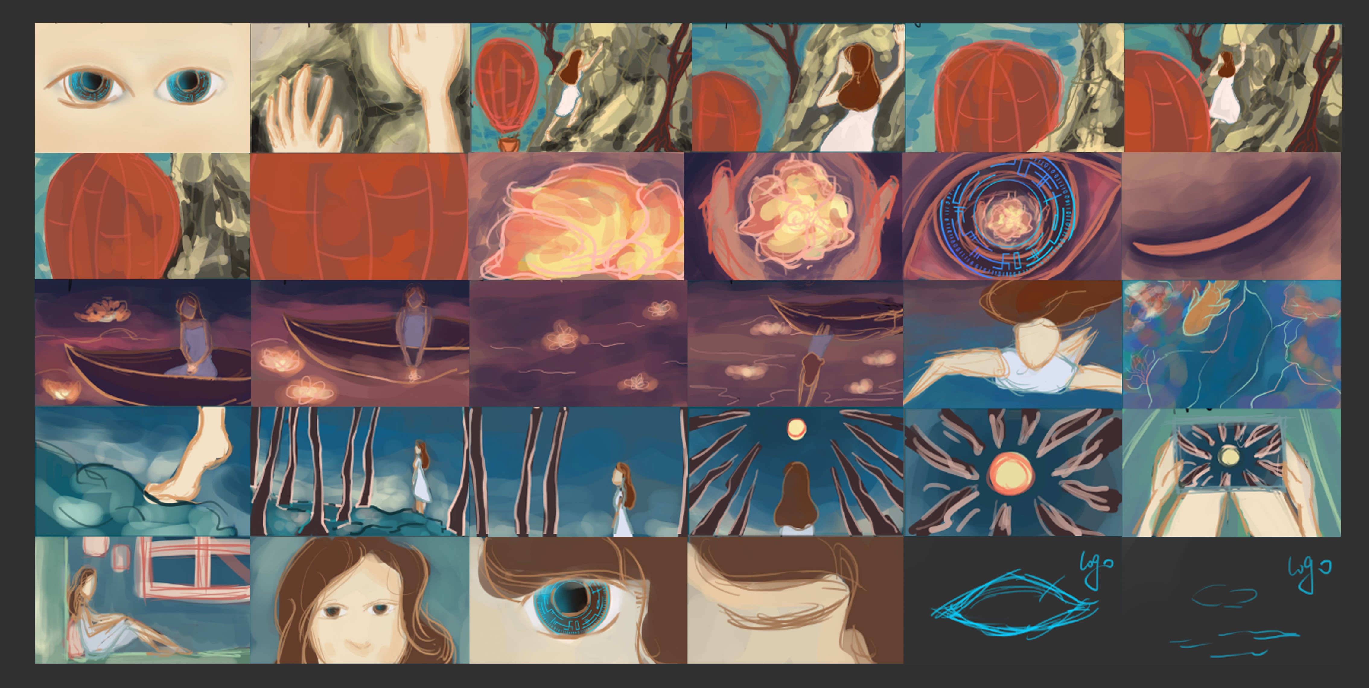
The next challenge was attention across changing environments. The story moves through daylight, night, water, forest, and a warm room. In the earlier color script, the red balloon stood out too prominently. An object intended to enrich the scene was competing with the character and the recording story.

I kept the dreamlike atmosphere through blues and purples, with purple birds against a white-clad character. Complementary colors energize the daylight scenes; analogous purples carry the night; purple shifts toward blue underwater; and pink brings the story back to the room. A recurring color can connect locations while allowing the lighting and mood to change.

The character studies address readability at a smaller scale. The eyes stay prominent as other facial features simplify, a white costume anchors the figure, and the long hair is divided into sections to support movement. The dress was adjusted for actions such as climbing while retaining its simple, natural silhouette. These decisions connect visual character to what the person needs to do in the story.

The environment development shows how the palette carries into finished scenes. The underwater study introduces a blue tint to reduce competing brightness, with a related blue adjustment proposed for the character. Mountain and forest artwork then extend the same cool color relationships. This turns a small color script into a consistent direction for larger, more detailed illustrations.

Looking at the scripts now, I assess the result through focal point, continuity, and contrast between figure and setting. The important tradeoff is between atmospheric detail and a readable subject: each environment can feel different while the character remains the stable element. That way of relating a local visual choice to the whole experience is the most useful part of this decision for my product-design practice.

Earlier Captured Moments color script with a bright red balloon and warm landscapes
Earlier color script: the red balloon competes with the character for attention.
Final Captured Moments color script connecting blue and purple landscape, water, and forest scenes
Final color script: complementary daylight gives way to purple night, blue water, and a pink return to the room.

03 / Timing and compositing

Make the recording visible

The two animatics surfaced different communication problems. The first version's music did not express the product function clearly; the second moved the actions too quickly. Those notes point to two separate questions: is the idea being communicated, and is there enough time to read the action? A finished illustration alone cannot answer either question.

I selected three scenes for animation testing to check character actions and timing. In After Effects, water tests explored the flower and river movement. A moving light ring in the eye gave the recording lens a visible cue. These studies make the transition from a drawn idea to time-based behavior tangible: movement, timing, and emphasis can be examined in a smaller part of the sequence.

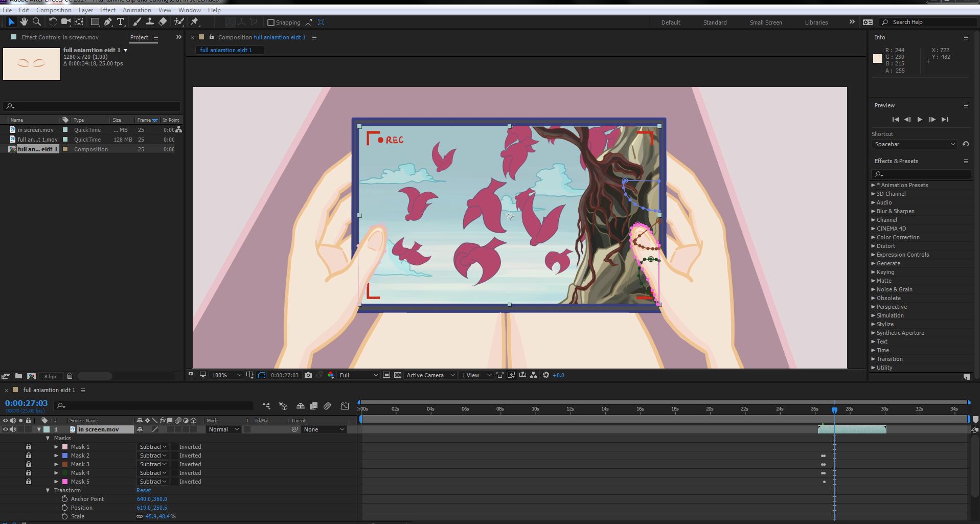
The device shot makes the product promise concrete. I integrated recorded footage into the display and used masks to keep the hand in front of the screen. Without that depth relationship, the recording would appear pasted over the device. With it, playback belongs to the physical object the character is holding, connecting the earlier point of view to a memory she can revisit.

The planned ident links the opening eye to an eye-and-clock mark. Production notes also list birds, water, and camera-operation sounds alongside music and credits. Together, the visual cue, playback composite, and finishing notes show how the product idea can remain recognizable across picture, motion, sound, and identity.

The completed upload runs 48 seconds, alongside the original 30-second advertising brief. The visible outcome is a finished concept film supported by storyboard, color, character, environment, and production work. Its contribution is making an unfamiliar proposition concrete through a consistent sequence; the next step would be to learn whether another person understands that sequence as intended.

Original After Effects production screenshot showing masks around the device screen and the character's hand
Original production screenshot: masks keep the hand in front of the recorded image so the device reads as a physical object.
Character and environment artwork
Captured Moments character turnaround sheet
The turnaround establishes proportion, silhouette, and costume.
Captured Moments character expression sheet
Expression studies keep attention around the eyes while exploring the character's emotional range.
Underwater background with colorful coral and dark rock formations
Finished underwater environment: coral frames open blue water.
Rock face with climbing roots and vines against a blue sky
Finished mountain environment: roots and vines contrast with open sky.
Forest background with tall pink tree trunks and a blue night sky
Finished forest environment: pink trunks continue the blue and purple palette.

Reflection / Next steps

From visual storytelling to product evaluation

The completed 2018 concept brings together a product proposition, visual identity, character and environment artwork, storyboard iterations, animation tests, and a finished film. The useful habit I take from it is to make an unfamiliar idea concrete early, compare alternatives against what needs to be understood, and carry the same meaning through each part of an experience.

If I continued the concept today, I would first check comprehension with a simple storyboard or prototype: after seeing it, can someone explain what is recorded, where it goes, and how to replay it? I would then explore recording intent and feedback, a clear status when a transfer fails, and controls for keeping, deleting, and sharing a memory. Recording other people also raises a design question about how capture is signaled and how consent is respected.

These are next-step product questions. The work shown here establishes the visual concept and its communication; hardware feasibility, app interactions, and audience testing would need their own evidence in a continuation.

Product Design
UX/UI Design
Visual Design
Product Design
UX/UI Design
Visual Design