Visual development & motion
Animation & concept
Films, characters, and imagined worlds from Rui Duan’s portfolio. Start with the finished motion work, then explore how shape, expression, and light make the images read.
Watch the work in motion
Animation, motion graphics & modeling
Start with Captured Moments, then choose another film to play here.
Choose from 12 films and studies +Close film index −
Character design
23 studies · 4 highlights
Keep the character consistent as the performance changes
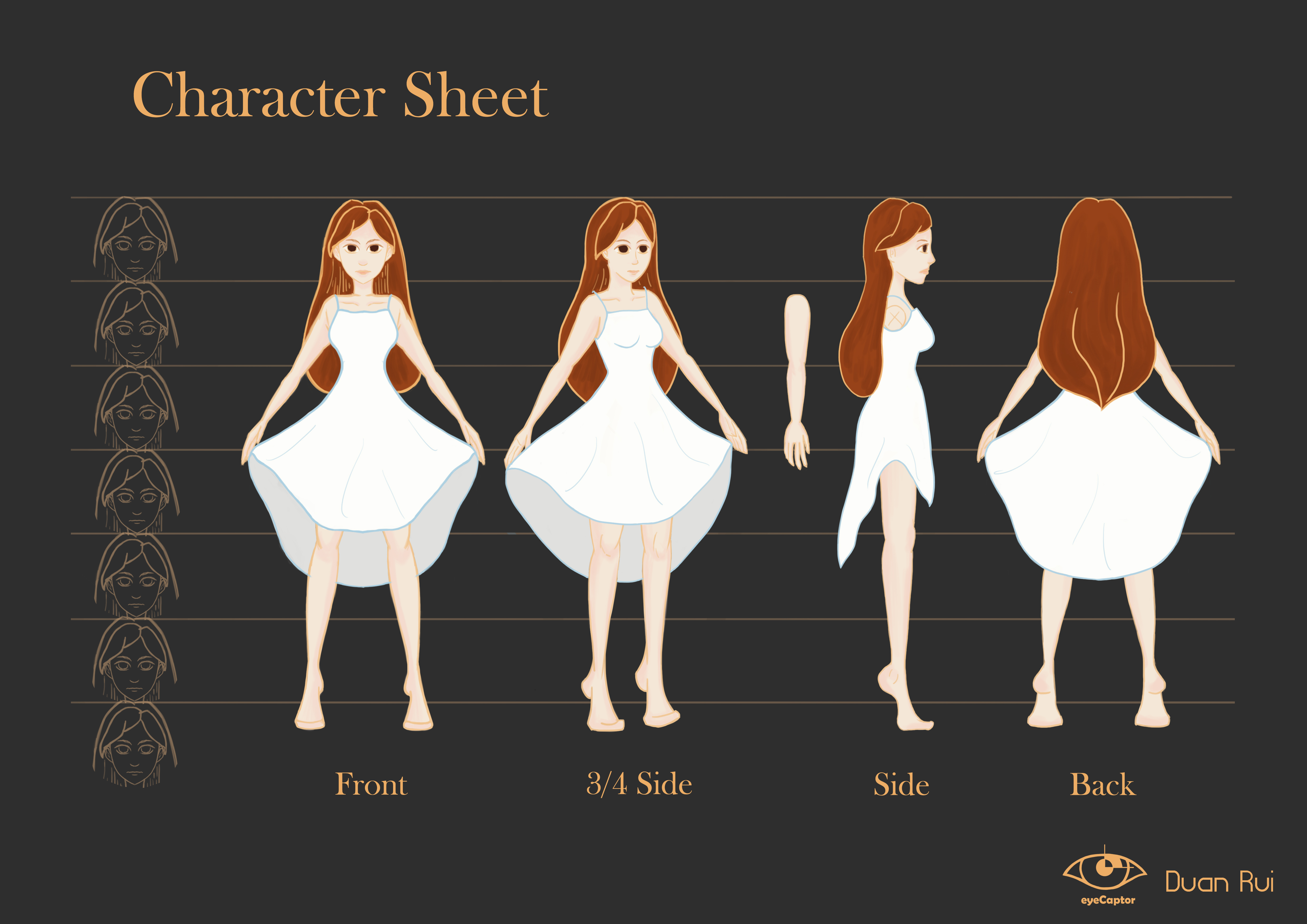
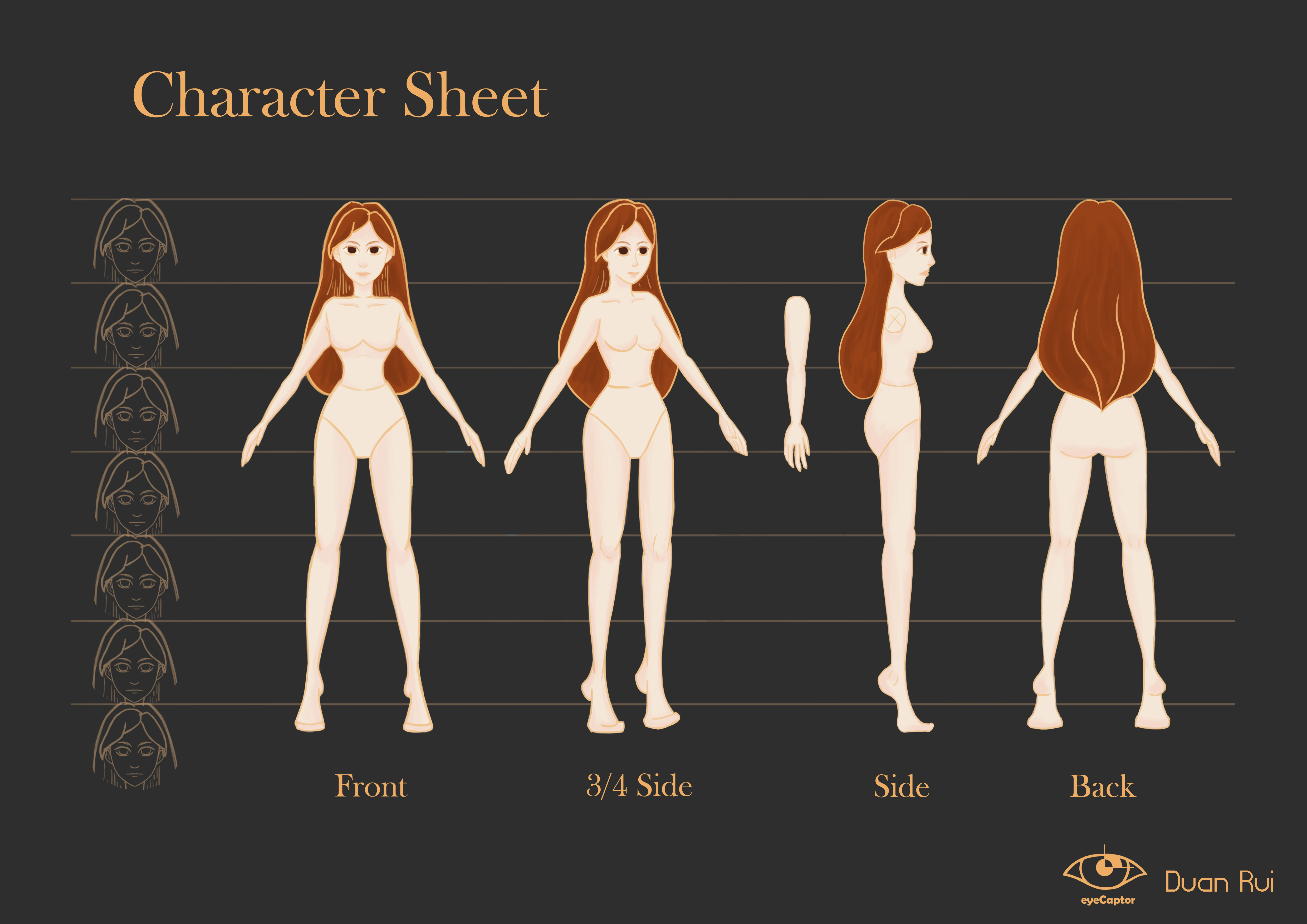
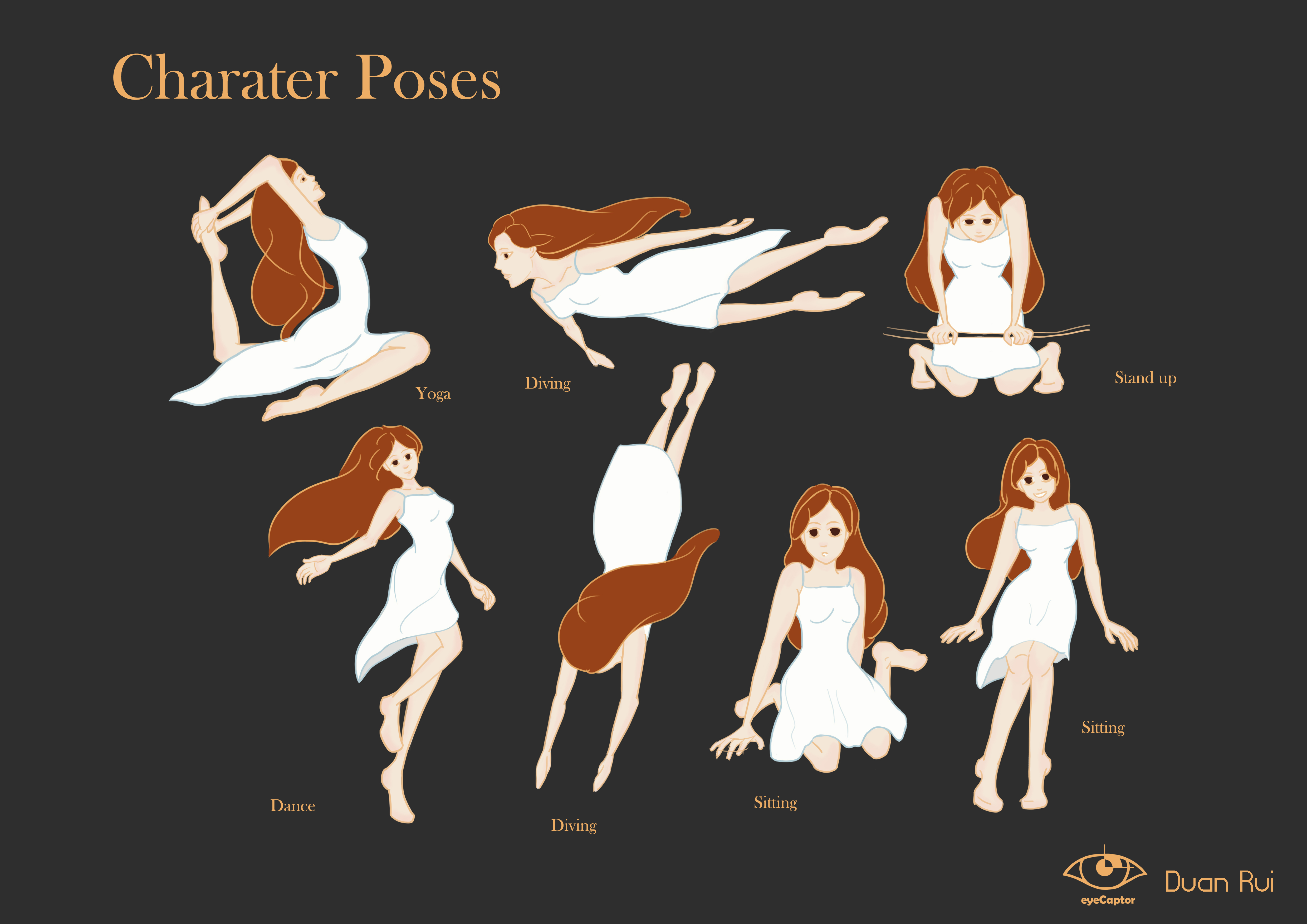
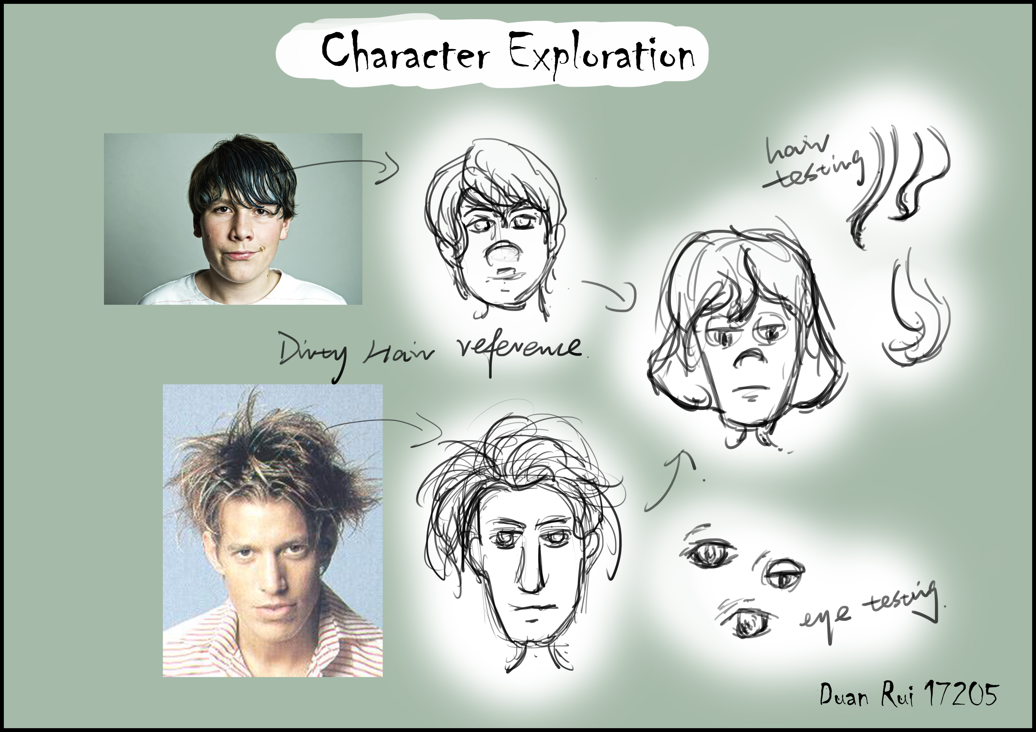
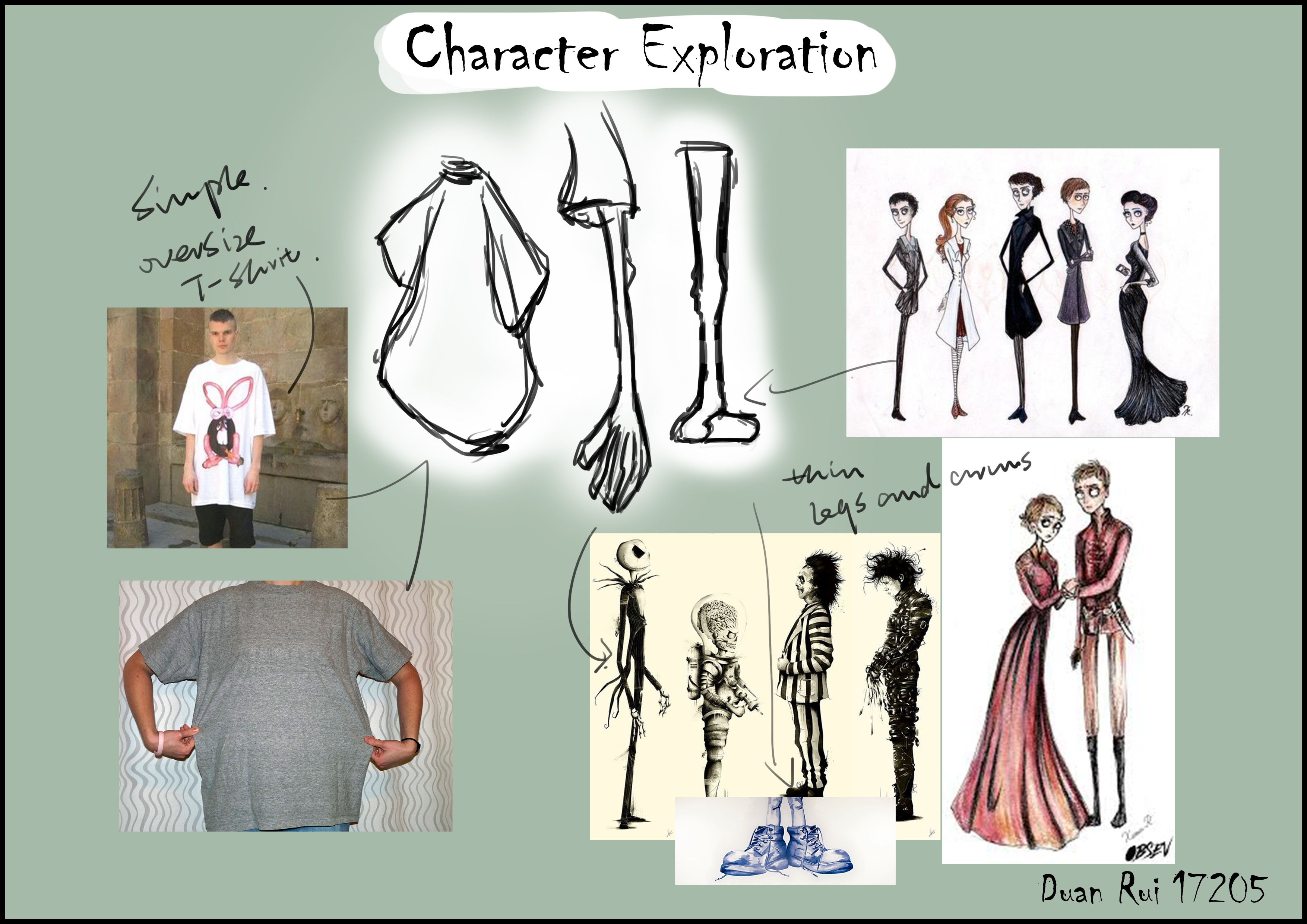
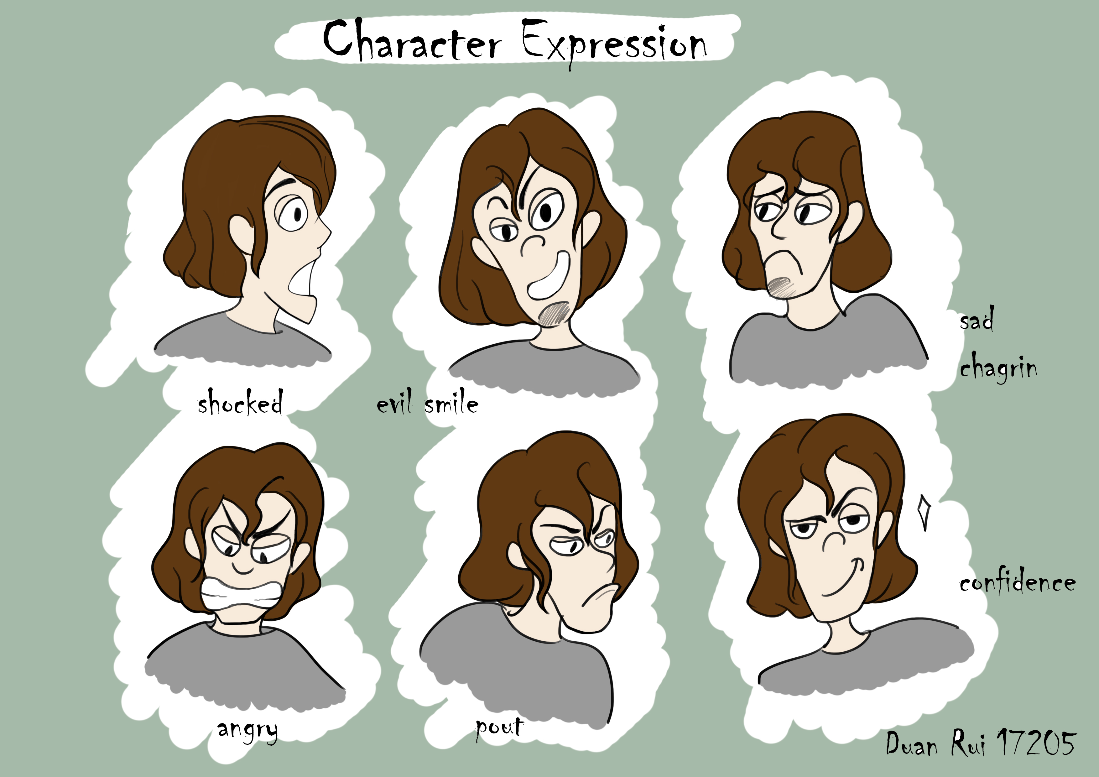
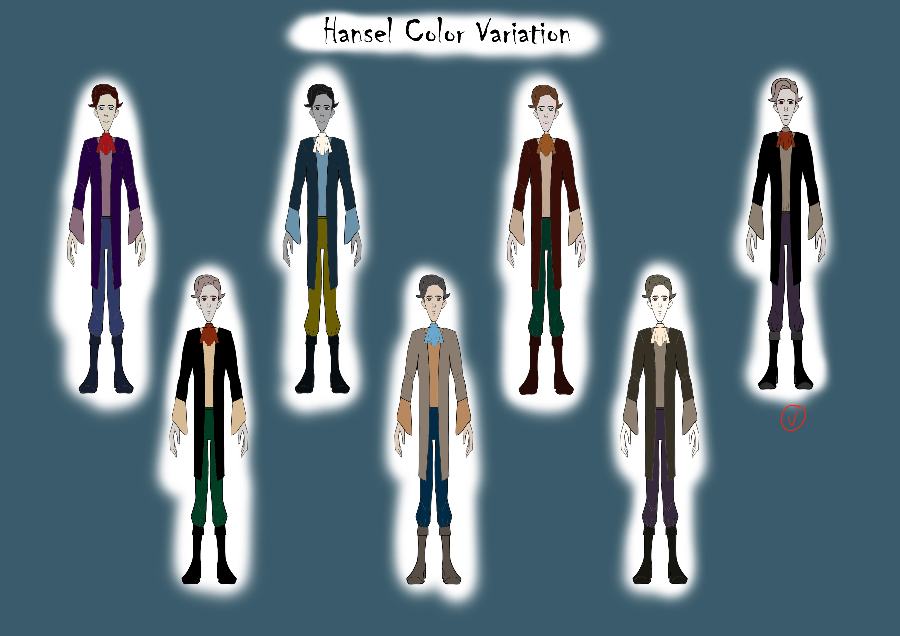
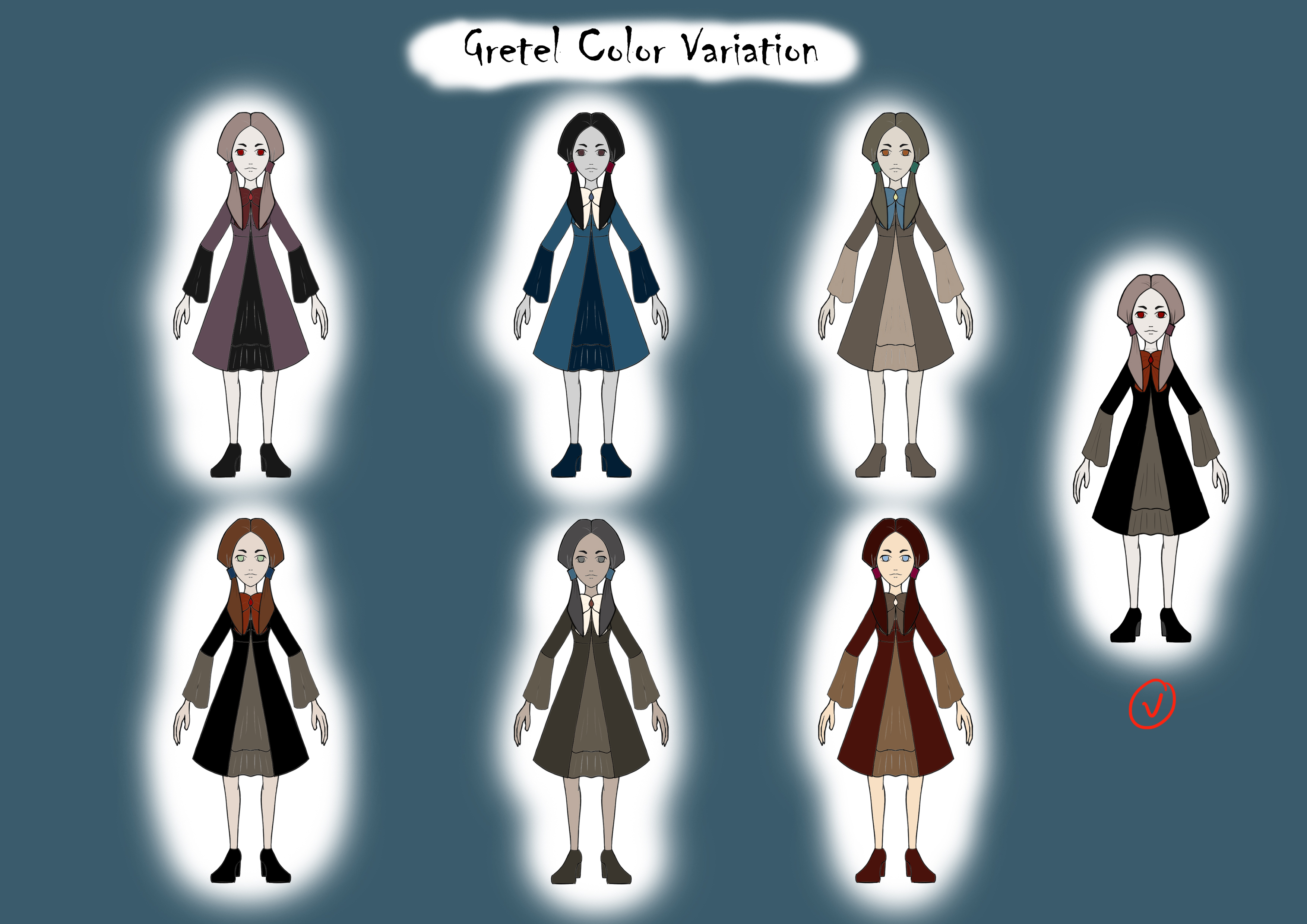
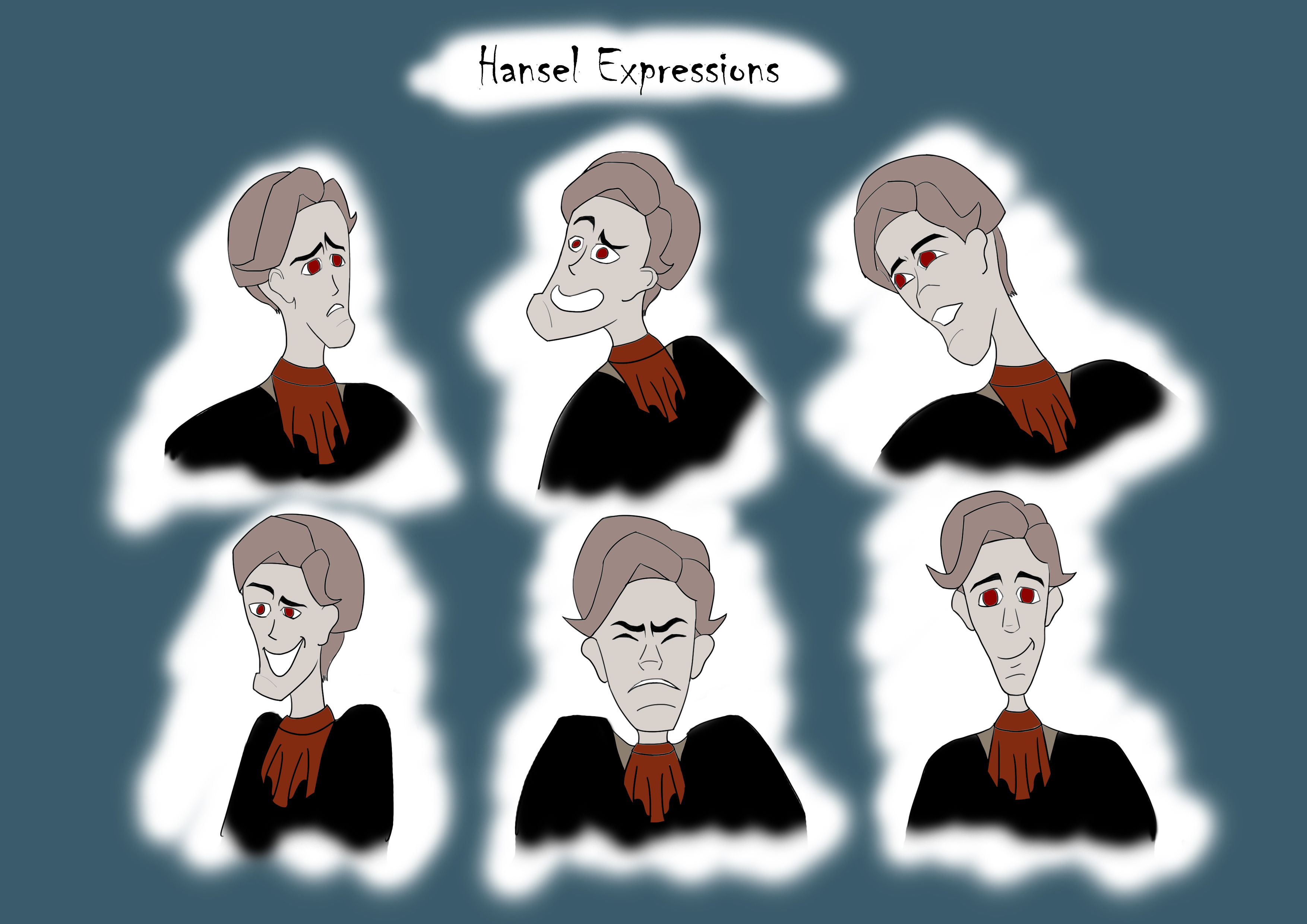
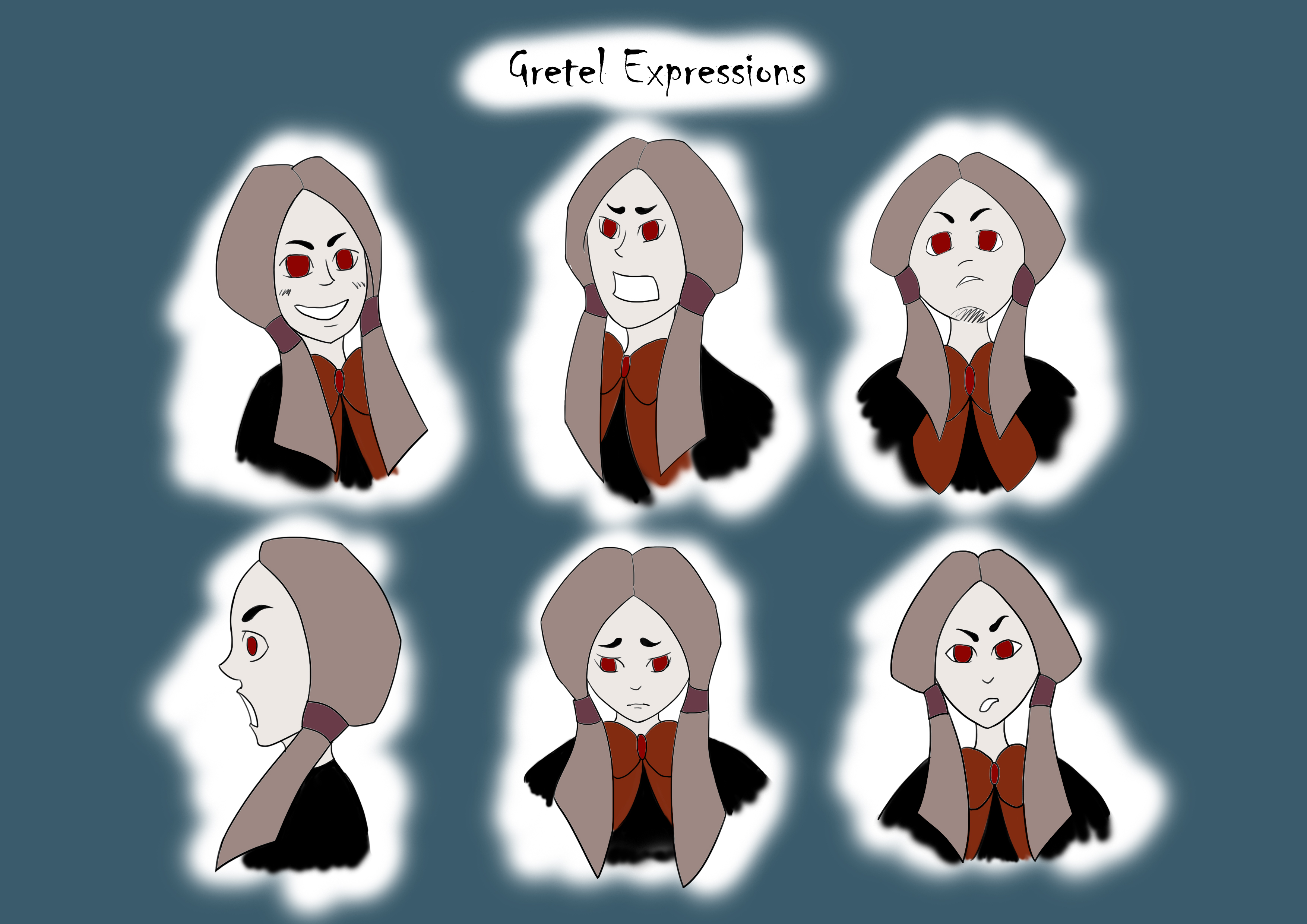
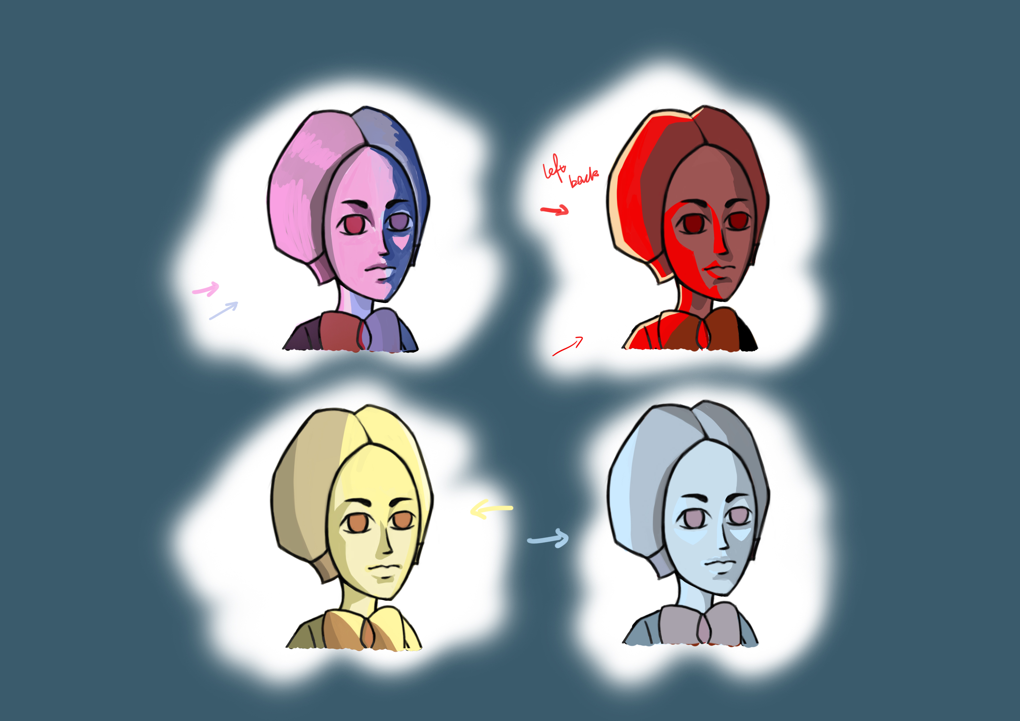
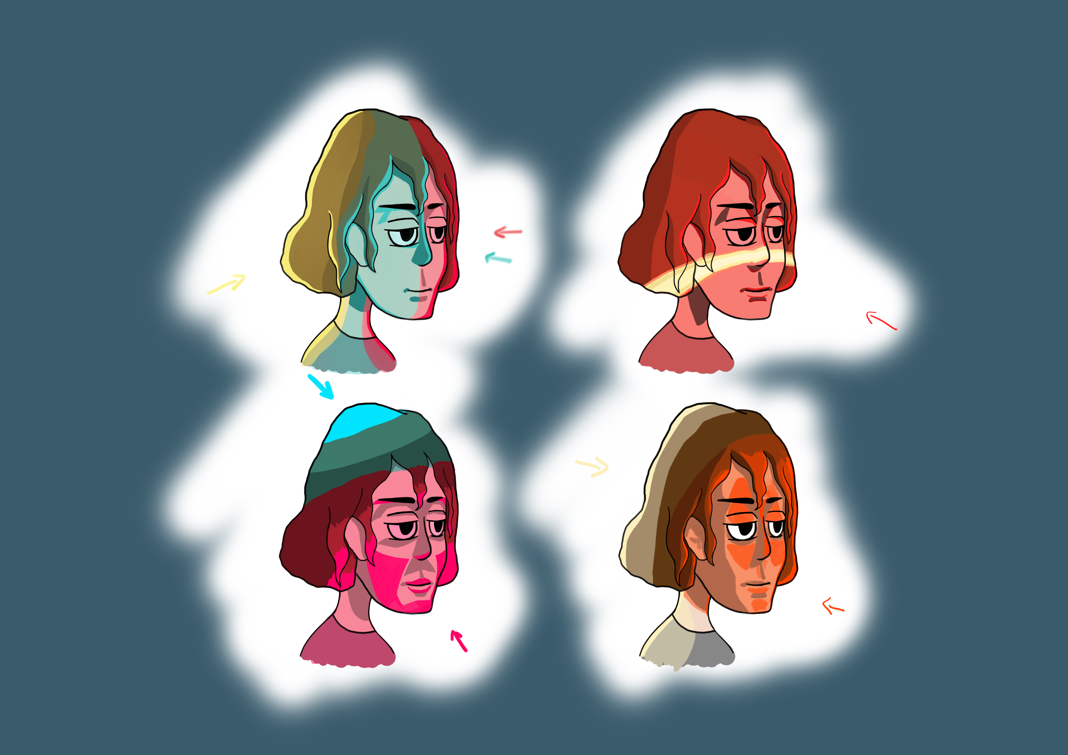
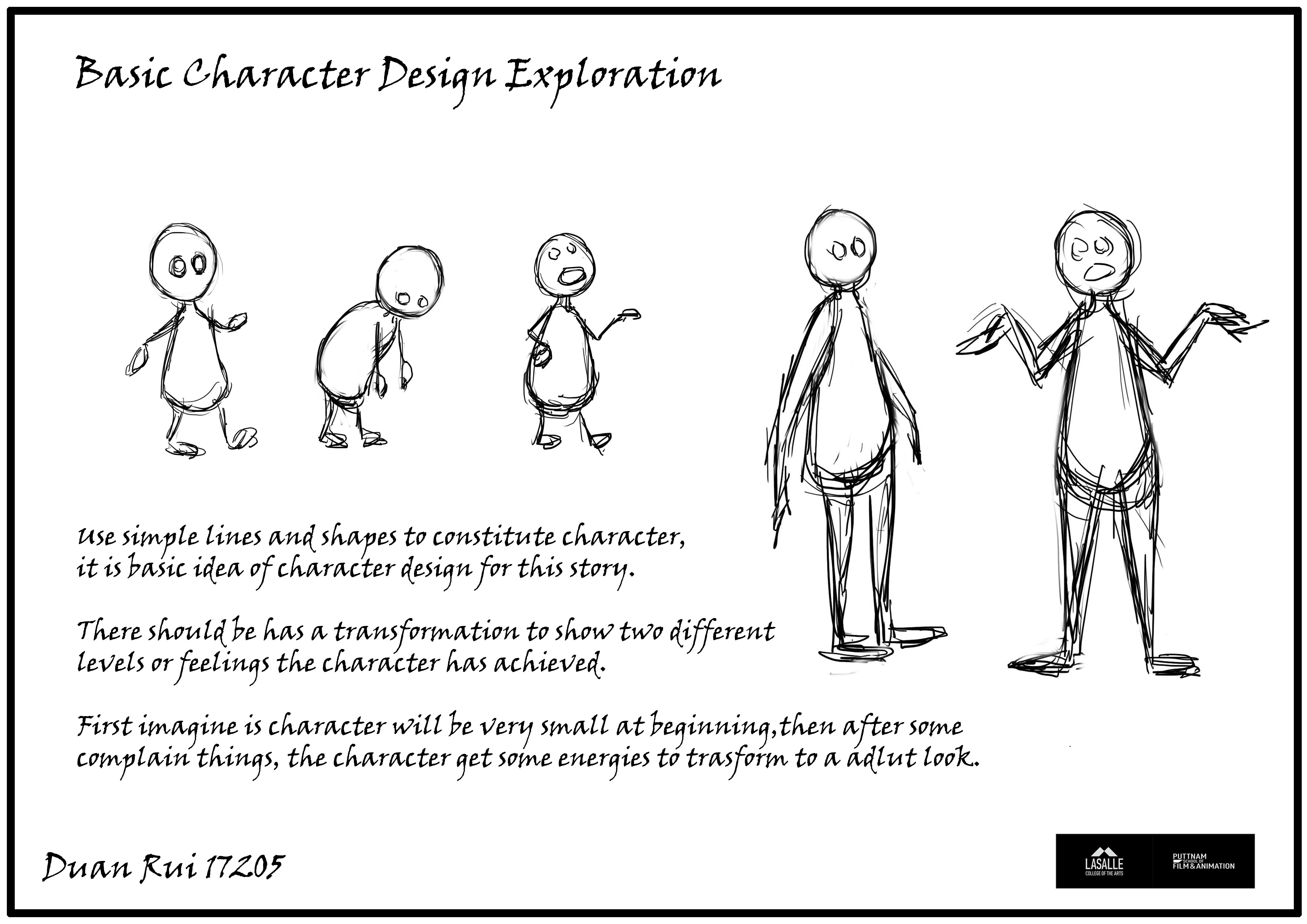
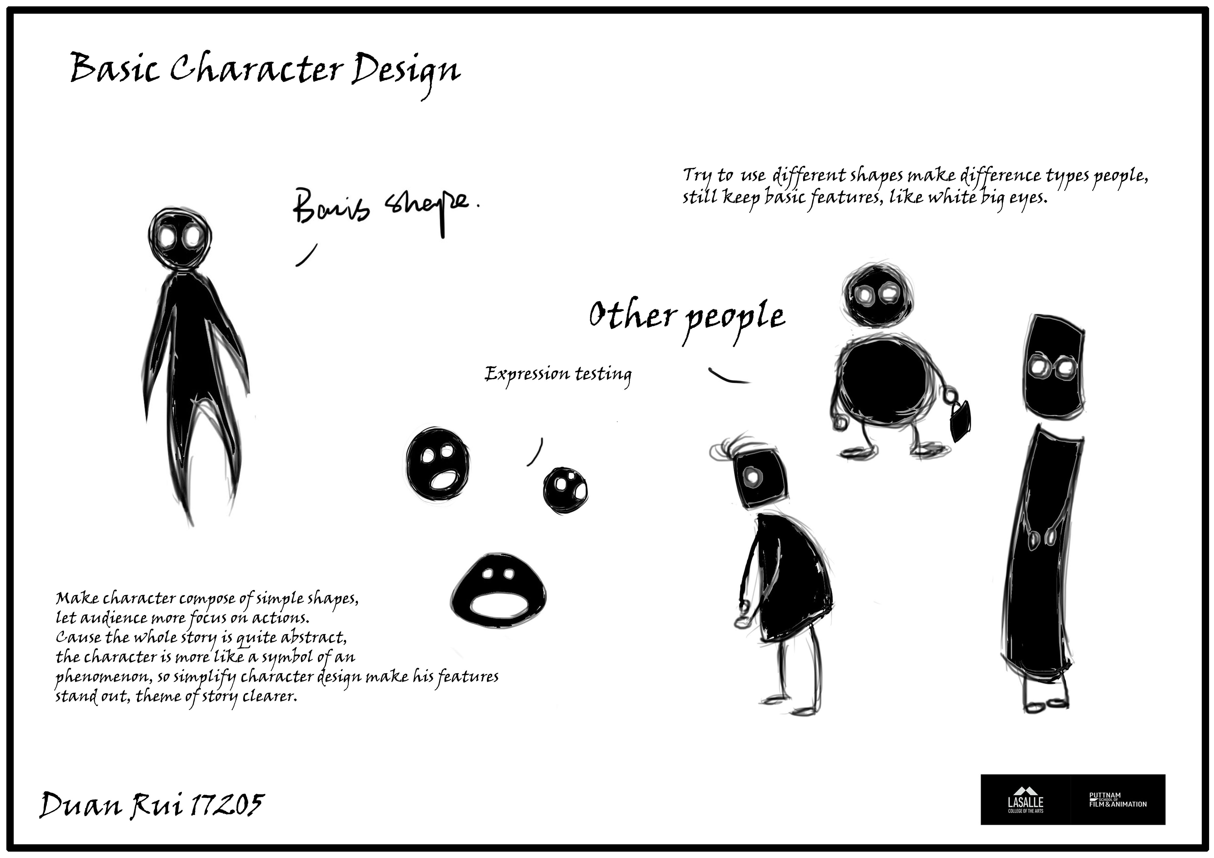
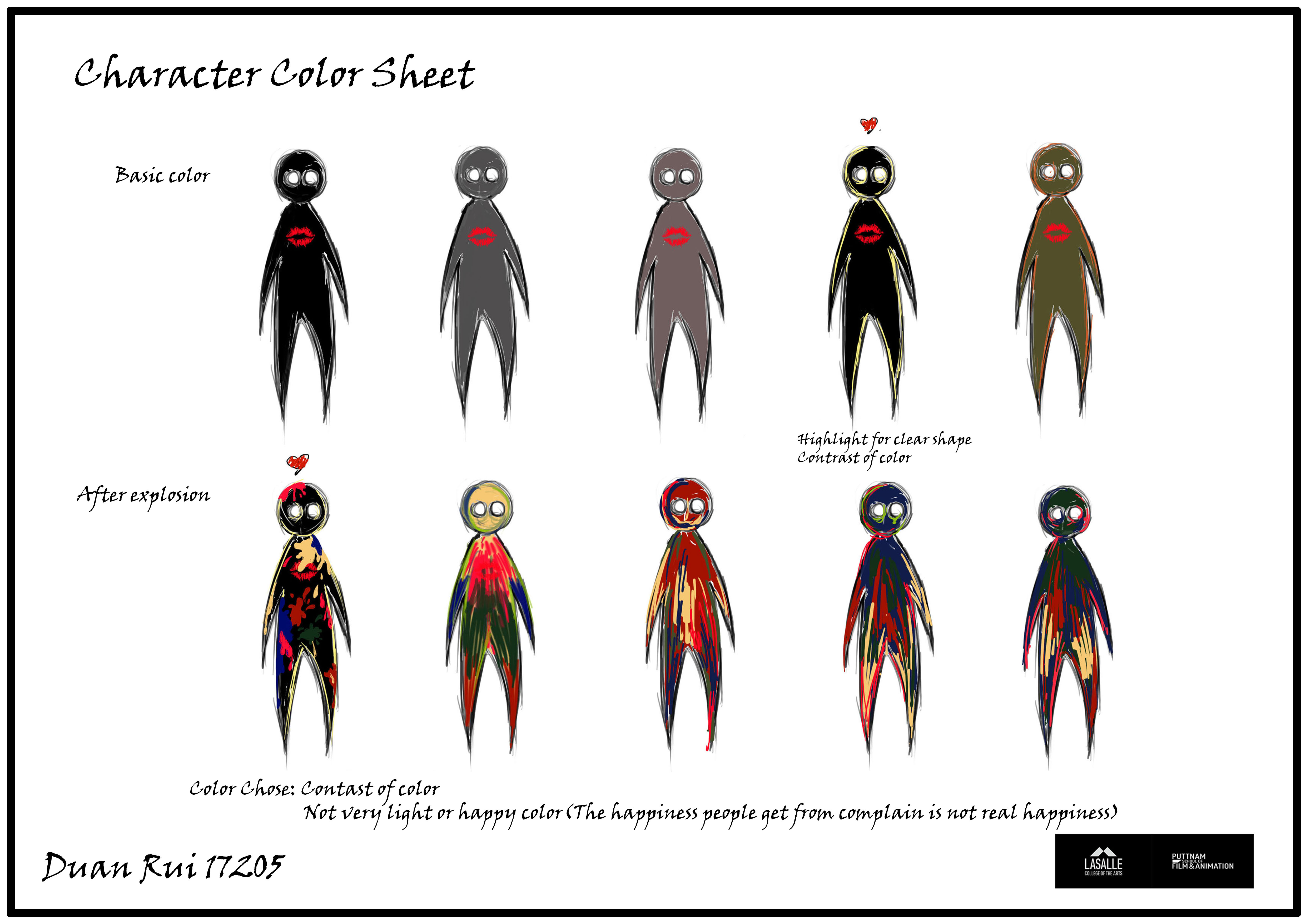
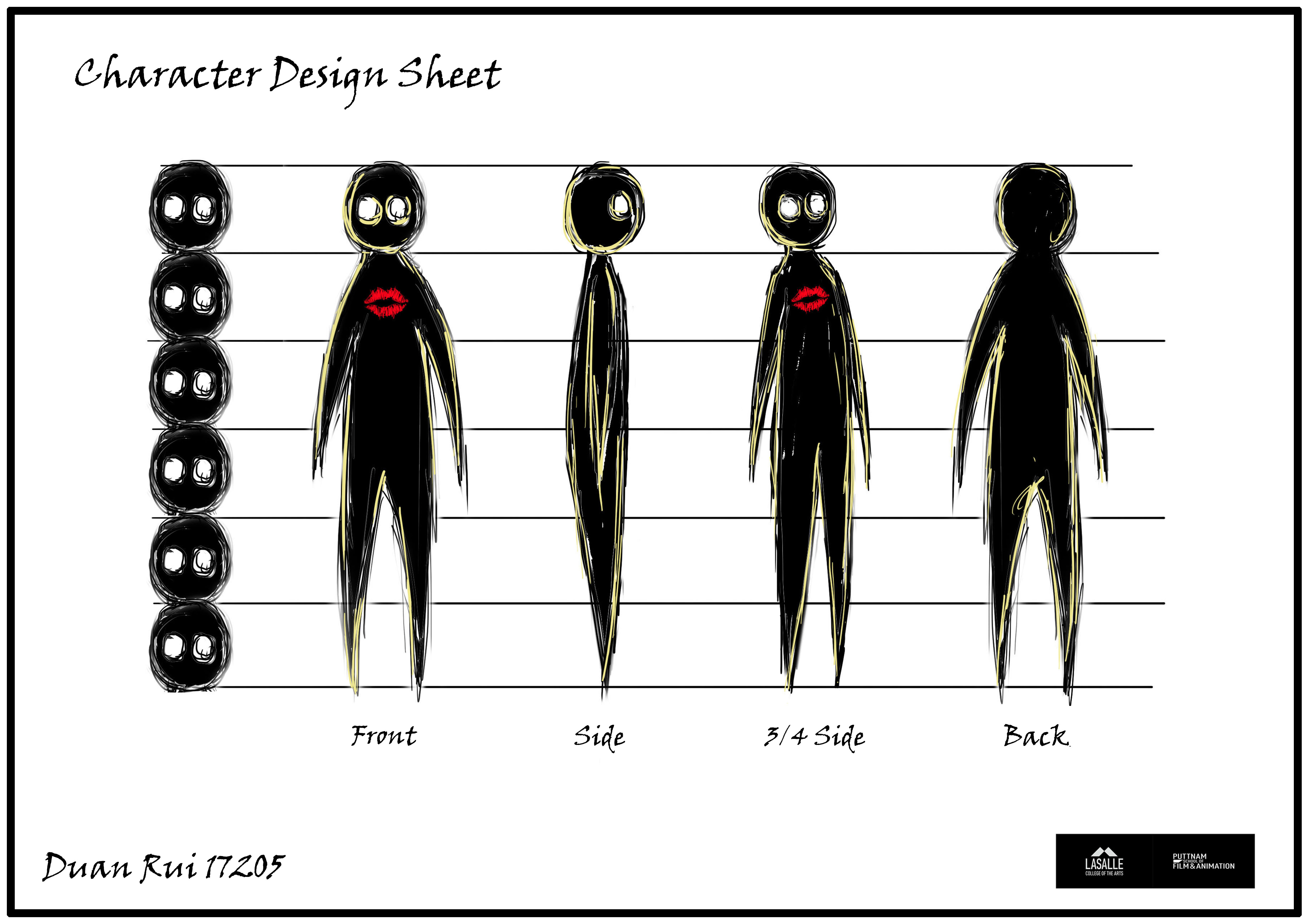
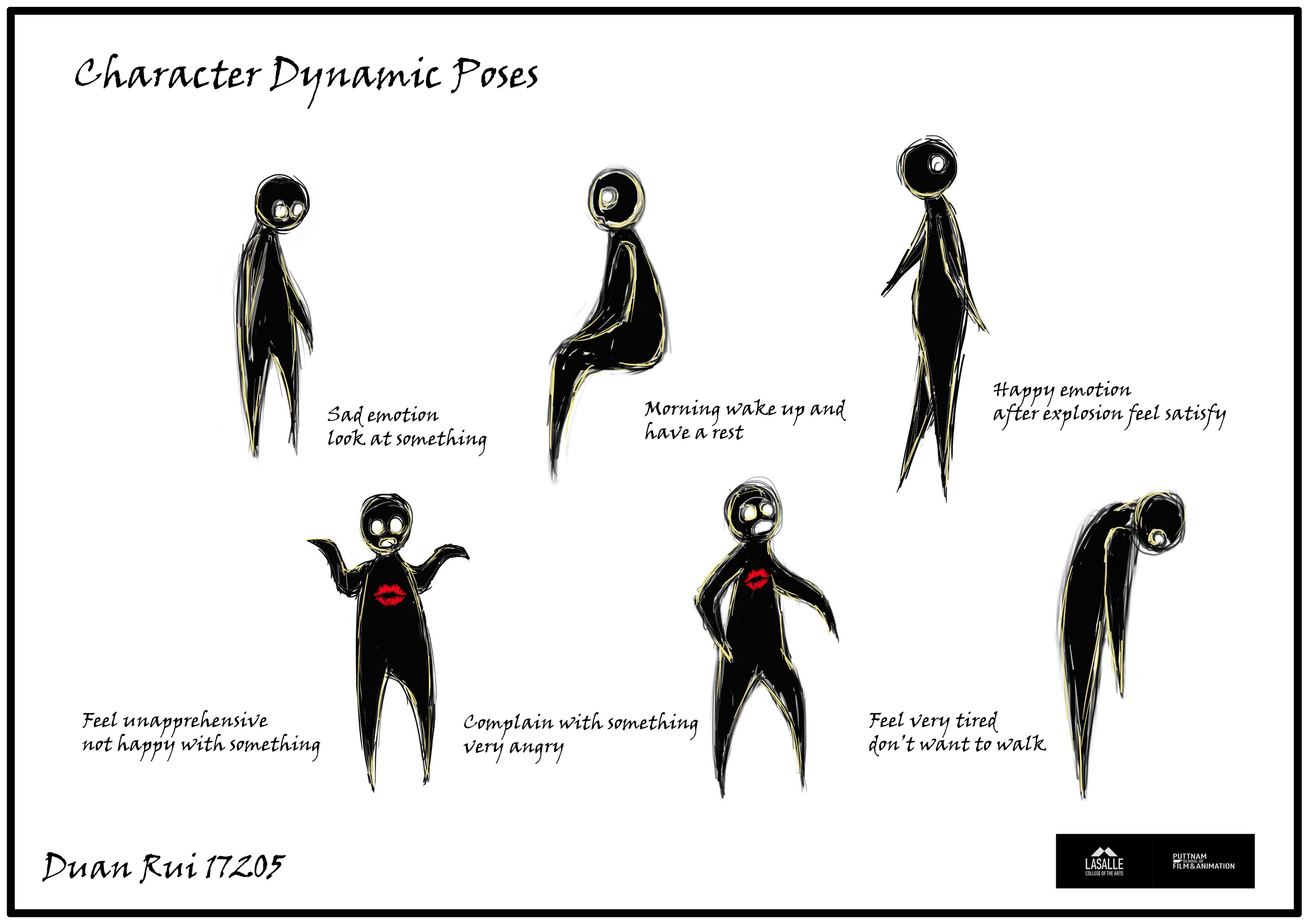
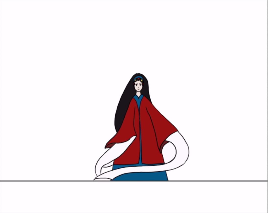
These character sheets separate color, construction, expression, and pose. Clothing palettes can be compared on the same figure; the turnaround connects front, side, and back views. Expression and pose variations show a useful balance: stable proportions preserve recognition, while changes in the brows, mouth, hands, and weight carry different emotional states.
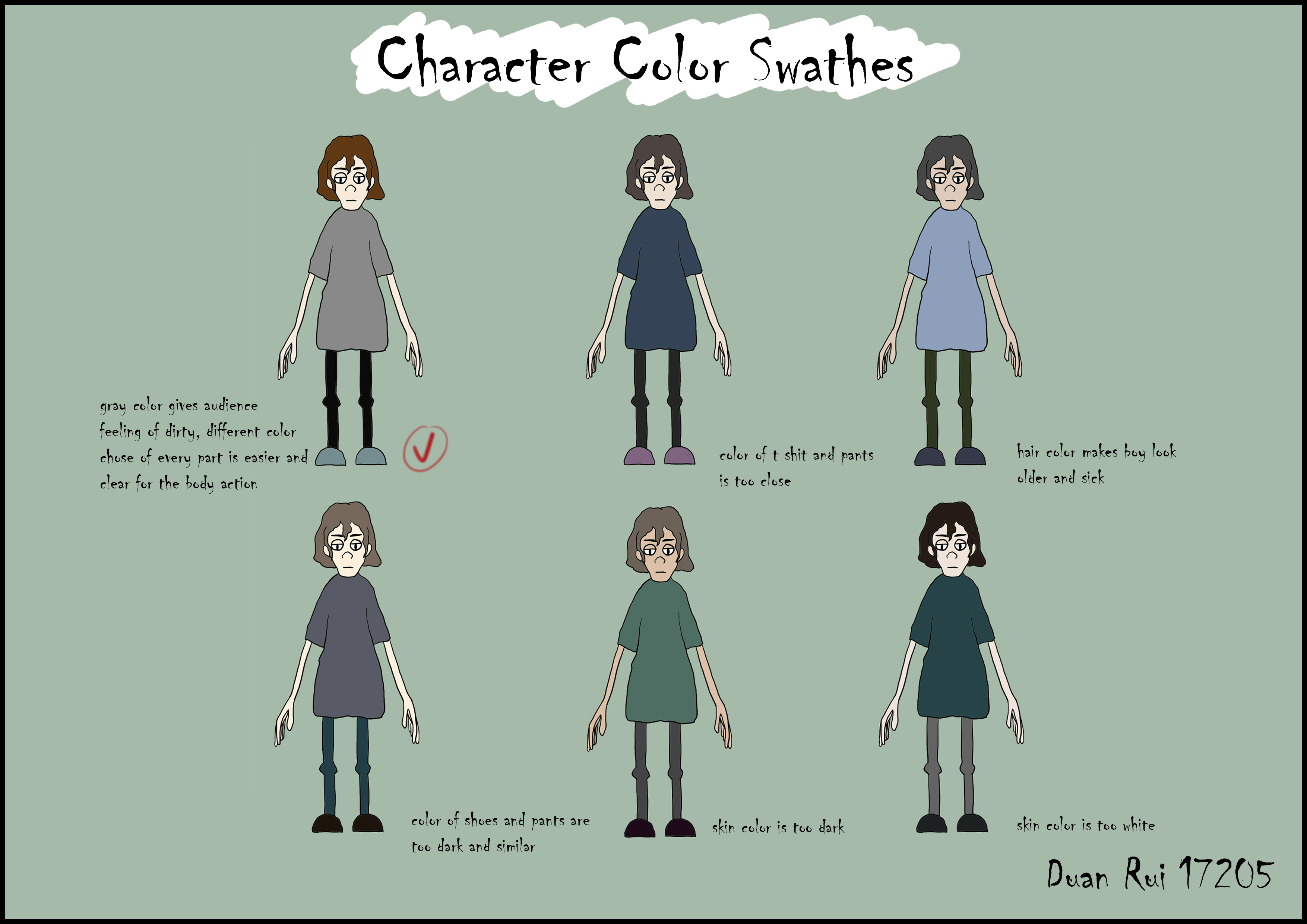
A closer look
- Stays consistent
- Hair shape, facial structure, body proportions, and the outfit’s silhouette.
- Changes
- Clothing, hair, and skin tones vary across six alternatives. Compare contrast between adjacent areas.

A closer look
- Stays consistent
- The character’s proportions and recognizable hair and costume.
- Changes
- Front, angled, side, and back views describe the same figure from different directions.
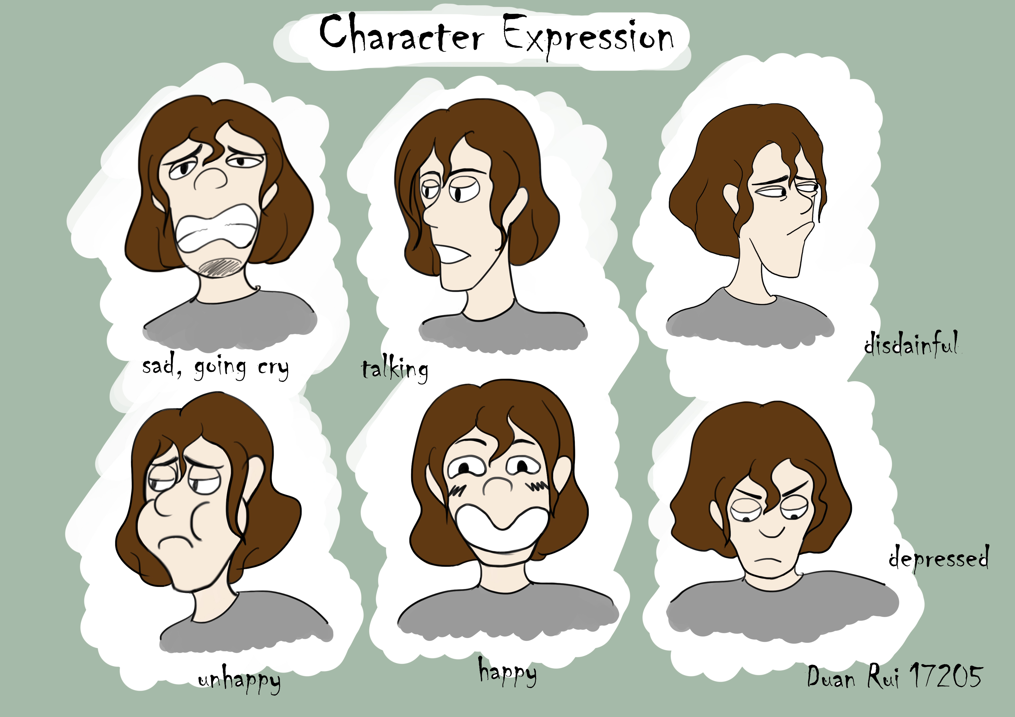
A closer look
- Stays consistent
- The underlying face shape and character identity.
- Changes
- Brow angle, mouth shape, and head tilt shift the emotional read.

A closer look
- Stays consistent
- The costume silhouette and the character’s defining proportions.
- Changes
- Arm gesture, balance, and the line of action carry contrasting emotional states.
View all 23 character design +Show fewer character design −


Environment design
31 studies · 4 highlights
Use structure and light to organize depth
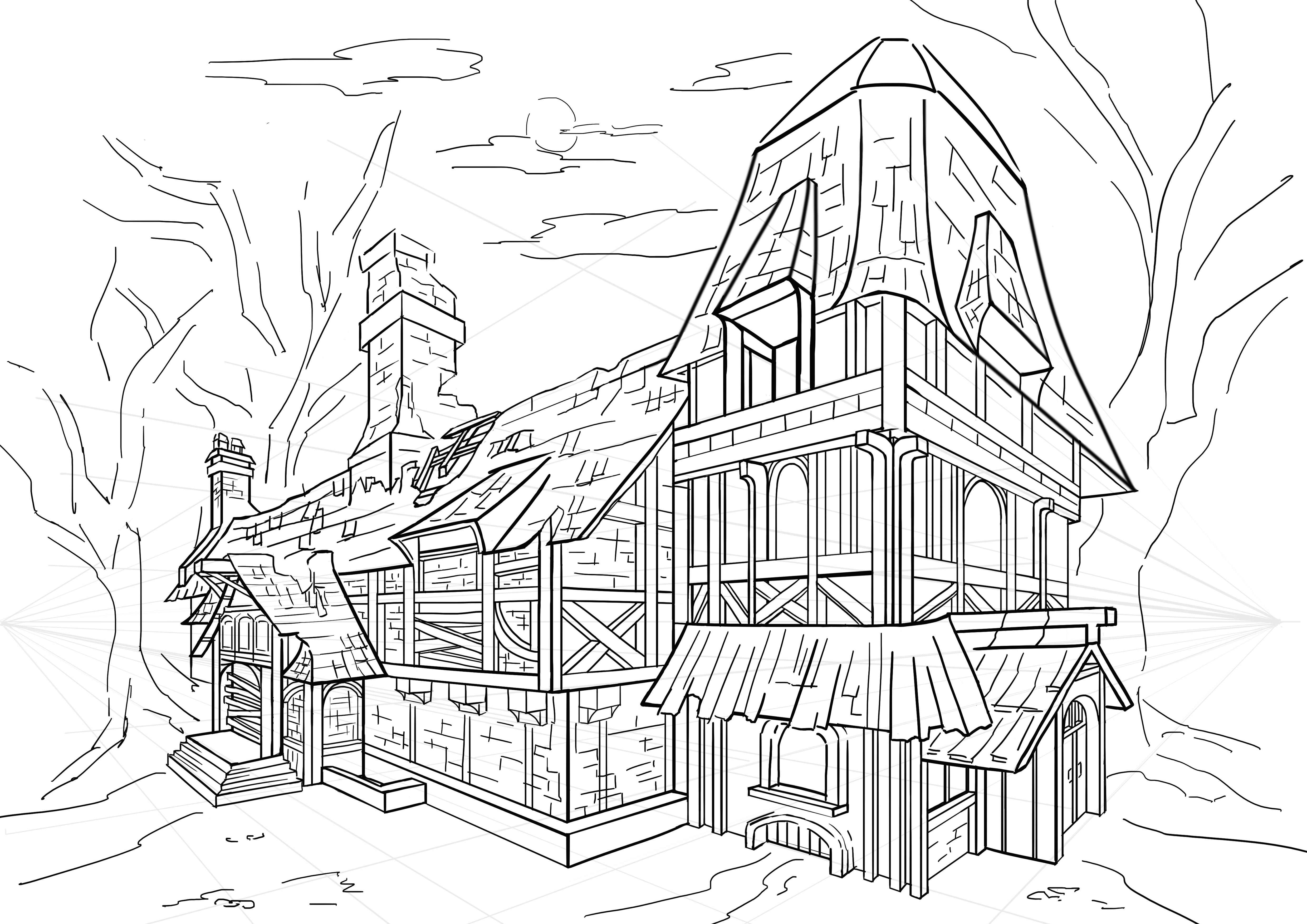
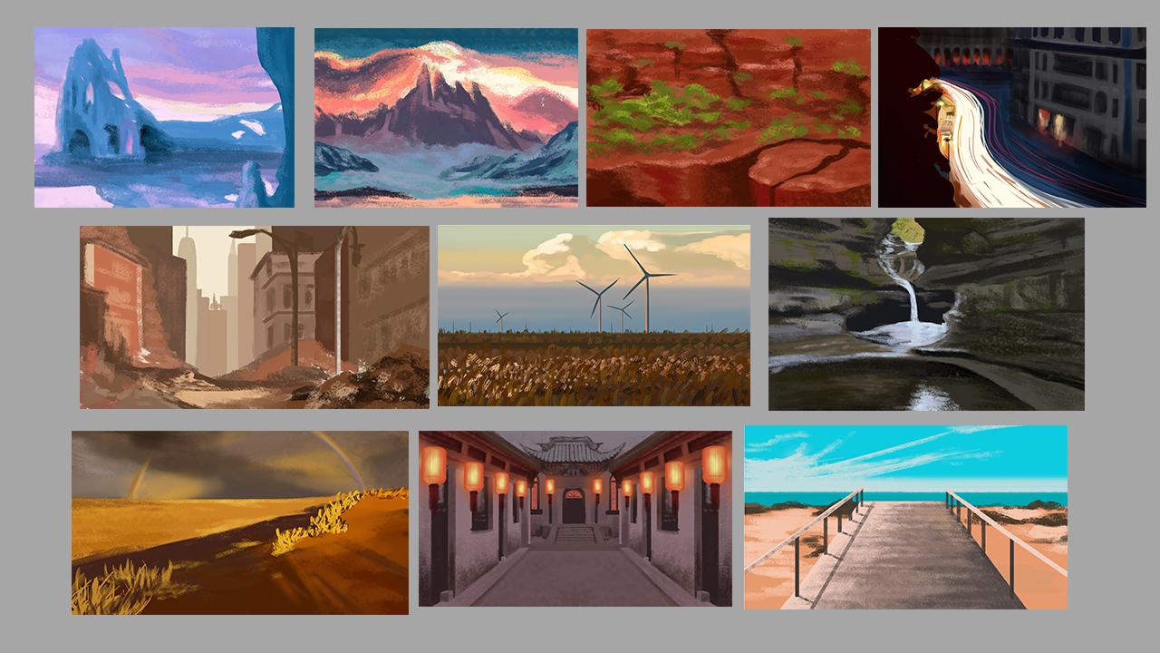
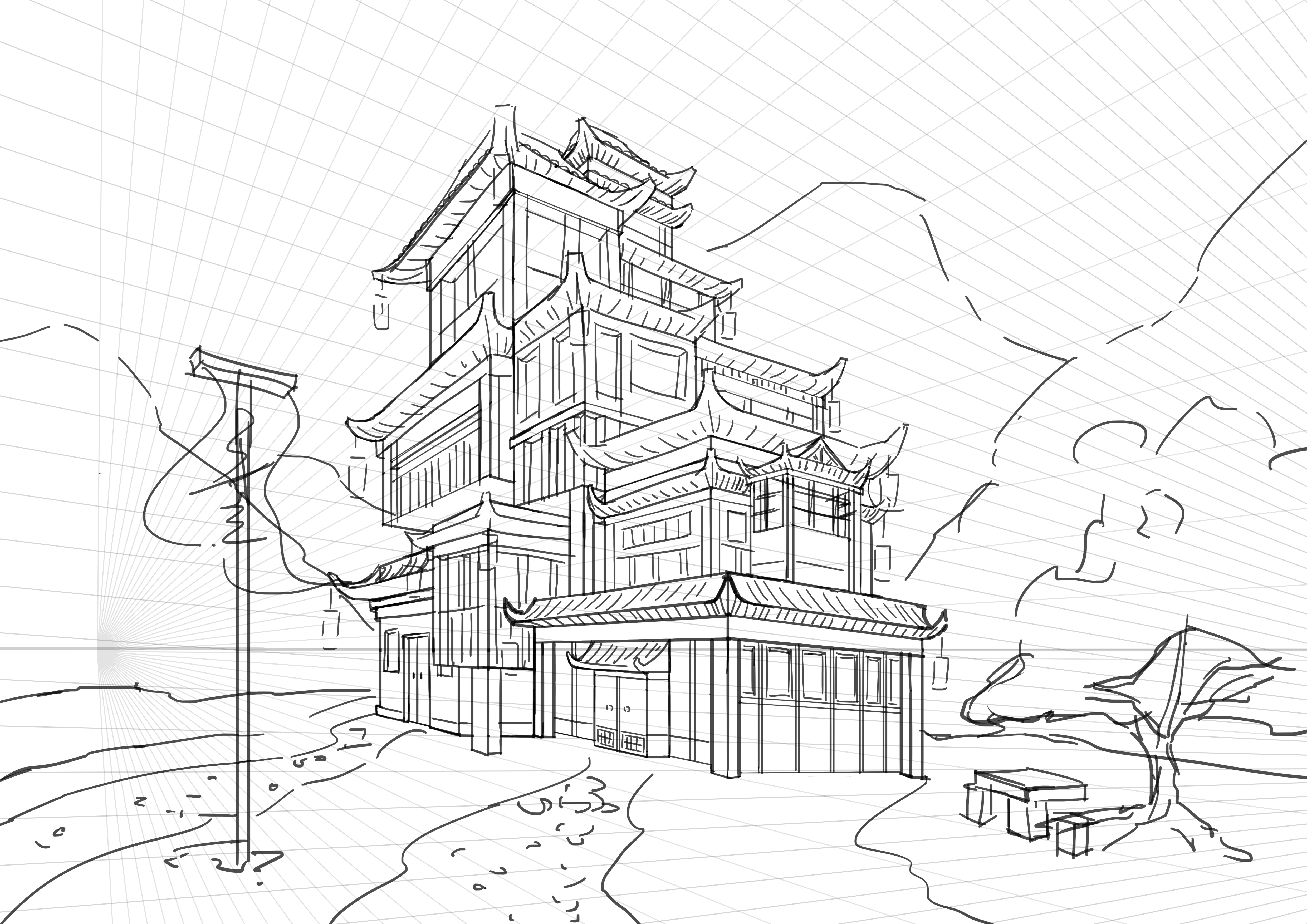
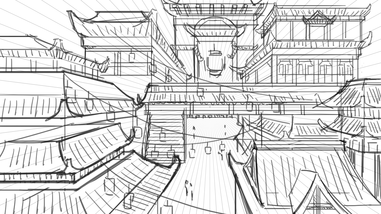
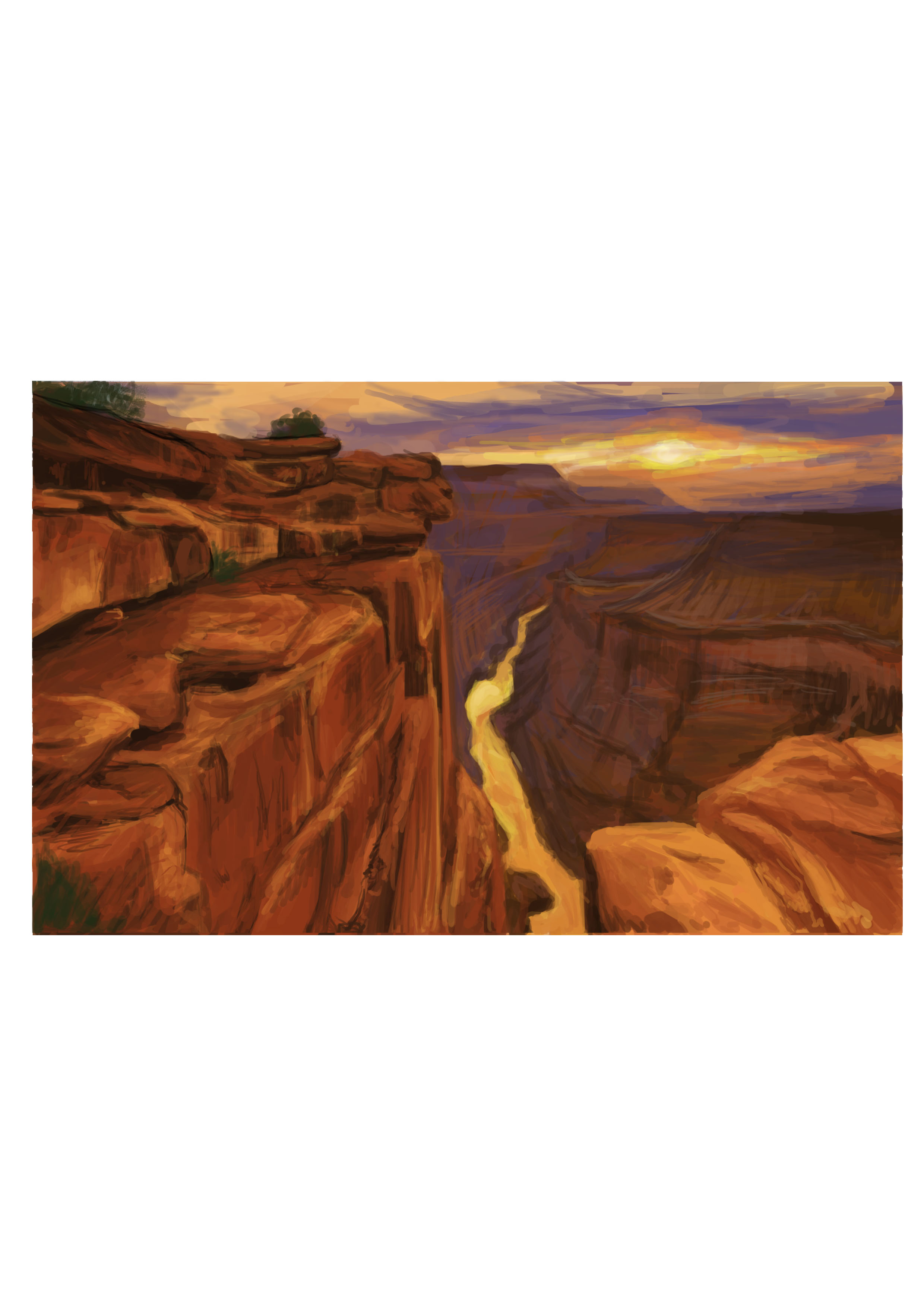
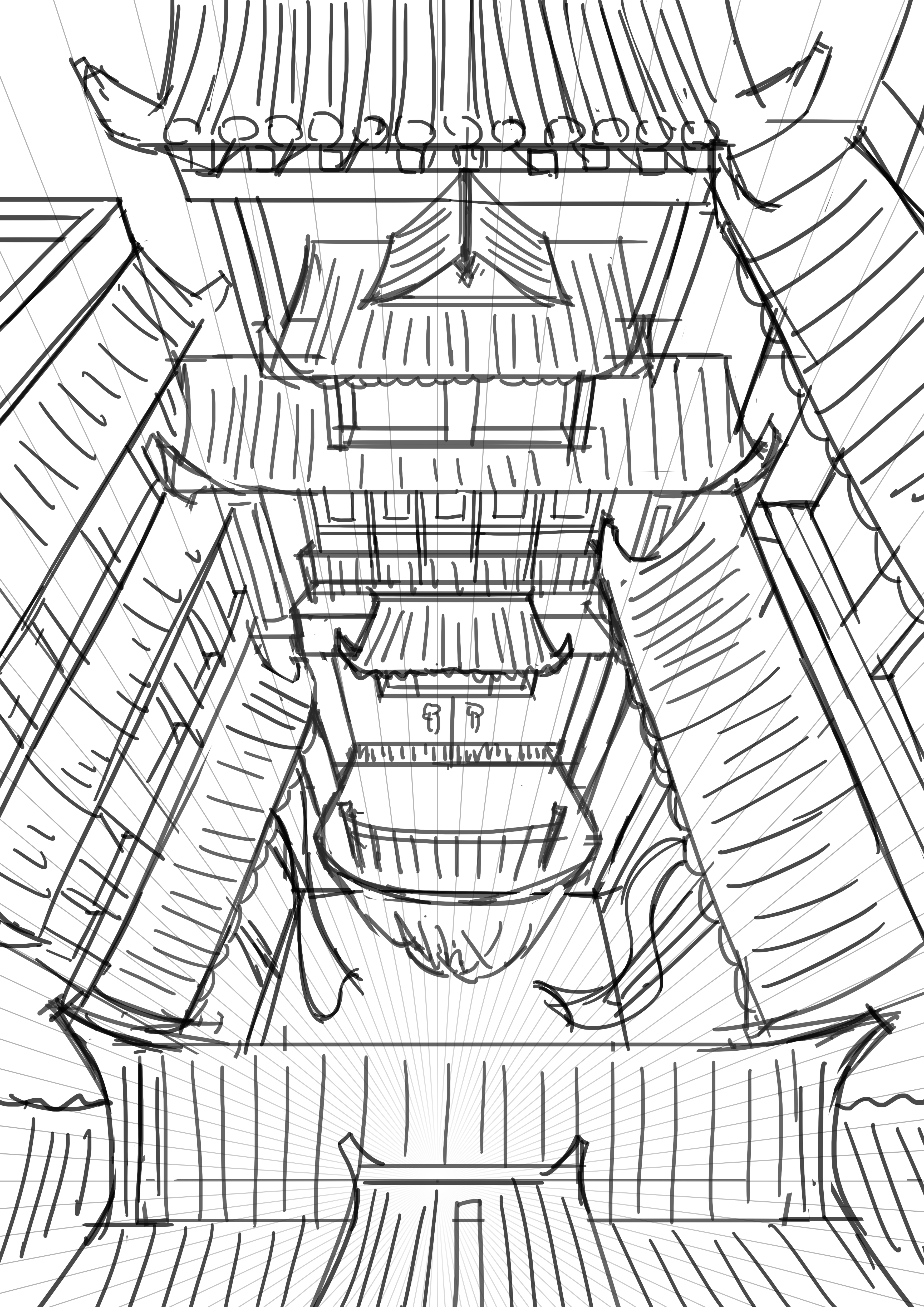
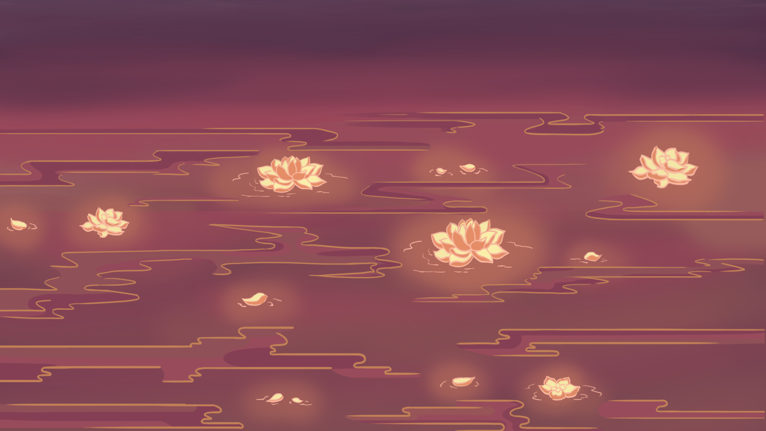
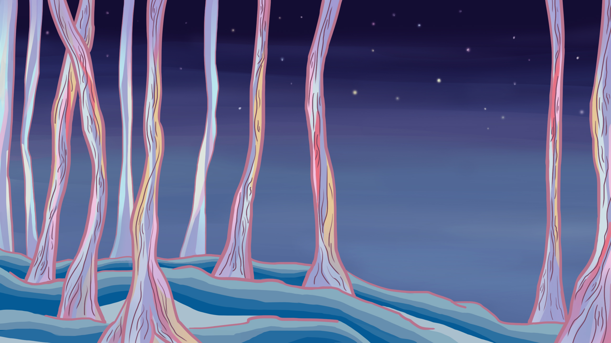
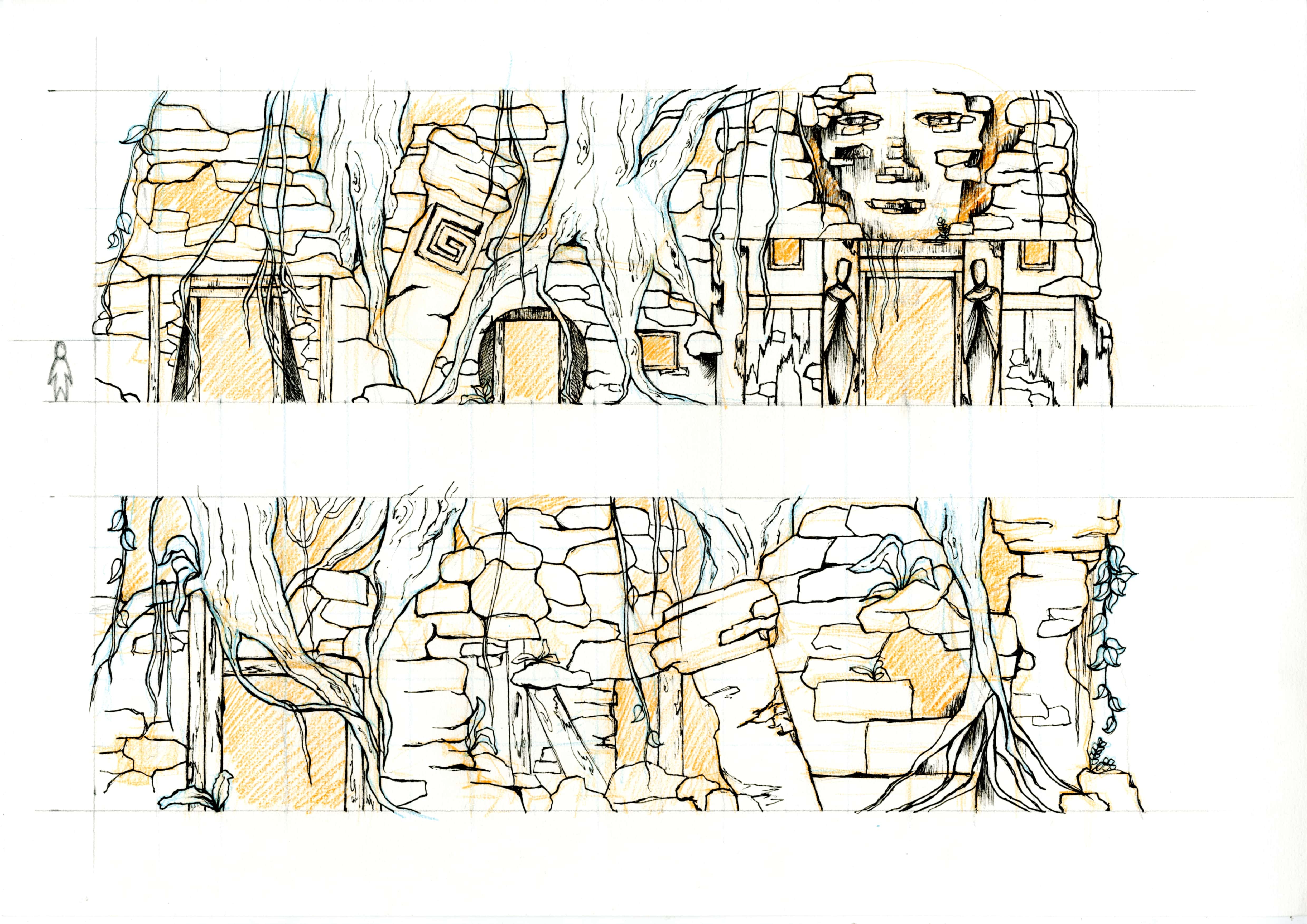
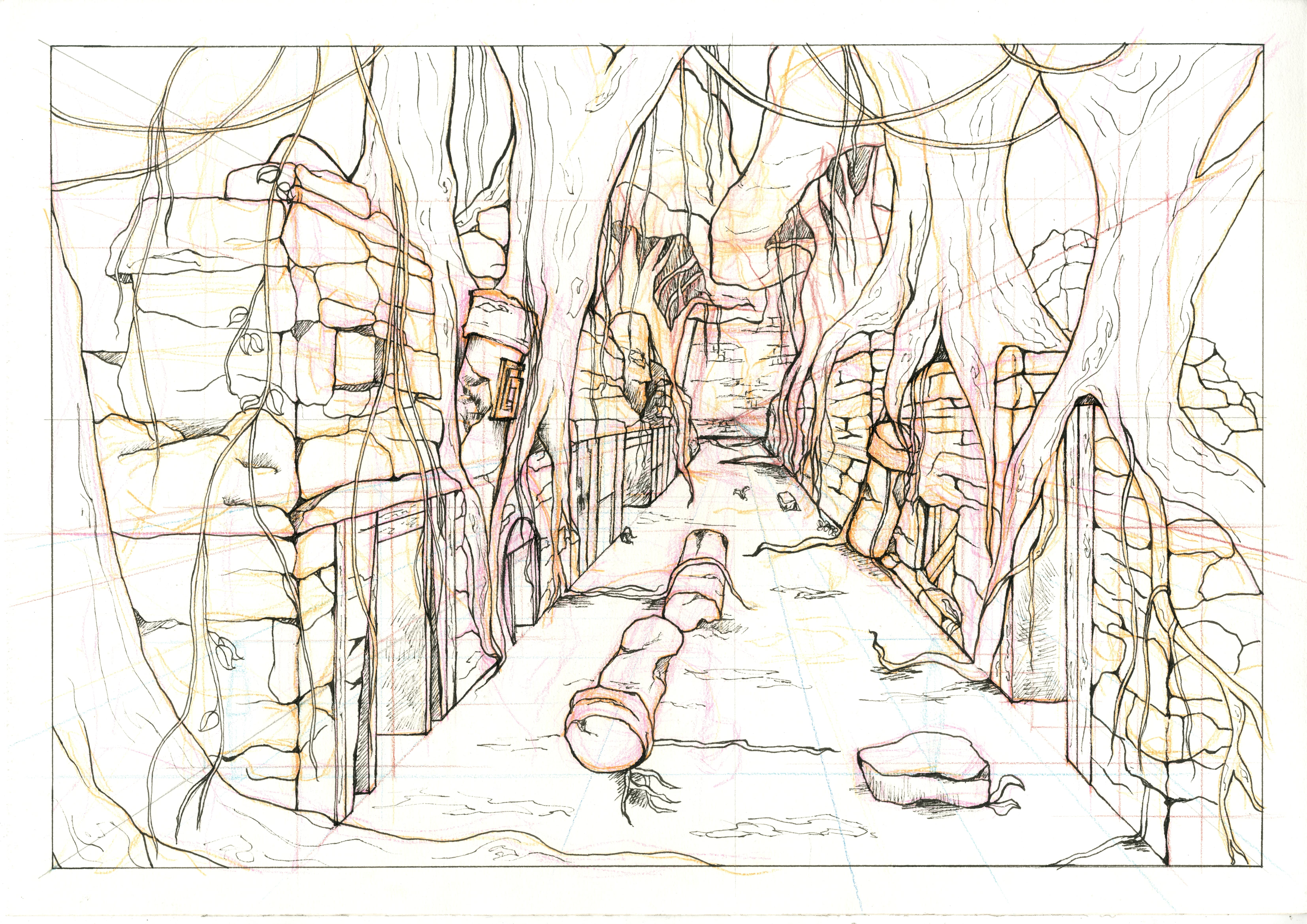
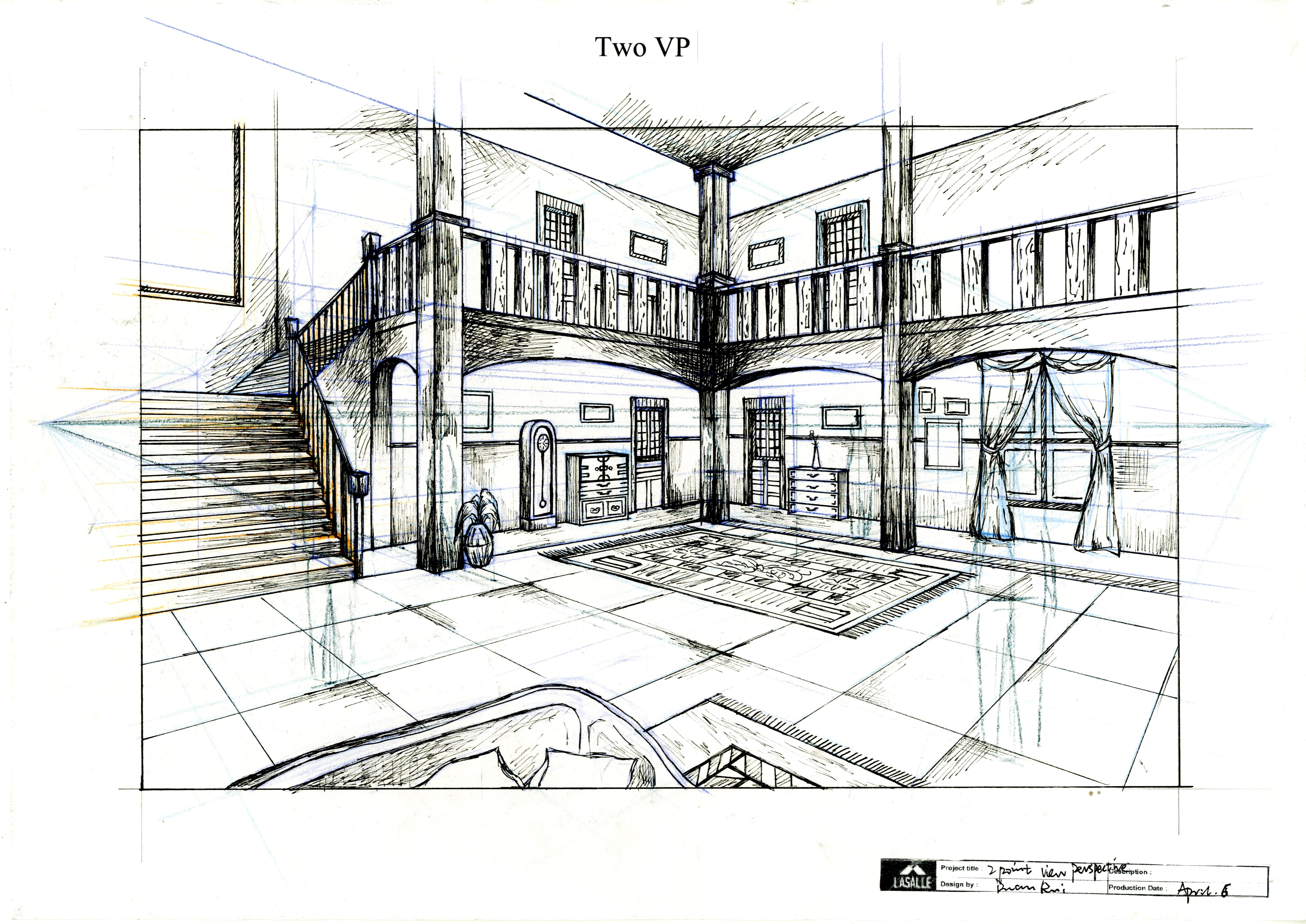
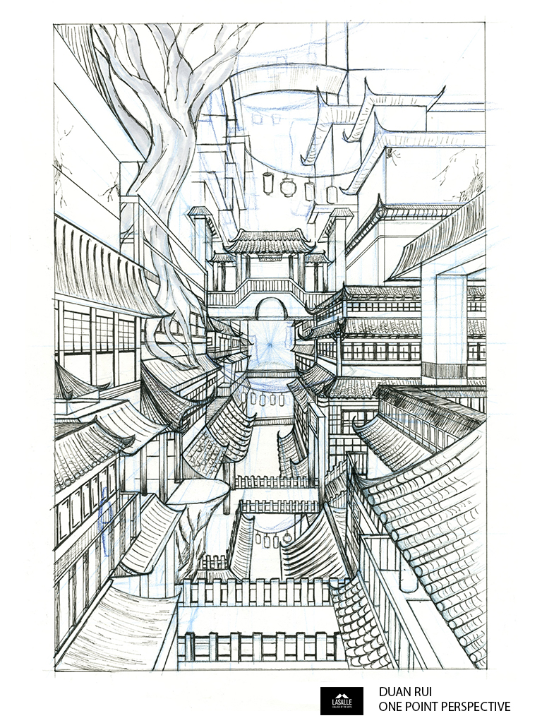
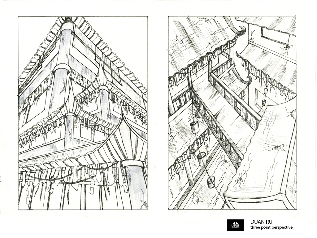
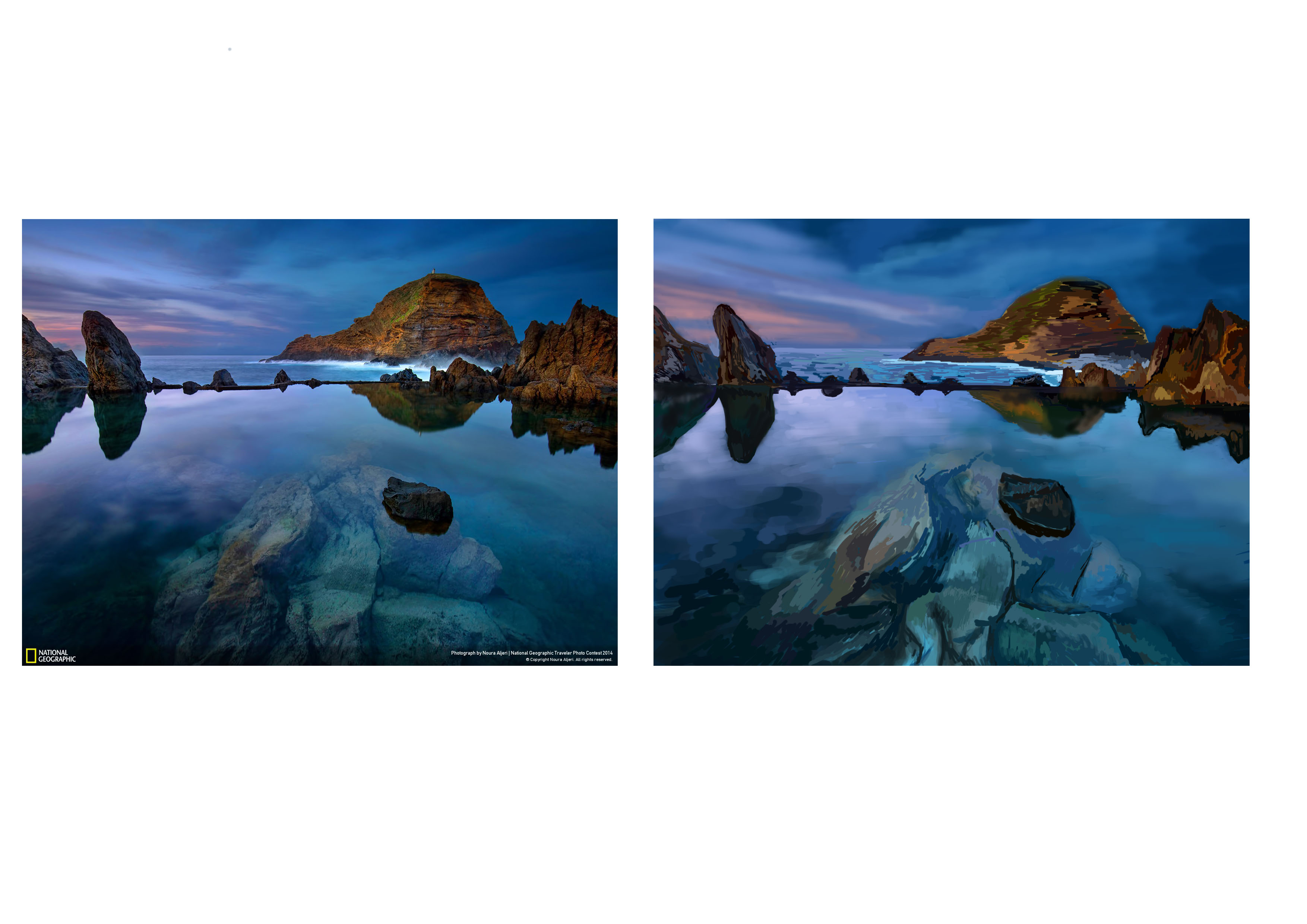
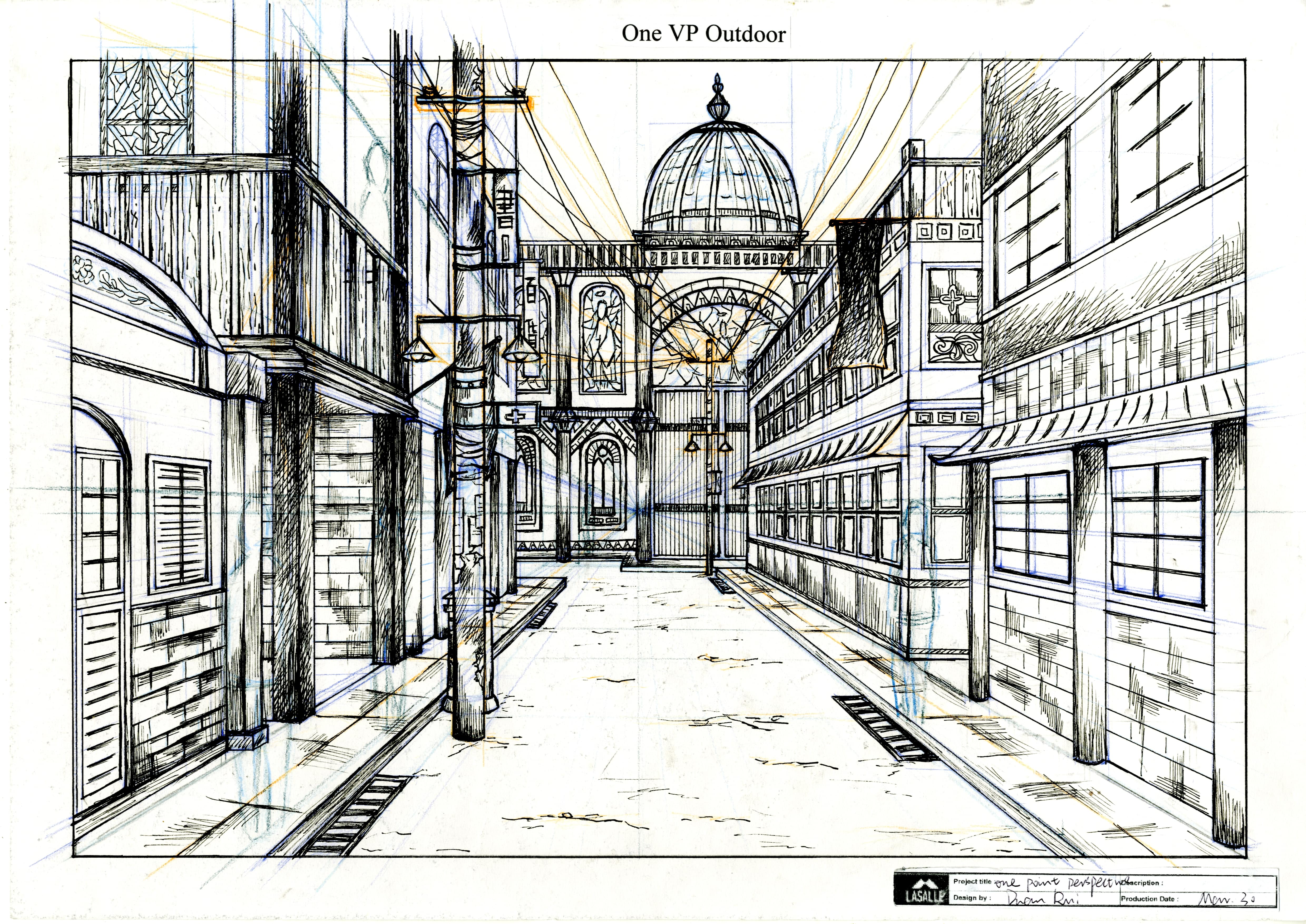
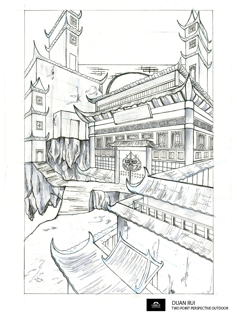
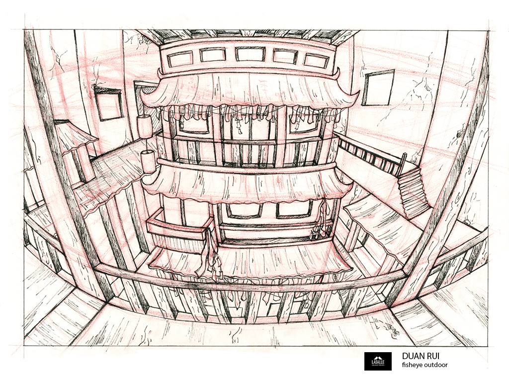
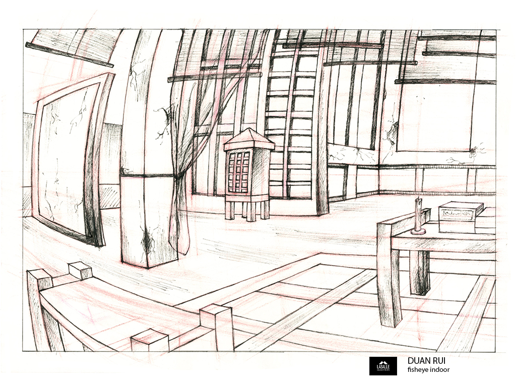
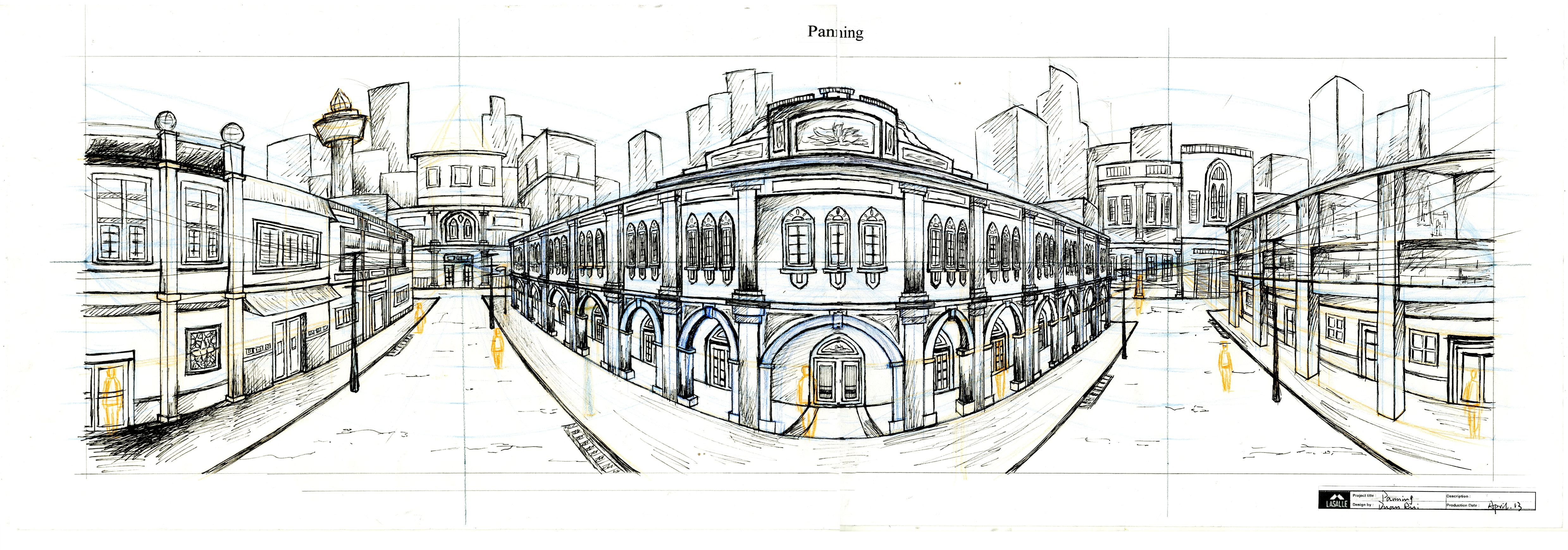
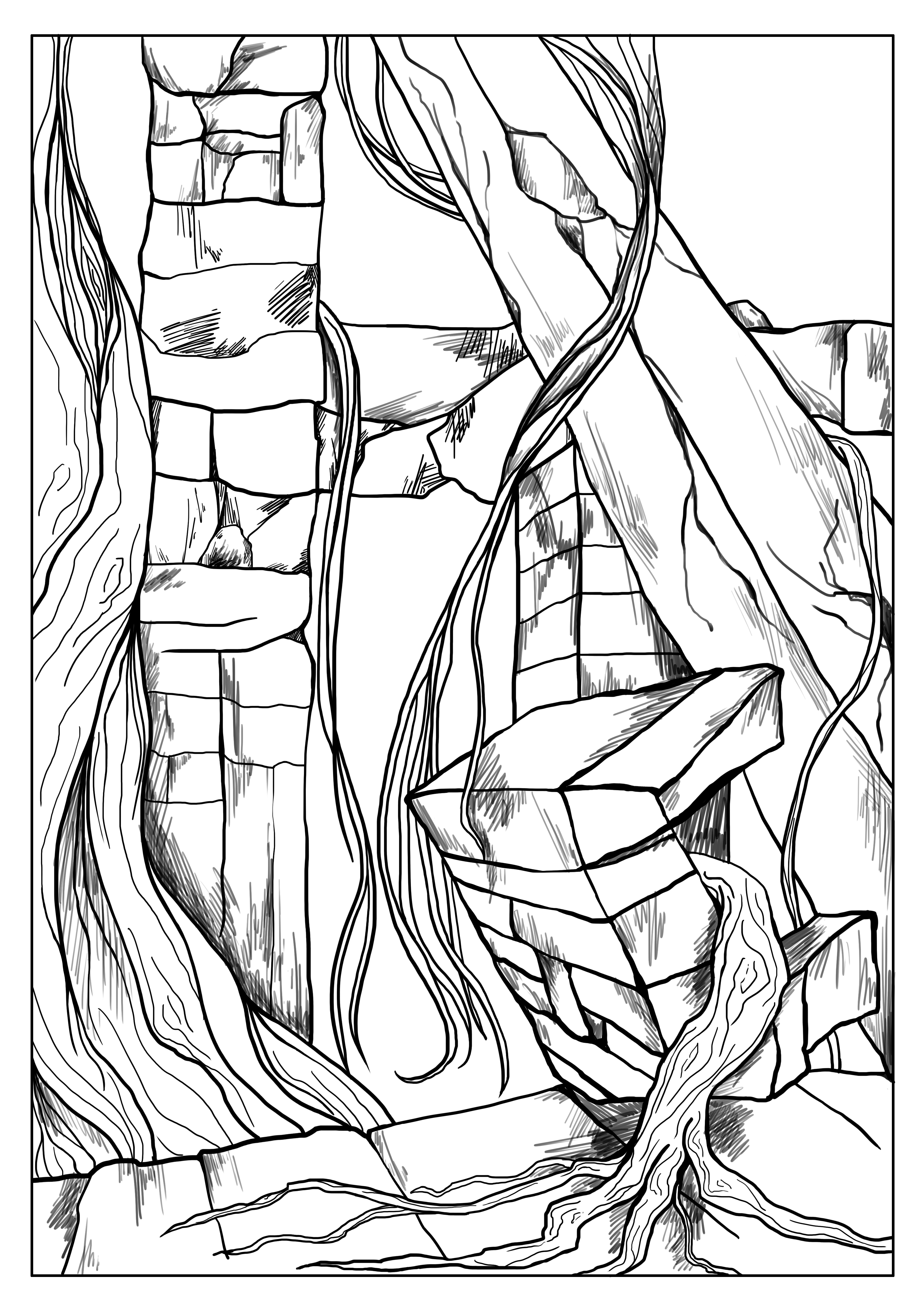
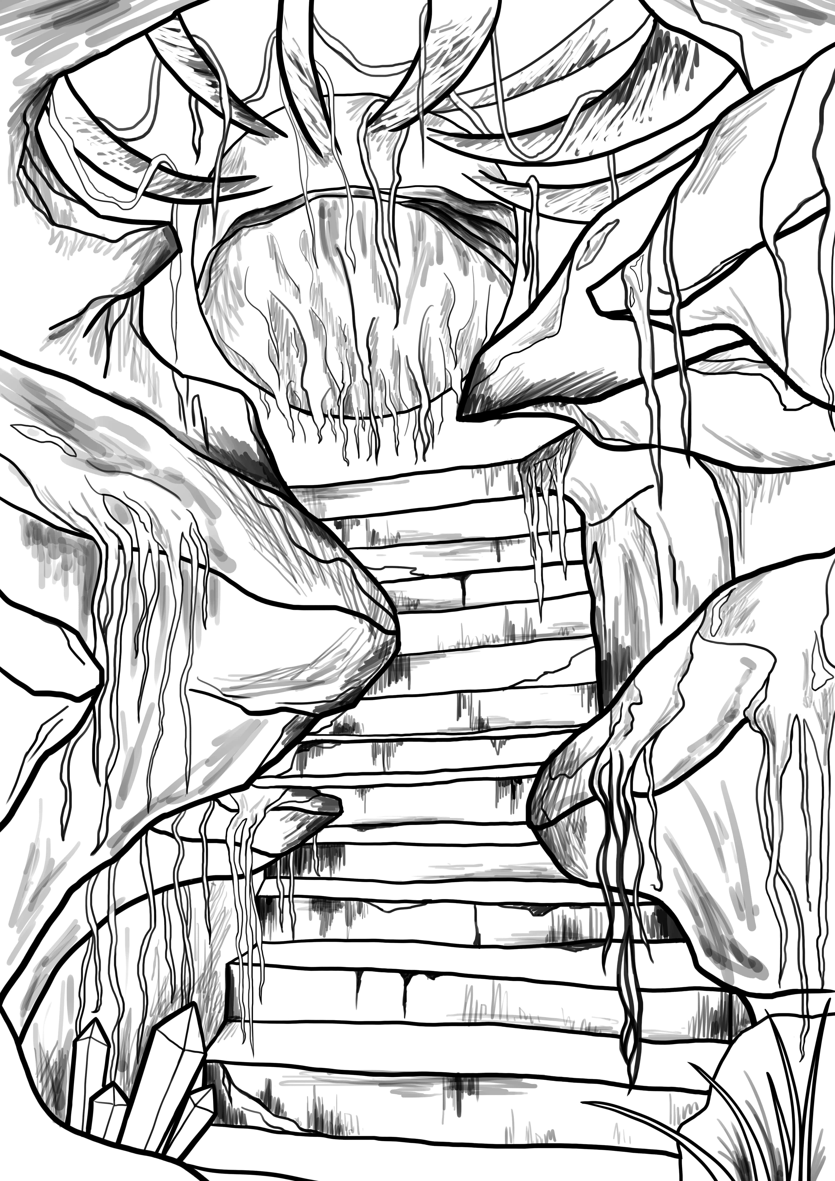
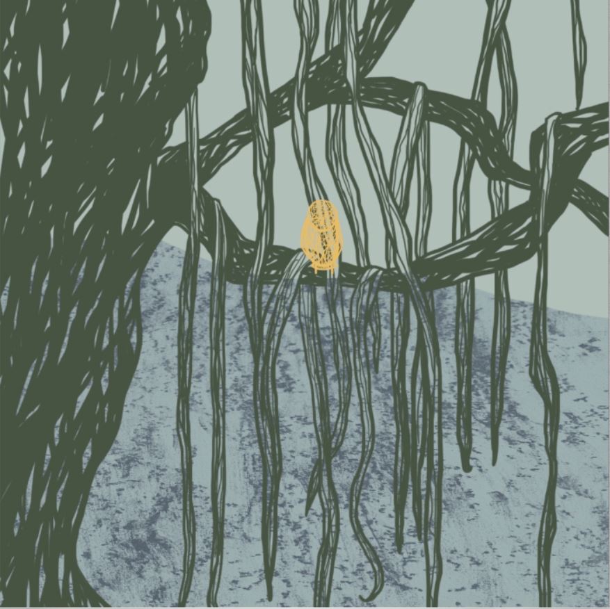
Compare the interior studies through two tools for organizing space: perspective lines describe depth, while bright windows and darker walls direct attention. The paintings use overlapping leaves, water, and distant sky, or a warm opening framed by cool rocks. Large shapes and value relationships keep each scene readable alongside its finer details.
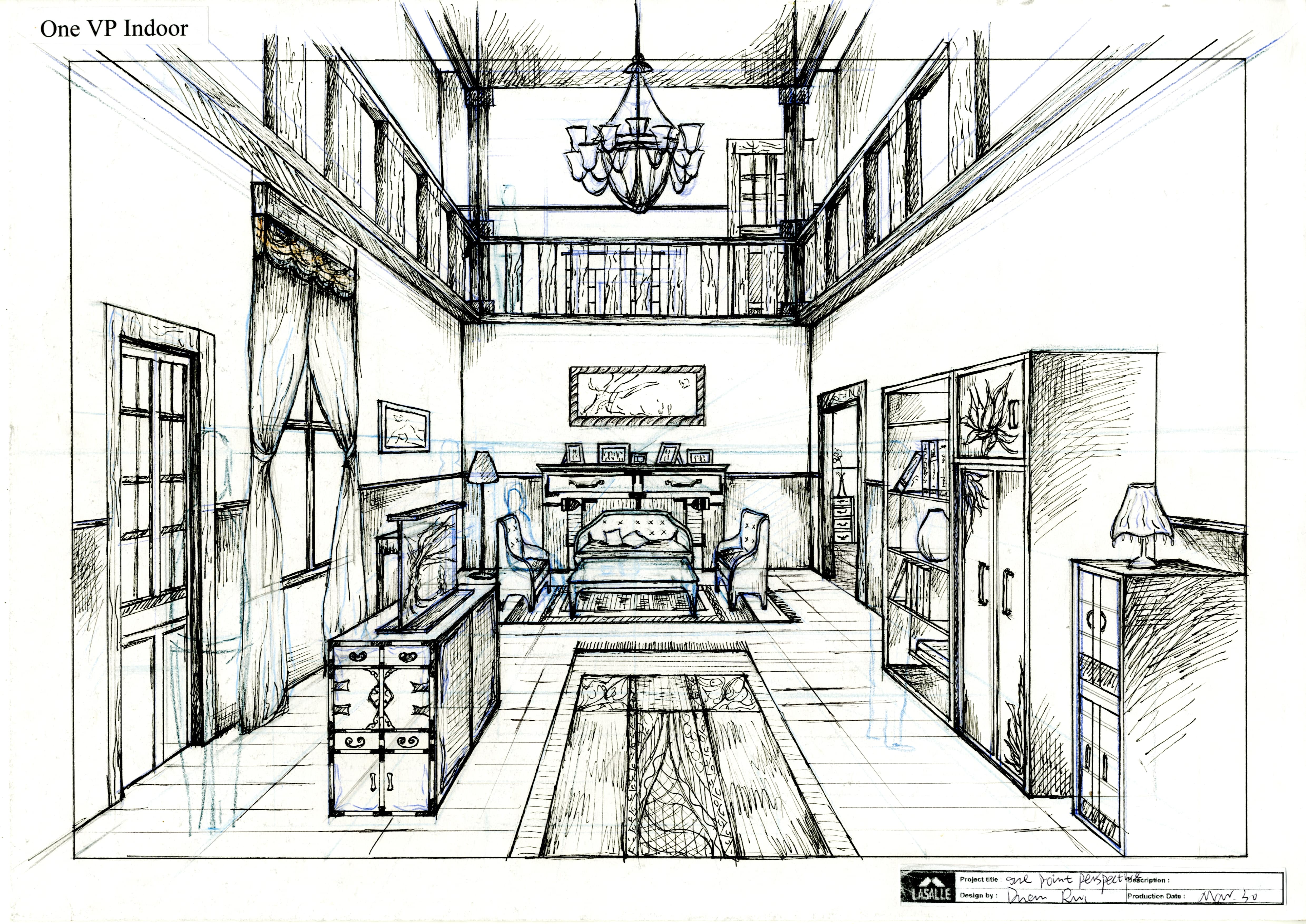
Read the composition +
Follow the floor, stair, and balcony edges into the room. Their convergence makes depth legible through line alone; the small details sit inside that larger spatial structure.
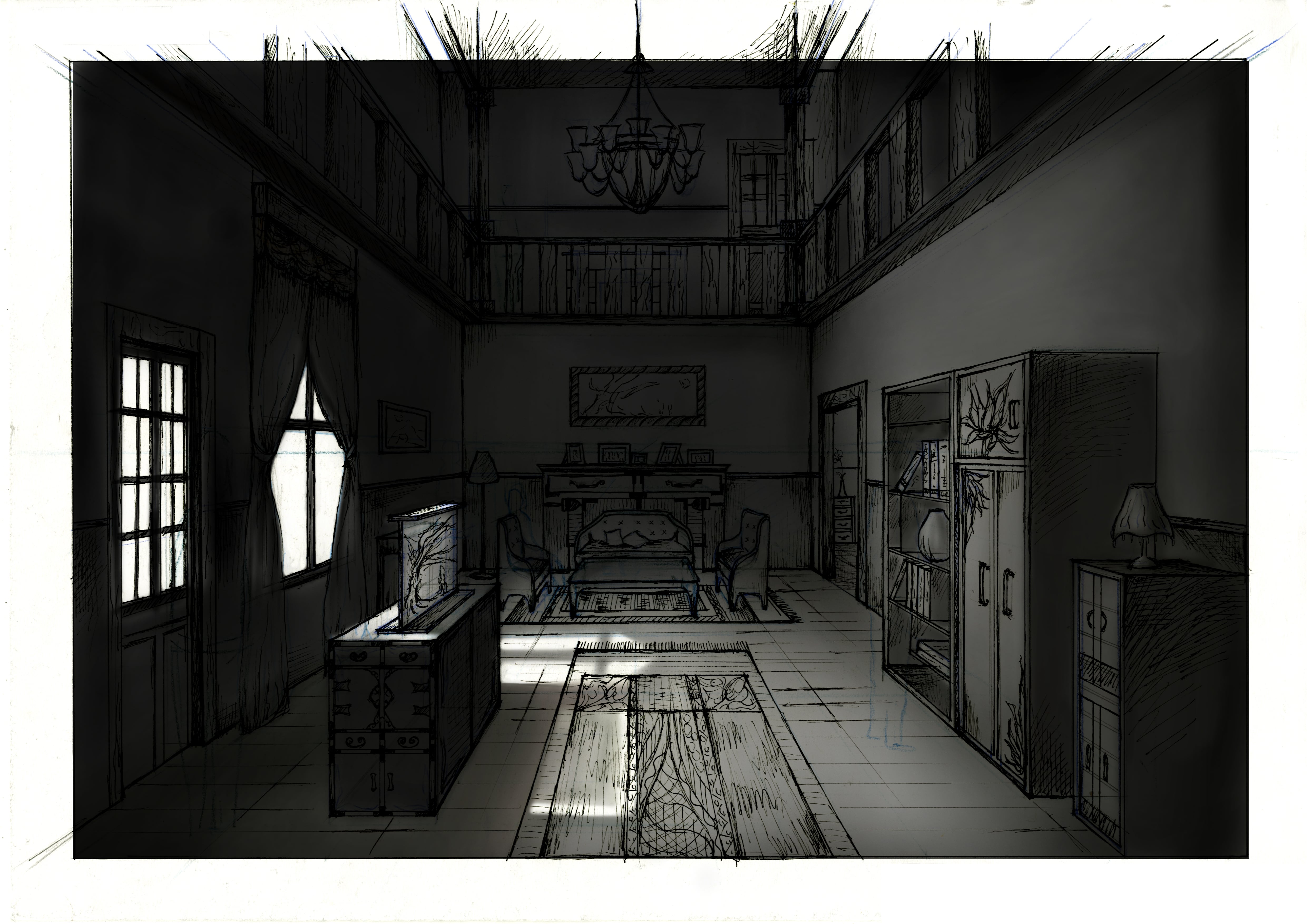
Read the composition +
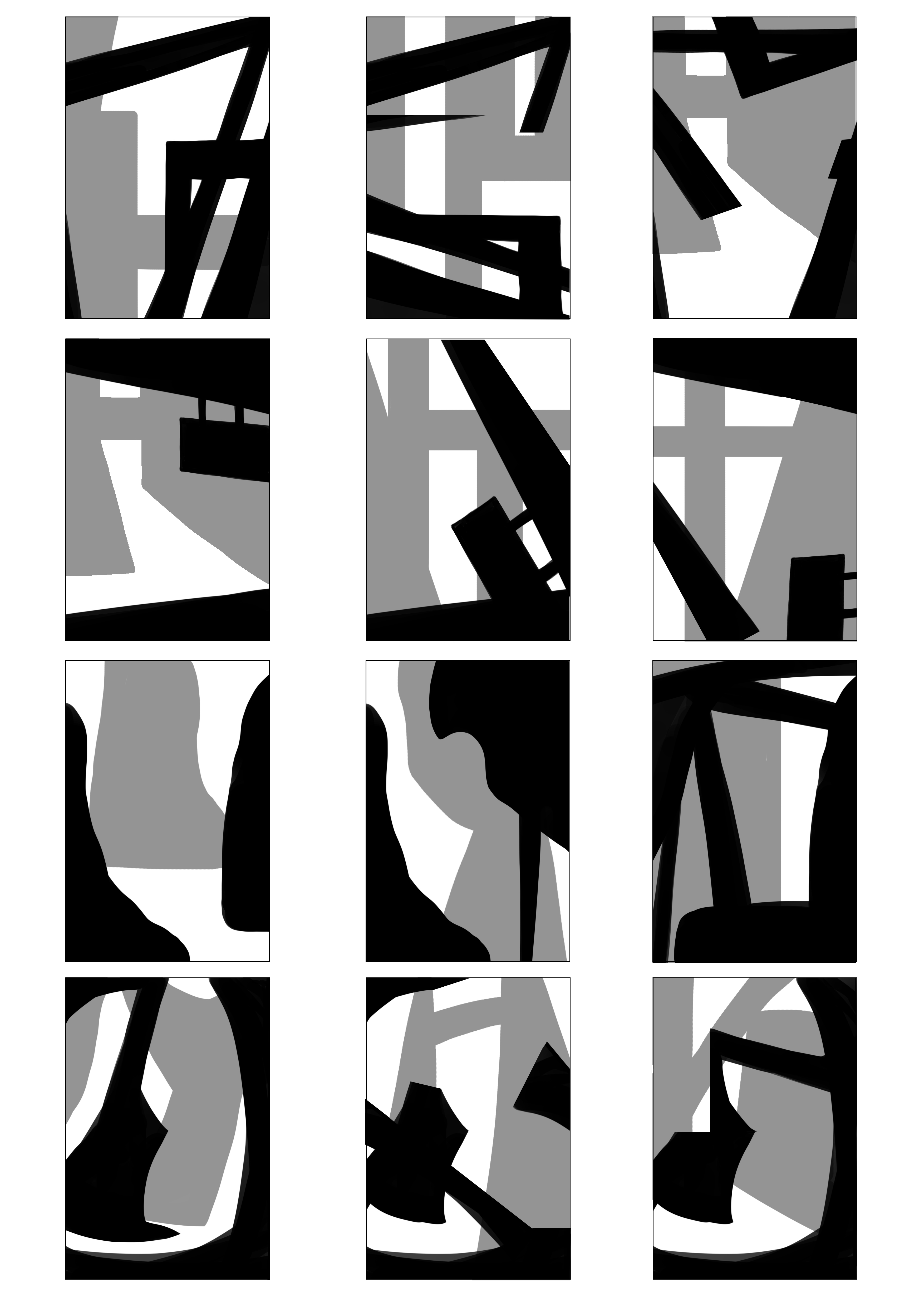
Bright windows and the lit floor create a route through darker walls. Compare this use of large light-and-dark shapes with the neighboring perspective drawing as two different ways to organize a room.

Read the composition +
Read three depth zones: overlapping leaves in front, water and luminous subjects in the middle, then the distant sky. Overlap, scale, and softer distant edges separate the planes without giving every part equal emphasis.
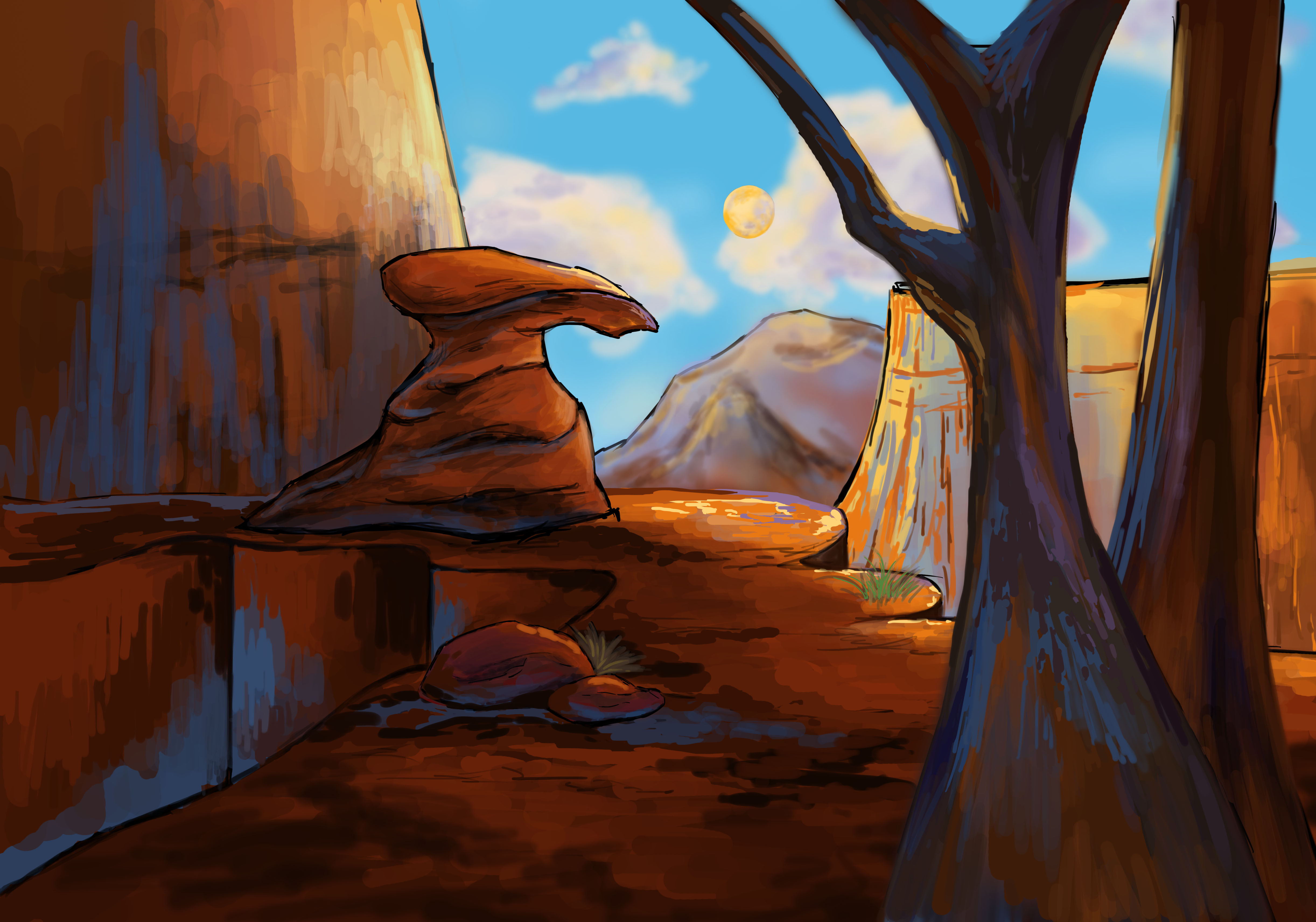
Read the composition +
Cool foreground shapes frame a warm, bright opening. That temperature and value contrast draws attention through the rocks; the broad framing remains visible even when the scene is viewed small.
View all 31 environment design +Show fewer environment design −





Frame studies
12 studies · 4 highlights
Control the first read through shape, hierarchy, and light
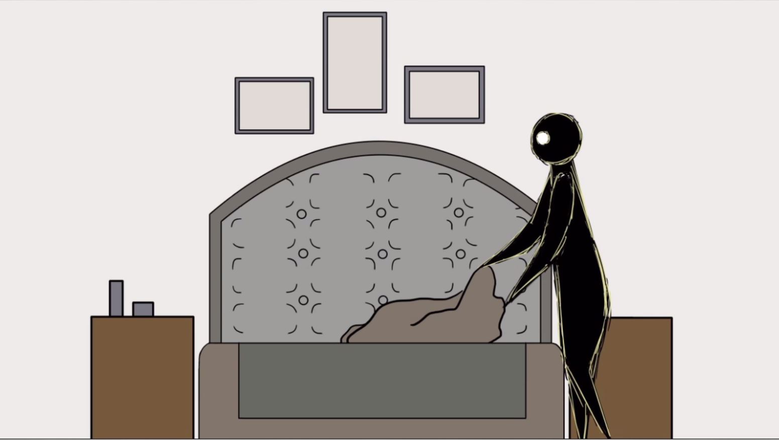
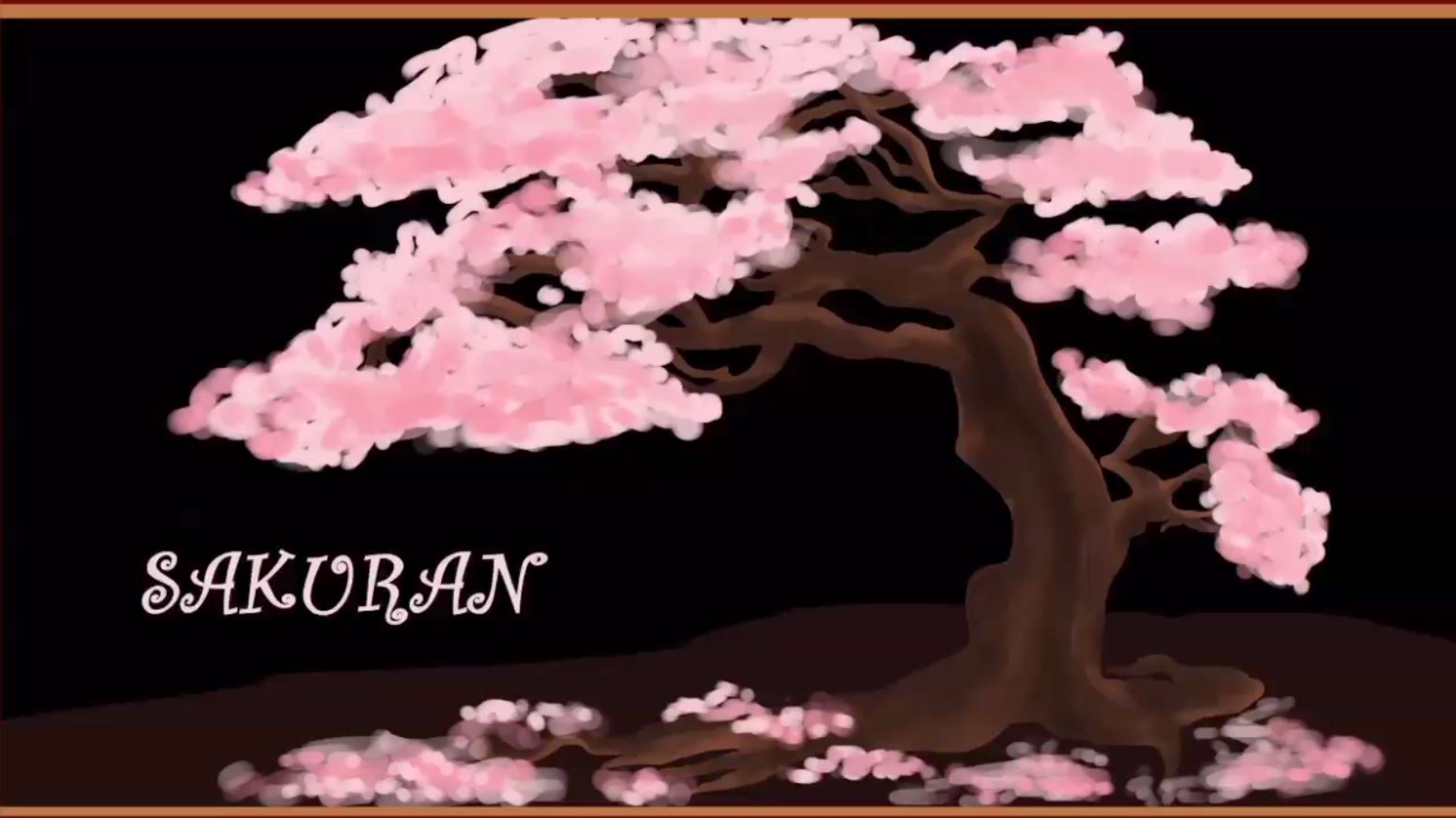
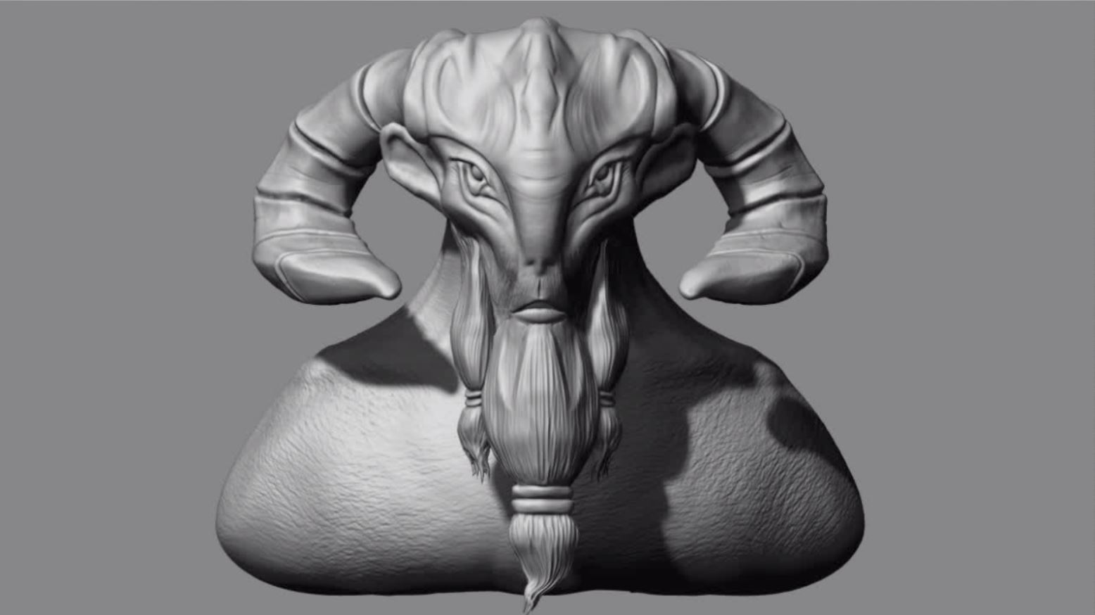
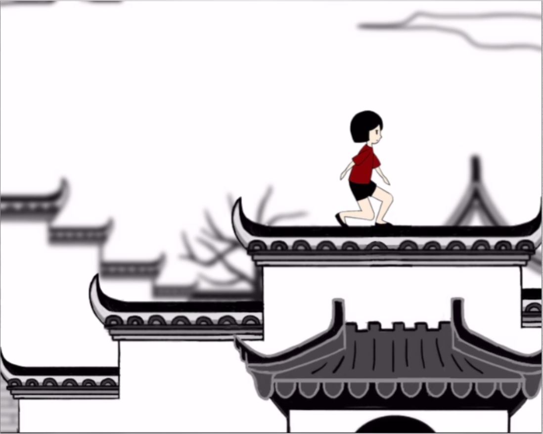
Hat and Singapore observation separate expressive figures from quiet backgrounds. EM Services organizes typography and landmarks into a hierarchy; the head model uses light to reveal facial form. Each medium presents a different way to establish a focal point. The film index extends these still-image comparisons into movement and sound.



View all 12 animation frames +Show fewer animation frames −



Product Design
UX/UI Design
Visual Design
Product Design
UX/UI Design
Visual Design


