Promotions invite exploration
36.6% of respondents said promotions or discounts encouraged purchases.
Interface choice → promotional entry points alongside search and categories.
A connected journey,
beyond checkout.
Choice explores continuity across a complex mobile commerce journey: discover, evaluate, purchase, track, then review or buy again. The independent project combines B2C retail and C2C marketplace architecture with detailed transaction and post-purchase UI states.
Independent prototype · 2021
Interactive mobile commerce prototype; not developed or launched.
Directional research inputs, linked to the original screens. Their effect on behavior remains untested.
36.6% of respondents said promotions or discounts encouraged purchases.
Interface choice → promotional entry points alongside search and categories.Reviews, product imagery, and seller credibility informed the research synthesis.
Interface choice → product and seller context beside selection and purchase actions.Delivery information and customer service remained part of the shopping experience.
Interface choice → status, tracking, and help within the order record.Jump to a decision, or follow the story below.
I surveyed 71 online shoppers, followed up with interviews, and reviewed Amazon and Taobao. Price and promotions drew attention; product detail, reviews, seller credibility, and delivery information supported confidence.
The design challenge was to carry that context across discovery, purchase, and delivery without making every screen compete for attention.
Scroll through three shopping perspectives. Select a numbered marker to jump to its evidence board; click any board to inspect the original artifact.


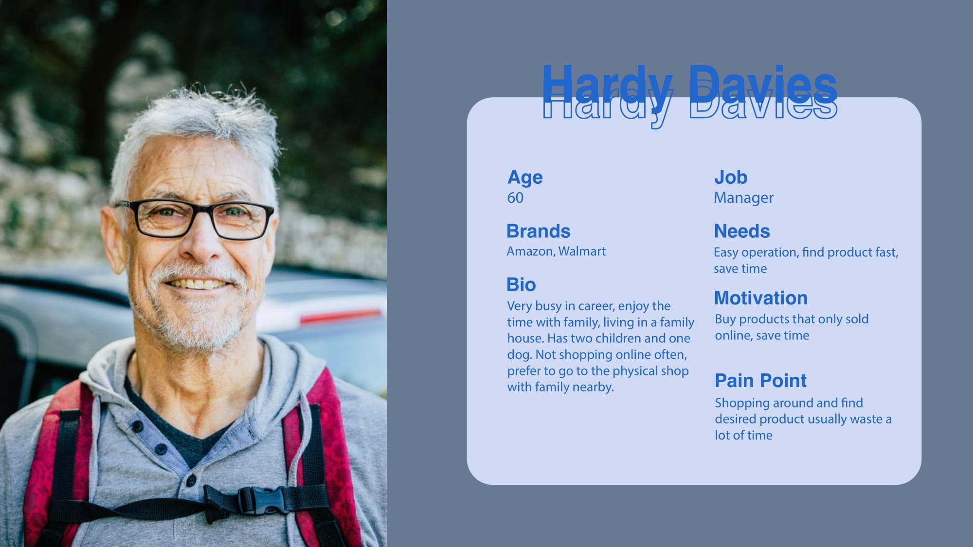
I mapped B2C retail and C2C marketplace behavior, including buyer and seller flows. This case follows the buyer journey, where the interface evidence is strongest.
That focus also exposes a scope trade-off: discovery, transaction, and service need to work together before alternate search modes or a wider seller toolkit add value. The original system map remains available below.
A readable preview of the original architecture. Click the map to inspect the full node relationships.
Select image to inspect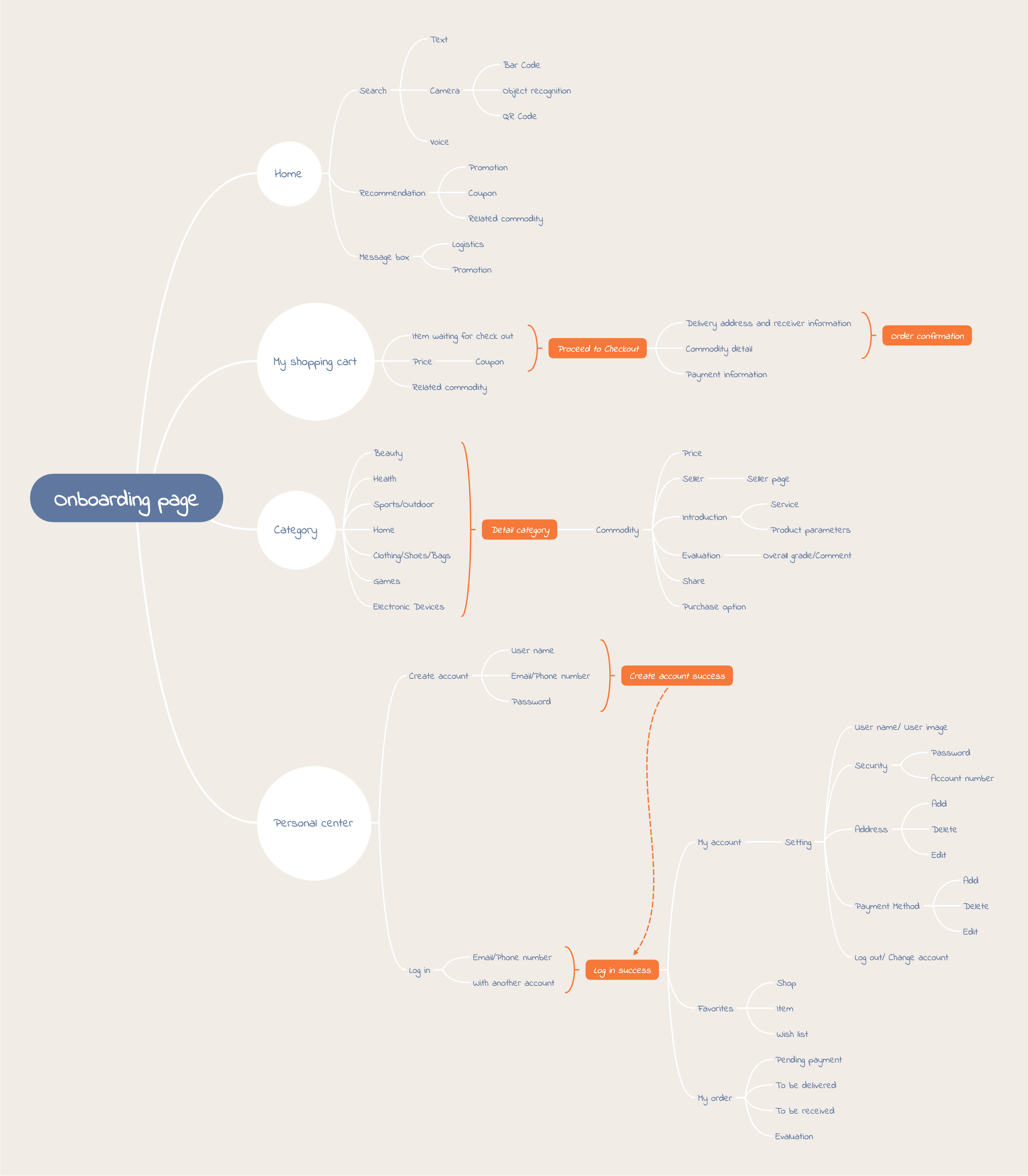
A quick view of the original screen set before the interface was refined. Click the atlas to inspect the full sequence.
Select image to inspect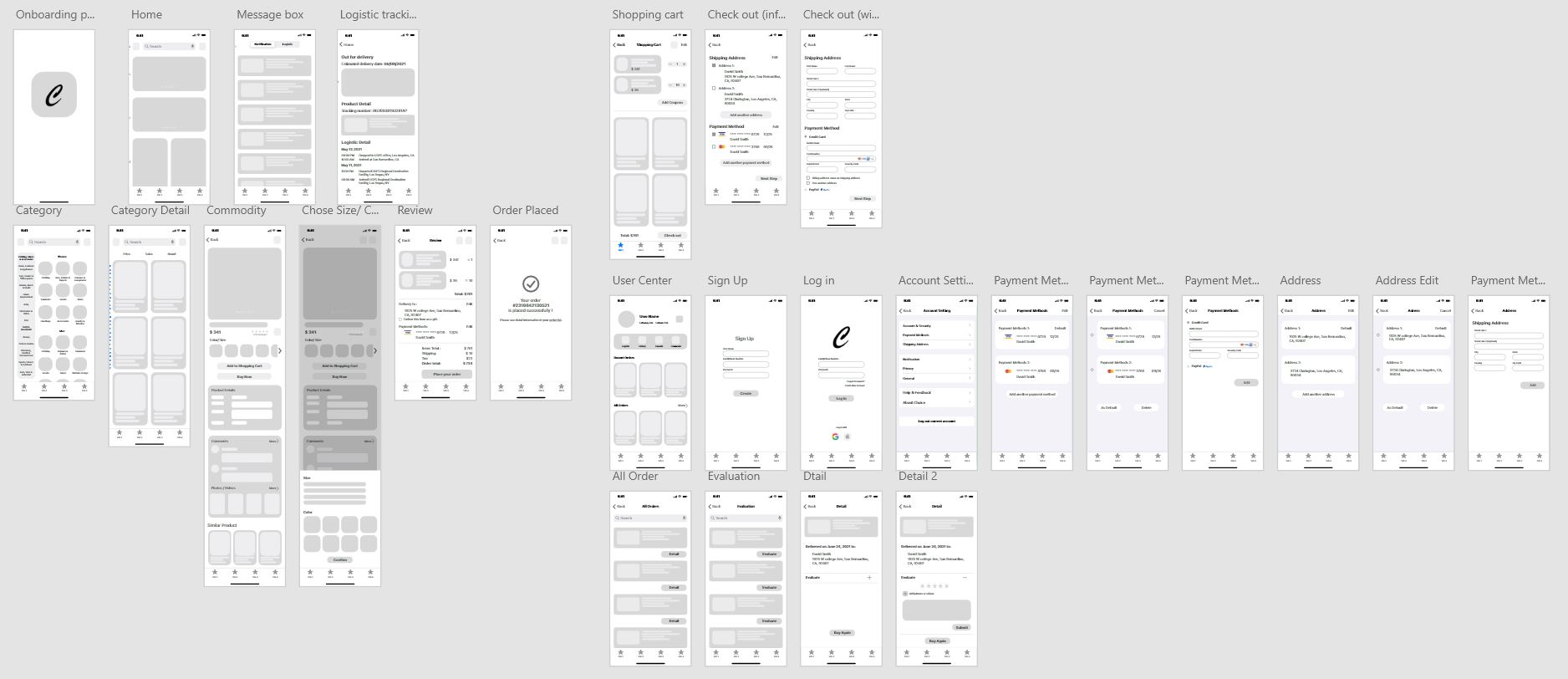
Use search, categories, promotions, and recommendations before reviewing product, seller, variant, and trust information.
Select variants, manage cart items, edit address and payment details, review fees, and confirm the order.
Follow delivery, access help, write a review, and use Buy It Again from the order record.
Search serves a known product; categories narrow a known product type; promotions and recommendations invite exploration. Broad departments stay visible while subcategories reveal the next level.
The trade-off is breadth versus attention. Product cards keep favorite and secondary actions available without giving every action the same emphasis. Voice, camera, and barcode search remain concept extensions rather than proof of a validated need.


Product Detail brings imagery, price, seller information, reviews, and purchase actions together. Variant selection opens a bottom sheet with the product still visible behind it.
The benefit is continuity; the cost is limited space for options. The sheet keeps selection temporary and reversible. The new exploration below takes this further by showing how an unavailable option could be handled without clearing the shopper's other choices.

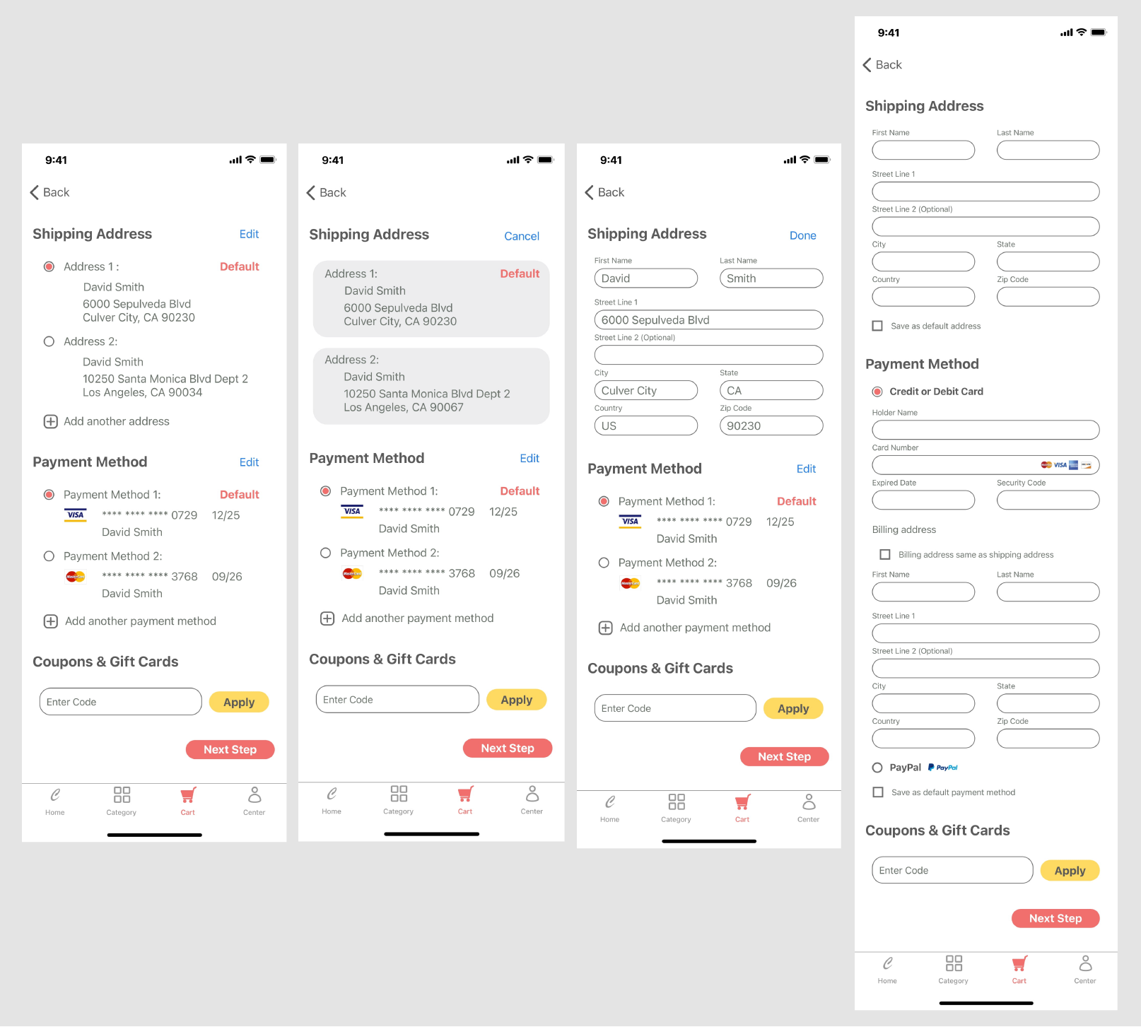
The cart groups items by seller and exposes quantity, selection, and order details. Checkout separates saved information from new address and payment entry, then brings the order together for review.
Keeping edits close to the summary adds controls, but makes corrections possible before payment. Products, delivery information, payment, discounts, and fees remain inspectable at the commitment point.
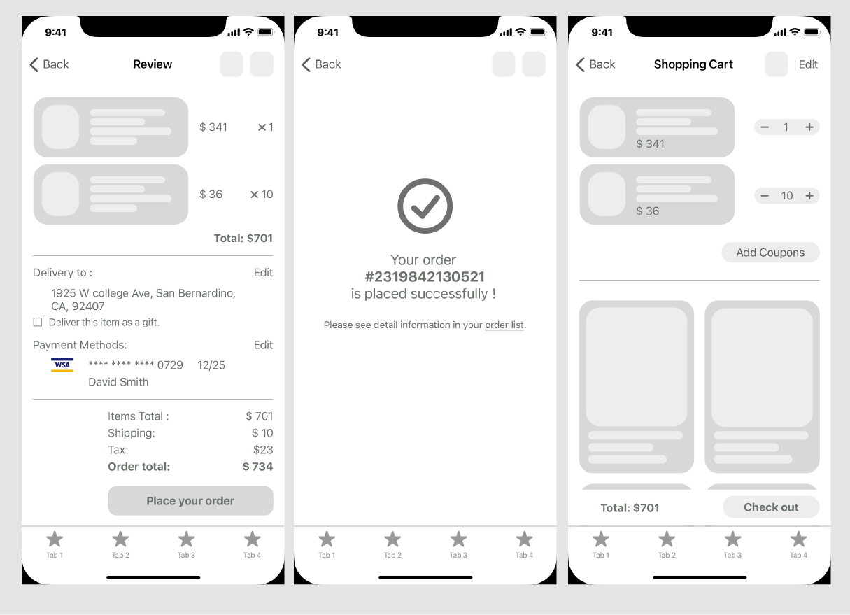
The original wireframe groups order information and confirmation before applying the visual system.

The review screen gives the total and primary action emphasis while keeping transaction details available.

After payment, the question changes from what to buy to what happens next. Order Detail leads with status, then uses expandable sections for tracking, shipping, payment, and review information.
Progressive disclosure reduces the initial information load at the cost of an extra action for detail. Help, review, and Buy It Again keep the order useful beyond delivery; their effect on retention has not been measured.


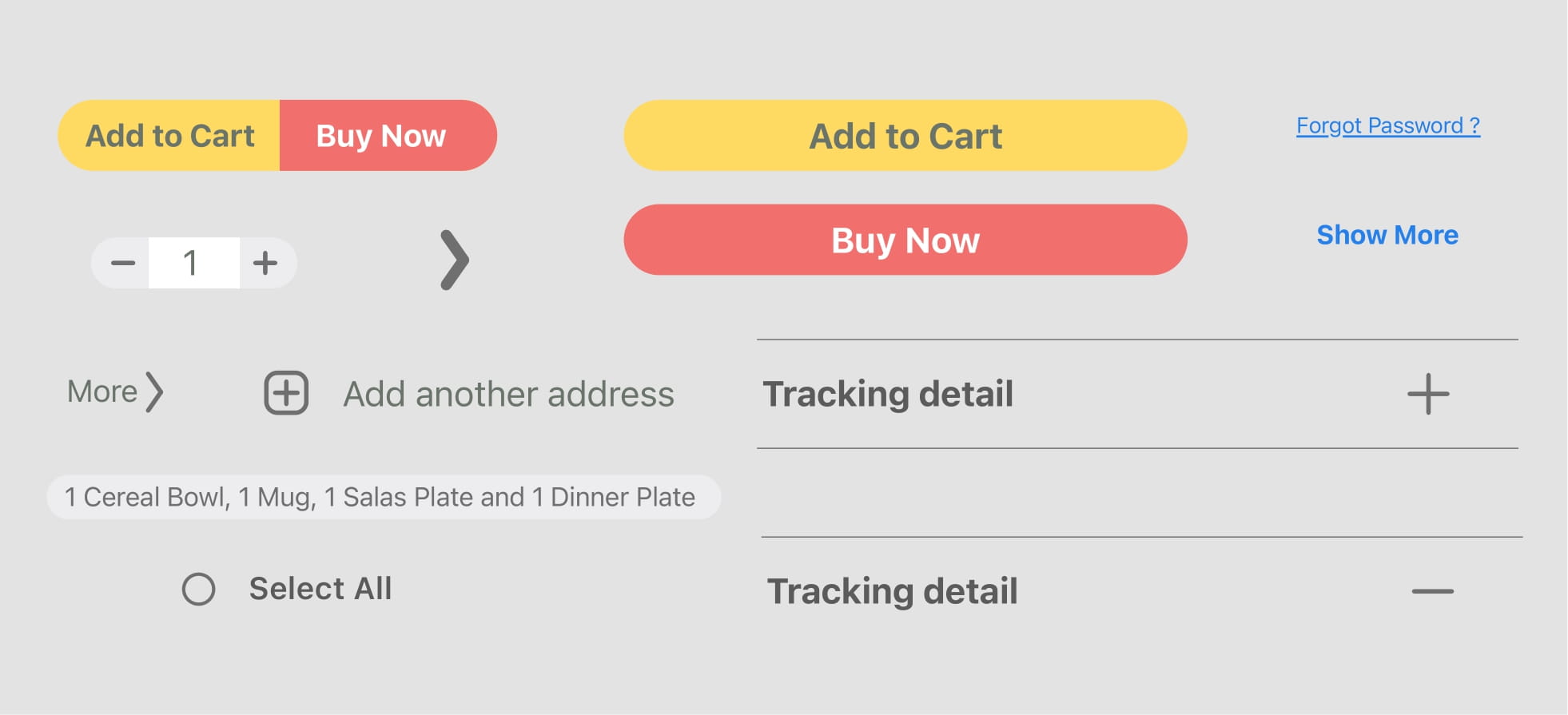
I built the prototype and high-fidelity UI in Figma and Adobe XD. Shared navigation, cards, fields, bottom sheets, and expandable rows connect the journey. Coral and yellow distinguish action emphasis within the original visual system.
The components repeat; the hierarchy changes. Imagery leads discovery, editable information leads checkout, and status plus next actions lead after purchase.
The original deliverables are a research-informed architecture, buyer and seller flows, wireframes, high-fidelity UI, a visual system, and an interactive prototype. The strongest evidence is the continuity between screens and states.
The project was not developed or launched. The remaining gap is behavioral evidence: can shoppers find the right item, recover from an unavailable choice, and explain the total before committing? The 2026 exploration below makes one of those questions testable; it does not establish a user outcome.
The concept's breadth is also its risk. A next iteration should validate one complete buyer task before expanding search modes or seller tools. I would observe recovery, backtracking, and understanding of the final price, then use those findings to prioritize changes. Those sessions have not yet been run.
A focused follow-up for a small set of high-risk moments: availability, quantity, and order review.
This is a separate 2026 exploration, not part of the 2021 project. It has not been user tested or connected to a production service.
Try the shopping flow
Scroll inside the phone, then change a finish and review your order.
Atelier tableware
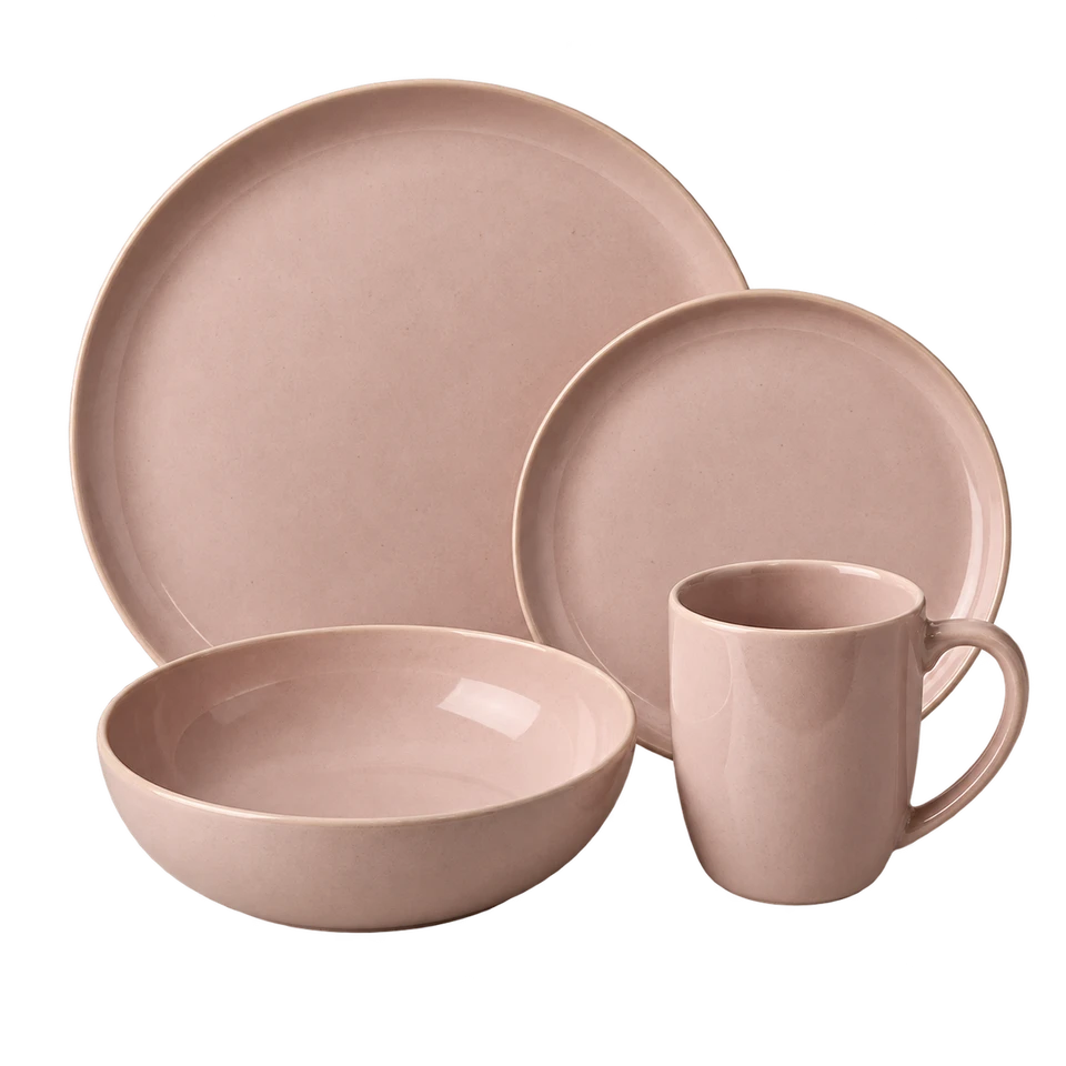 Set of 4
Soft edges, durable glaze, and a calm place at the table.
$88.00per set
The same finish, quantity, and price stay visible before the next step.
Interactive concept — no payment will be taken.
Your finish, quantity, and total stay together.
This is a prototype confirmation. No order was placed.
Choose a finish, then add the set to your cart.
Motion keeps the product, selection, and review states in one continuous thread.
Recorded from this 2026 exploration · no real order or payment.


