Hollywood Bowl concert campaign

A poster language built to travel
A self-directed 2020 promotional concept for a hypothetical Kenji Sawada concert at the Hollywood Bowl. I translated Japanese poster references into a high-contrast system of layered type, monochrome imagery, and repeatable venue cues.
- Role
- Graphic Designer
- Timeline
- 2020
- Collaboration
- Independently developed the visual direction, poster designs, and concept applications.
- Status
- Self-directed campaign concept completed in 2020.
- Art direction
- Typography
- Poster layout
- Concept applications
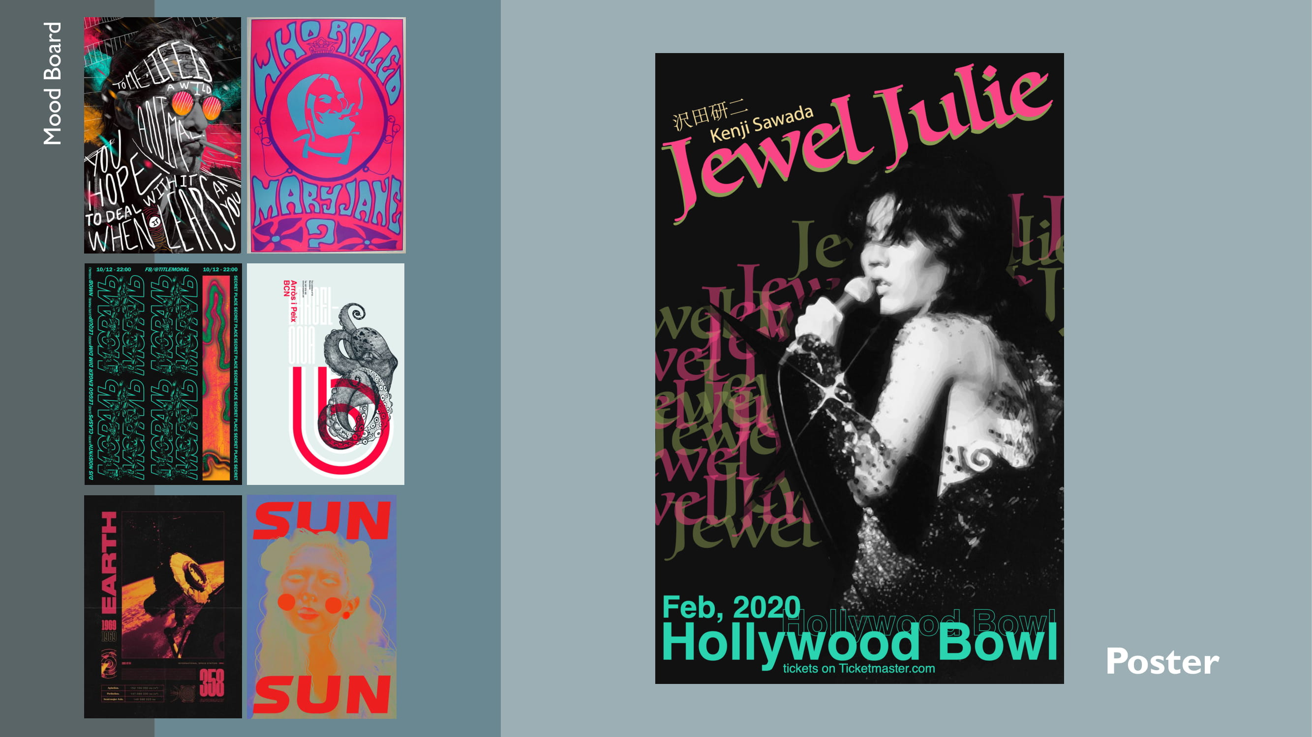
A reference board sets the visual tension
This self-directed promotional concept imagines a Hollywood Bowl appearance for Japanese performer Kenji Sawada. The work translates mid-century Japanese poster references into a controlled visual language: a monochrome performance image, black as the primary field, hot pink and olive for expressive type, and teal for venue information and structural lines. Across the board, the portrait crop and repeated letterforms establish tension between a human subject and hard geometric fields. The final direction keeps that tension while reducing each element to a role that can recur across formats.
Typography separates atmosphere from event details
The expressive title and repeated fragments create rhythm around the portrait, while the date, venue, and supporting information stay grouped in a quieter block. On the poster, the large serif title overlaps the portrait while a separate teal information block sits below it. In the bus-stop image, the same arrangement reads as a compact graphic field framed by the shelter and surrounding signage.

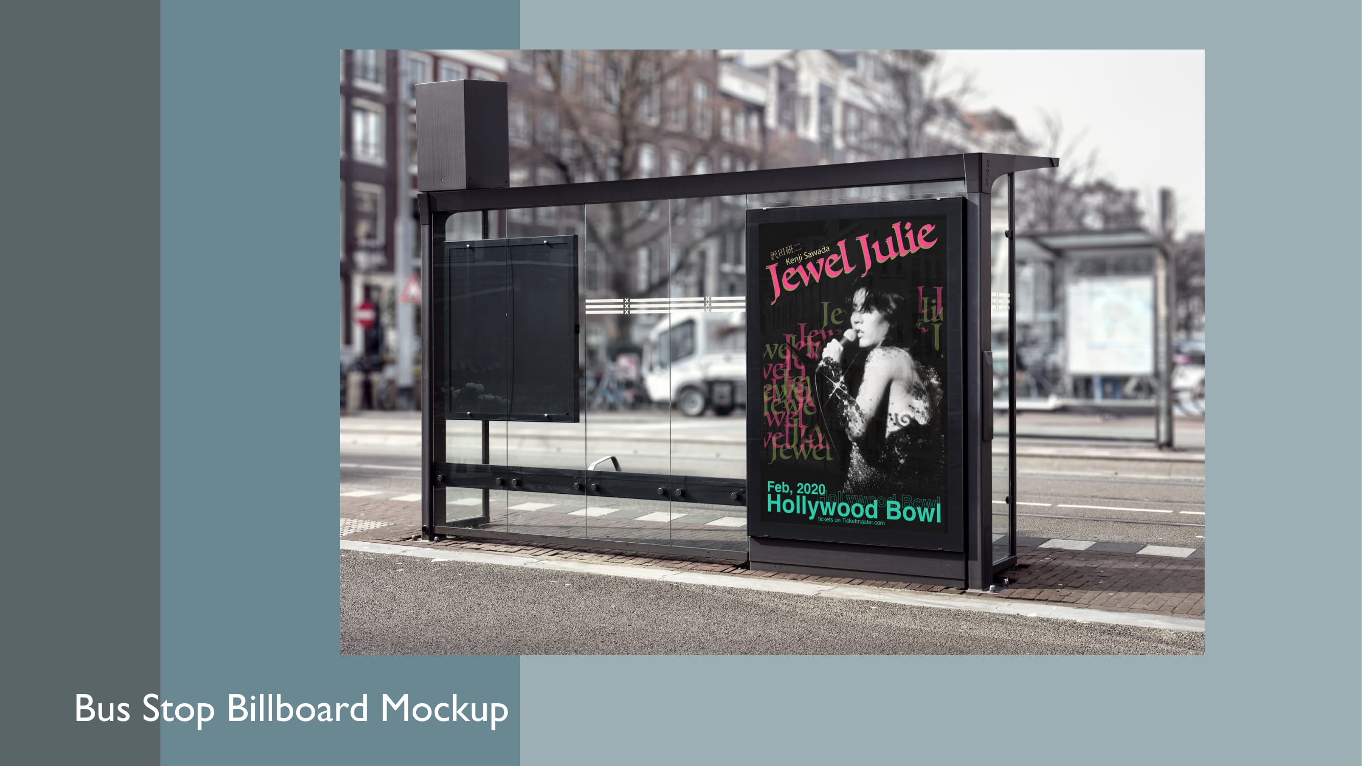
Recognition anchors adapt across formats
The applications change density rather than simply repeating one poster. Paired street banners divide the system into complementary title-led and portrait-led roles; the hoodie reduces the front to a compact lockup and reserves a simpler venue mark for the back; the record sleeve returns to a denser composition for close viewing. Each application carries a different amount of information, so the system shifts between an image-led gesture and a more complete composition without adding new visual ingredients. Black, the three accent colors, the serif title, and the cropped portrait remain the recognition anchors.


Promotional concept
All applications are concept mockups for a hypothetical concert.


