Skip to case study

Numi Tea Rebrand

Client / context
Brand Concept
Timeline
2020
Role
Graphic Designer
Status
Concept
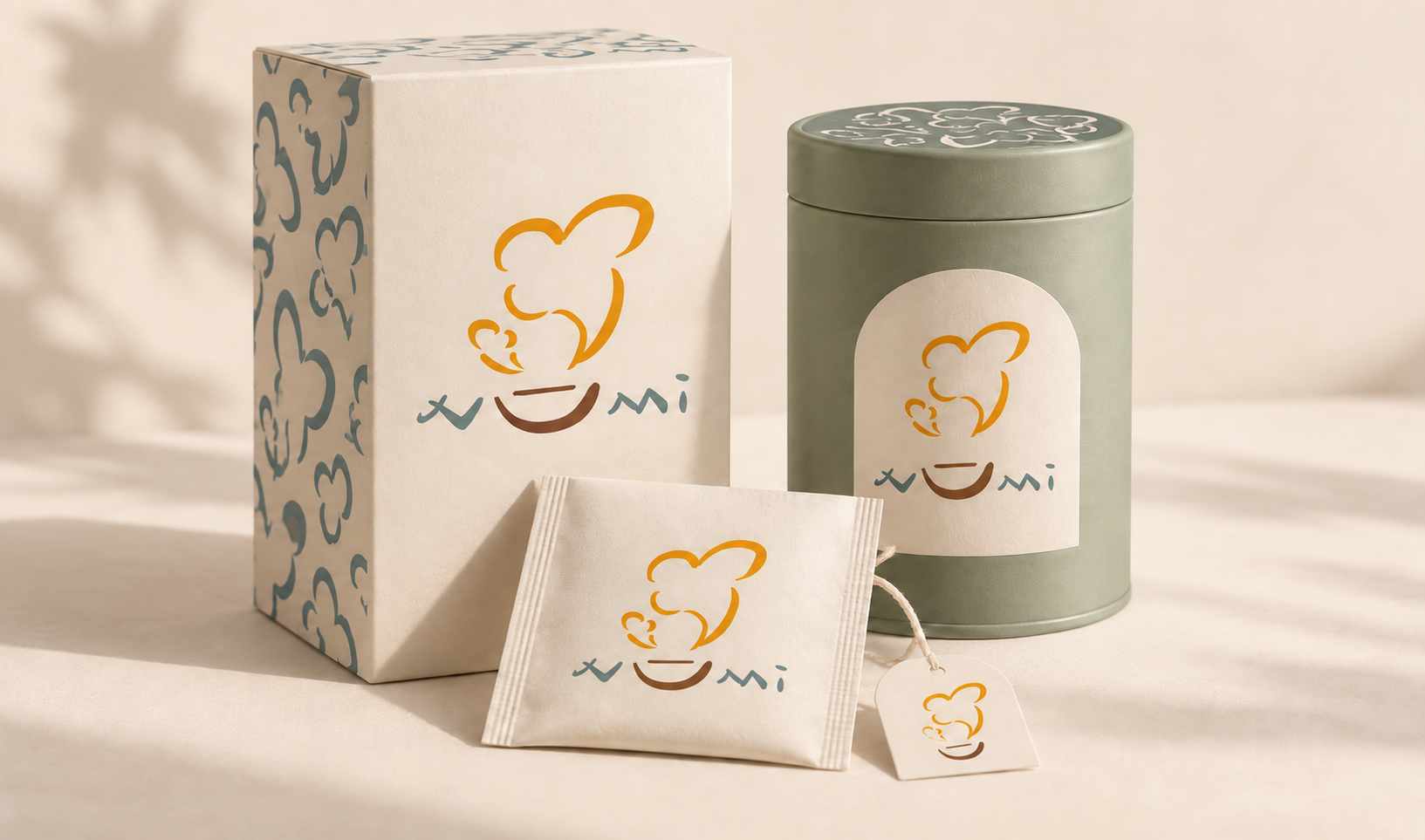
Numi Tea packaging visualization with the concept identity applied across a carton, canister, and sachet

Brand review + application extensions

At a glance

A hand-drawn tea identity, expressed through warm color, patterns, and packaging.

Scope
Creative brief, logo exploration, illustration, packaging, and brand applications.
Concept
Self-initiated concept; not commissioned by or affiliated with Numi Organic Tea.

01 Numi case study

Read the brand before redrawing it

Numi already carries a clear point of view: the Oakland tea company was founded in 1999 by siblings Ahmed Rahim and Reem Hassani, with a childhood Baghdad story about dried-lime tea at its centre.

On numitea.com, a white serif NUMI sits inside a charcoal rough-edged block while botanical artwork and colour-coded packs do the shelf work. Reem's paintings, inspired by Ahmed's photography, give the system a human starting point. This study treats that identity as the baseline and asks how a hand-drawn mark might carry the same warmth across more touchpoints.

Original identity study · 2020. Brand review and application extensions · 2026. The current website is a 2026 review reference, not a claim about the original 2020 context.
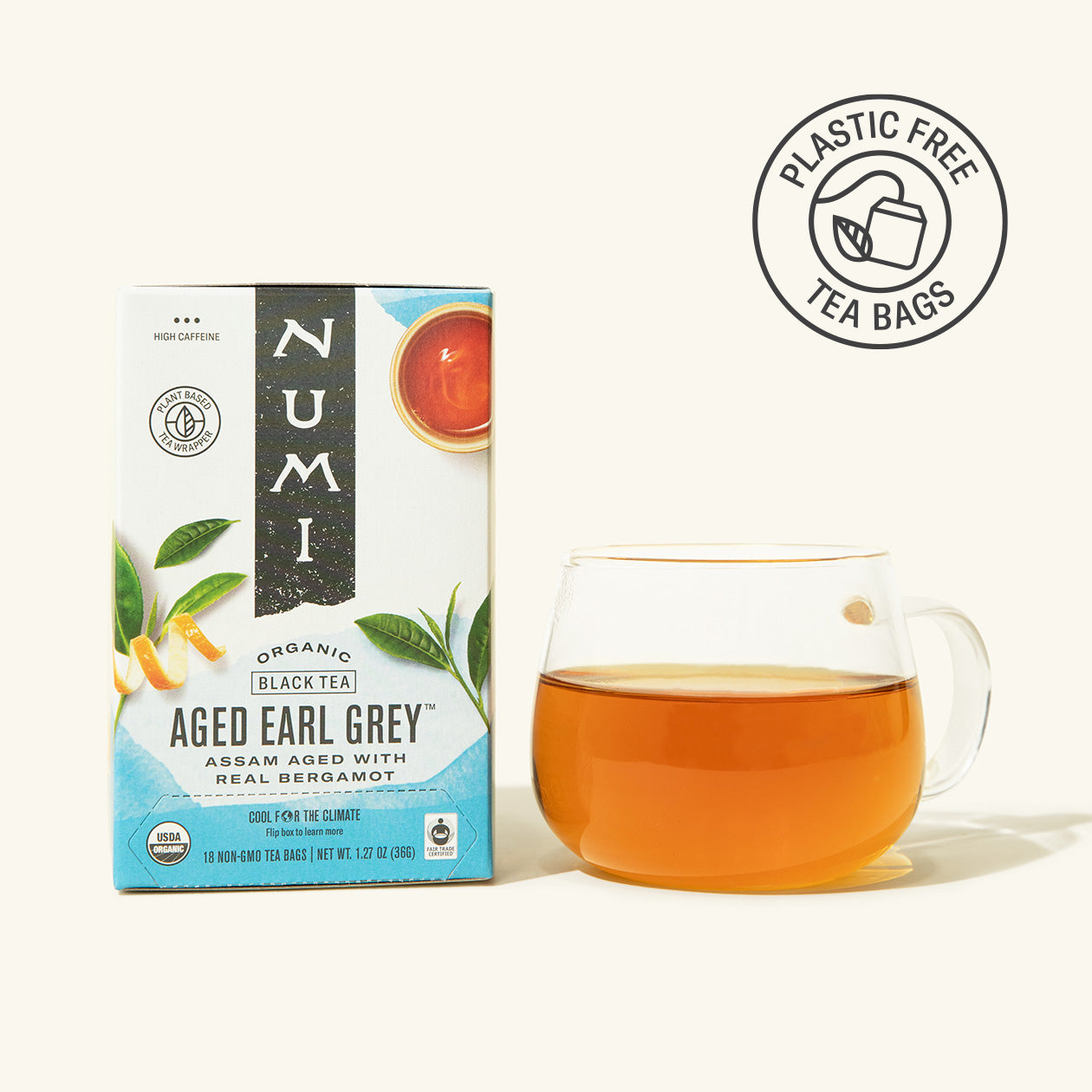
Current Numi Aged Earl Grey packaging and cup reference from the official product page
Current Numi packaging, reviewed 2026; © Numi. Reference image from numitea.com, not a 2020 before state.
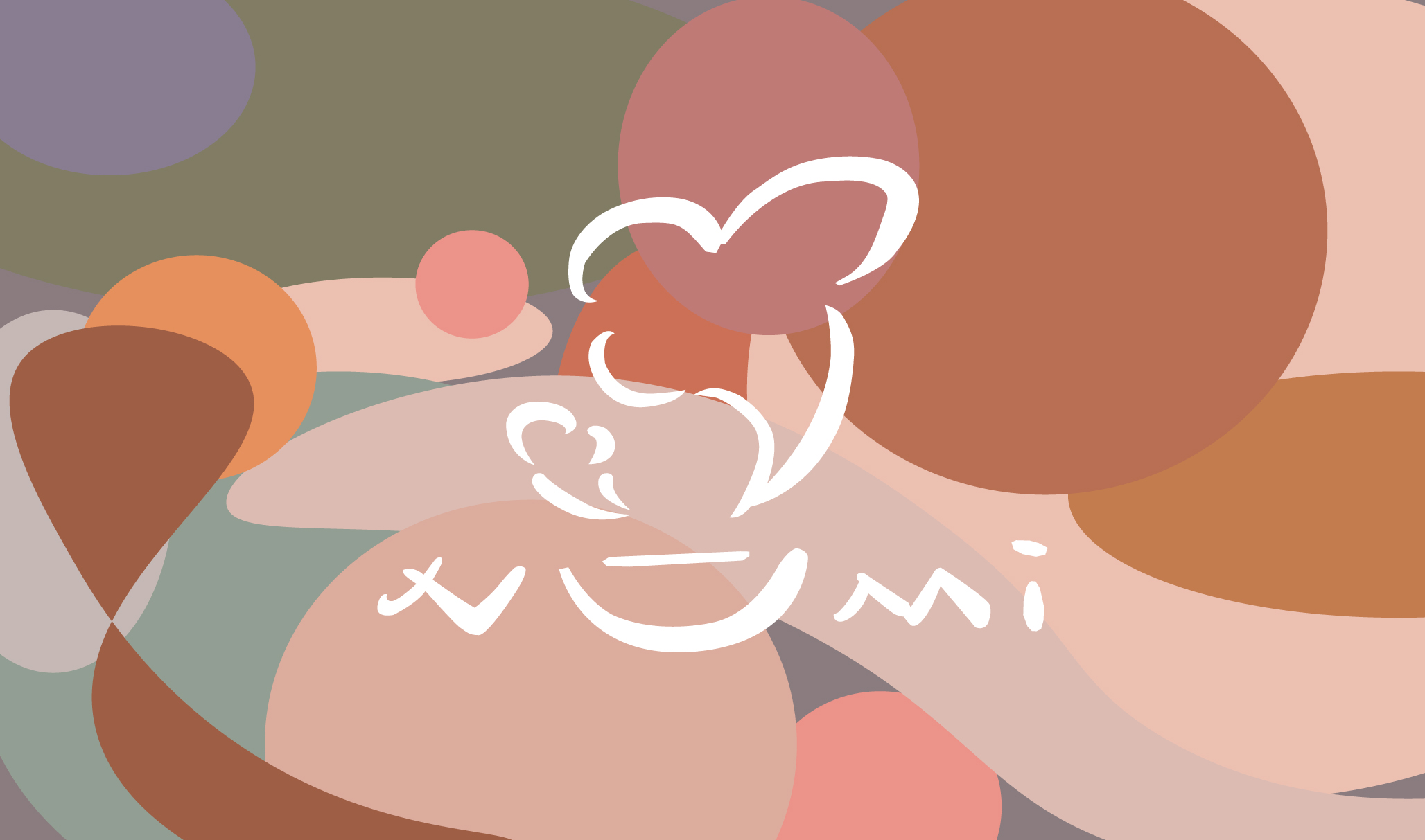
Numi selected illustrated wordmark and color system
The selected mark combines the tea illustration, custom wordmark, and color system.

02 Numi case study

Define the experience around four small tasks

The concept is framed as a sequence: Notice the pack, Choose a blend, Brew with confidence, then Return to a ritual worth repeating. Each task gives the identity a job instead of asking decoration to carry the whole story.

That sequence sets a simple hierarchy: brand first; blend, type, taste, and caffeine second; brew and disposal guidance third. Numi's current site already provides product information such as flavour, caffeine, bag count, and brew time. The concept creates one visual rhythm for those details across the shelf, gift table, and screen.

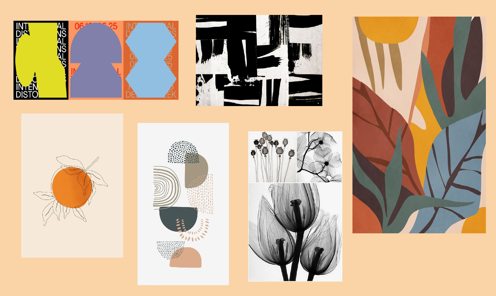
Numi visual reference board
A reference board used to explore mood, shape, and color; the collected references are inspiration, not finished identity work.
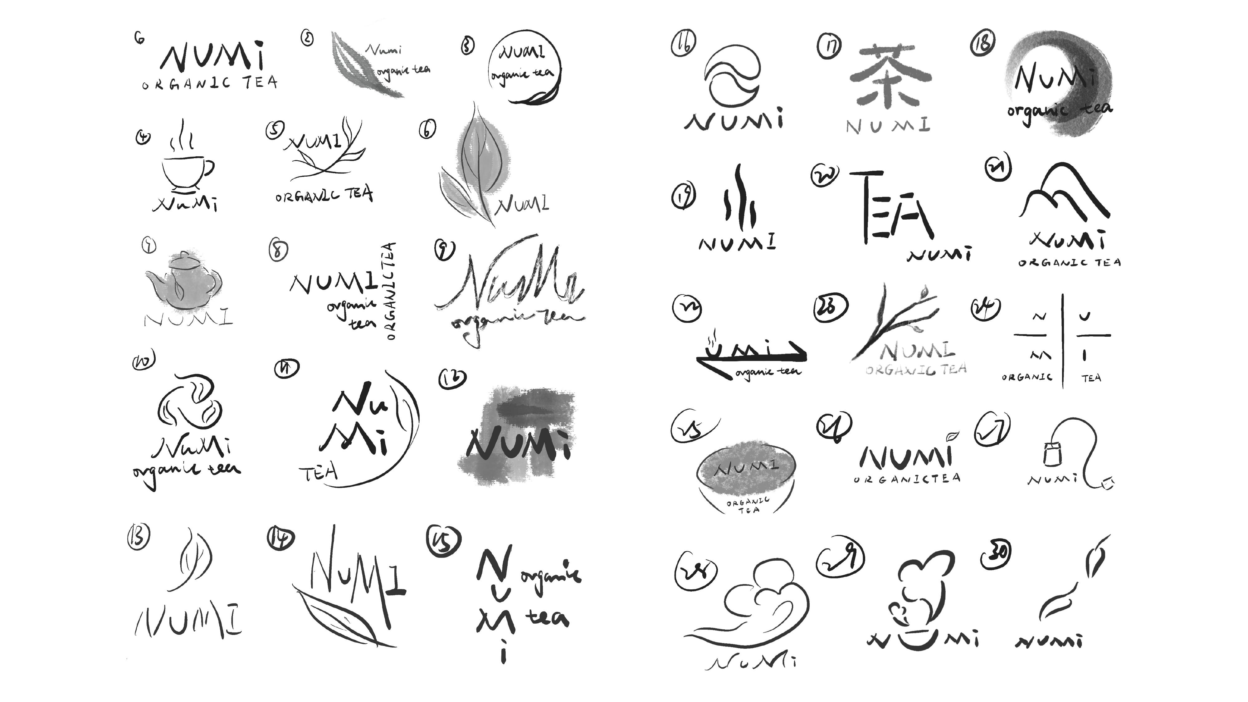
Hand-drawn Numi logo explorations
Sketches explore lettering, steam, leaves, and tea-inspired forms.

03 Numi case study

Explore three directions before choosing one

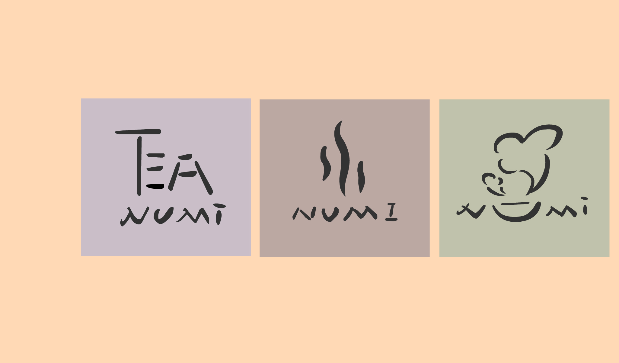
The left route turns TEA into typography: direct, compact, and easy to recognise. The centre route reduces the signal to three steam lines: softer and more atmospheric, but dependent on the line staying legible at a small size. The right route combines a cup with a cloud-like steam shape: a recognisable silhouette with enough motion to feel alive.

The cup-and-steam route is the selected direction because it bridges illustrated warmth and a compact mark while leaving the wordmark room to breathe. Replacing the familiar charcoal NUMI block with an abstract cup-and-steam mark could also cost existing-customer recognition. That is a design judgement, not a test result: small-size reading and the tradeoff between distinctiveness and instant brand recall still need validation.

Three Numi Tea logo concept directions
Three directions explore tea illustration, steam lines, and typographic forms.

04 Numi case study

Build a system that keeps the hand in hand-drawn

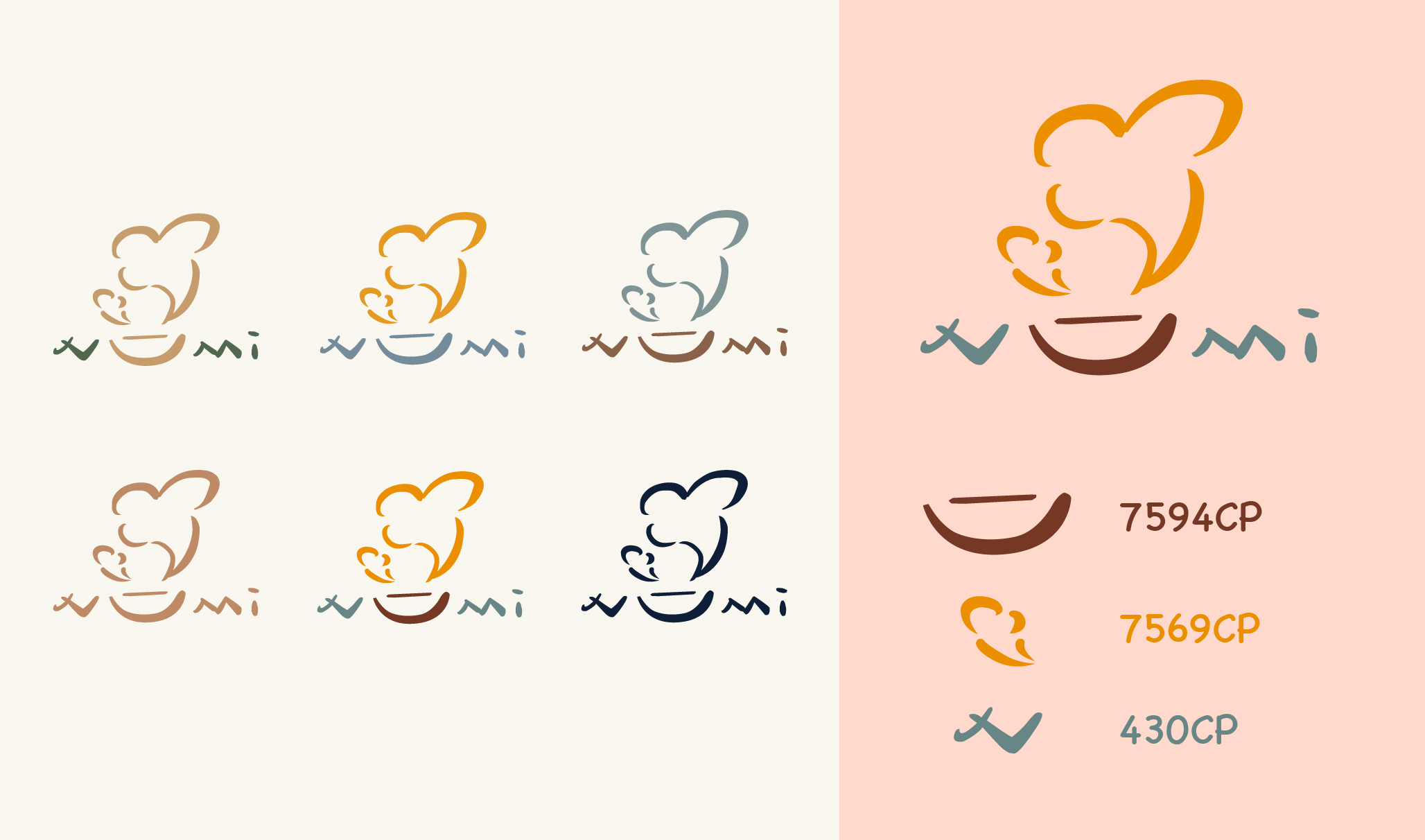
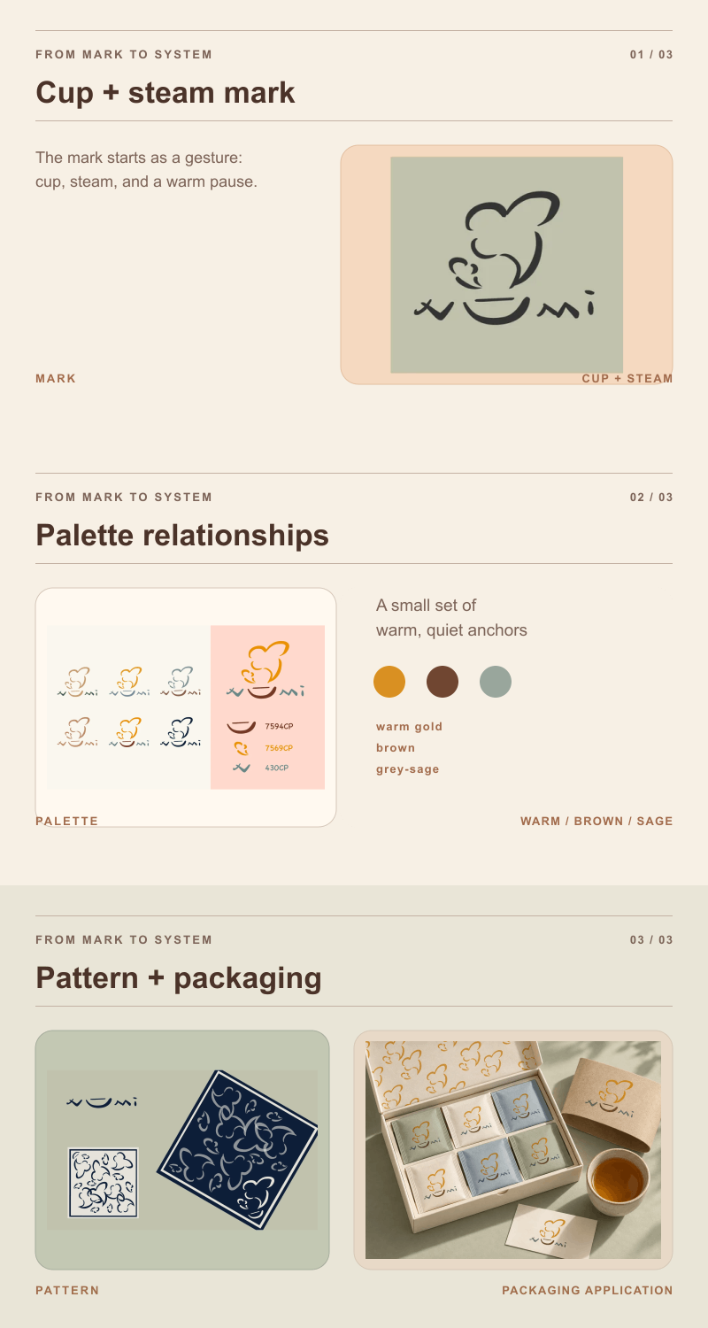
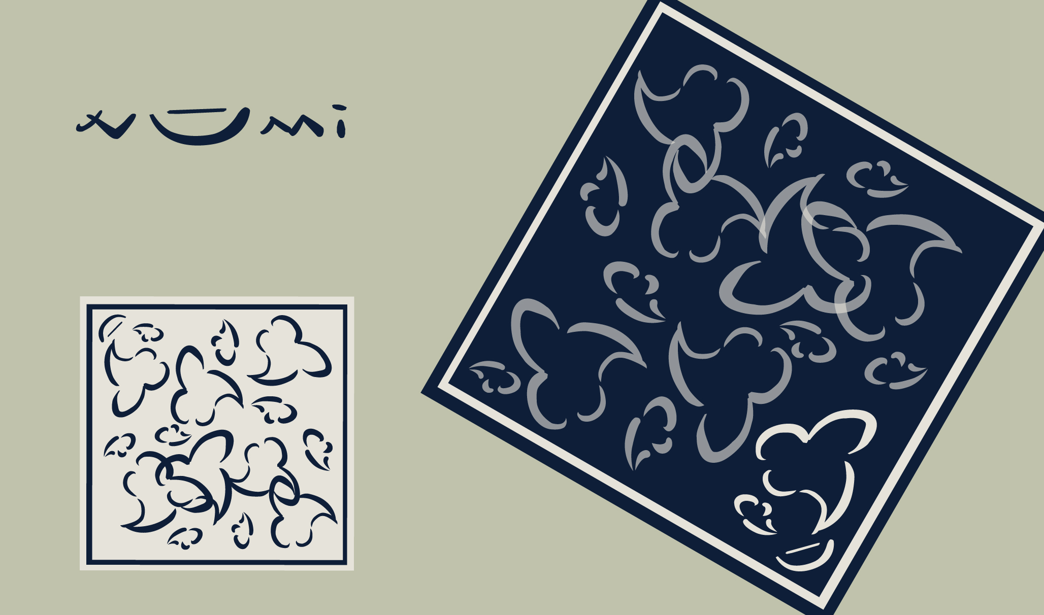
The selected mark becomes an anchor, not a stamp. The original studies establish a restrained tea colour range; the 2026 extension proposes pairing colour with explicit blend labels, with shape and type doing a second coding job so colour never carries meaning alone. Repeating illustrations turn the mark into a pattern without flattening its artisanal character.

The Pure Tea page already describes organic ingredients, real fruit, flowers, spices, and sourcing. This concept gives those product facts a visual container; it does not add medical claims or new sourcing promises.

Numi selected logo and color variations
The selected mark is tested across muted, warm, and dark color combinations.
Numi identity system motion study resolving the cup mark, palette, and pattern
Identity system, in motion The cup mark resolves into colour and pattern so the system reads as a set of relationships.

05 Numi case study

Apply it at hand, from shelf to ritual

The packaging direction proposes three layers: Brand; blend, type, taste, and caffeine; then brew and disposal. Together they can support a quick choice while leaving room for illustration, pattern, and the quiet pause of a gift moment.

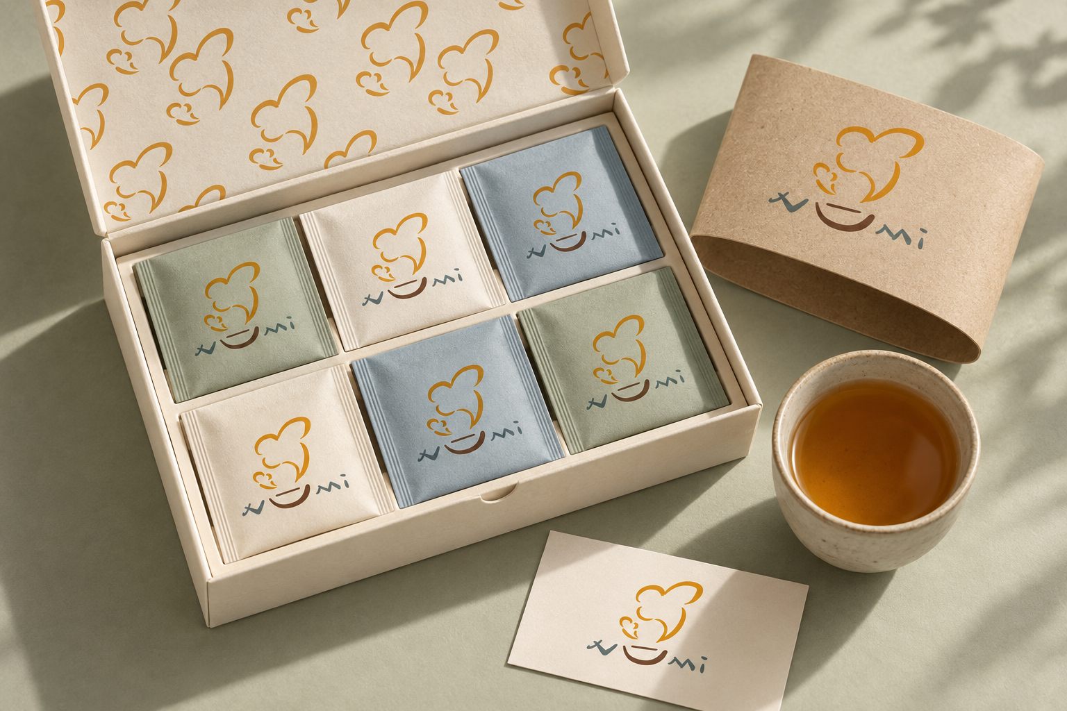
Posters, tags, patterns, packaging, and the gift visual extend the same identity logic across everyday touchpoints. The gift image studies unboxing structure and pattern; it does not yet show blend labels or brew and disposal guidance. Production validation would cover print contrast, packaging structure, and disposal labeling, with Numi's plant-based wrapper information treated as a constraint to verify.

Numi concept gift and tea ritual application using the selected identity
Concept extension: the unboxing structure and pattern are explored here; blend labels, brew guidance, and disposal guidance remain to be added.
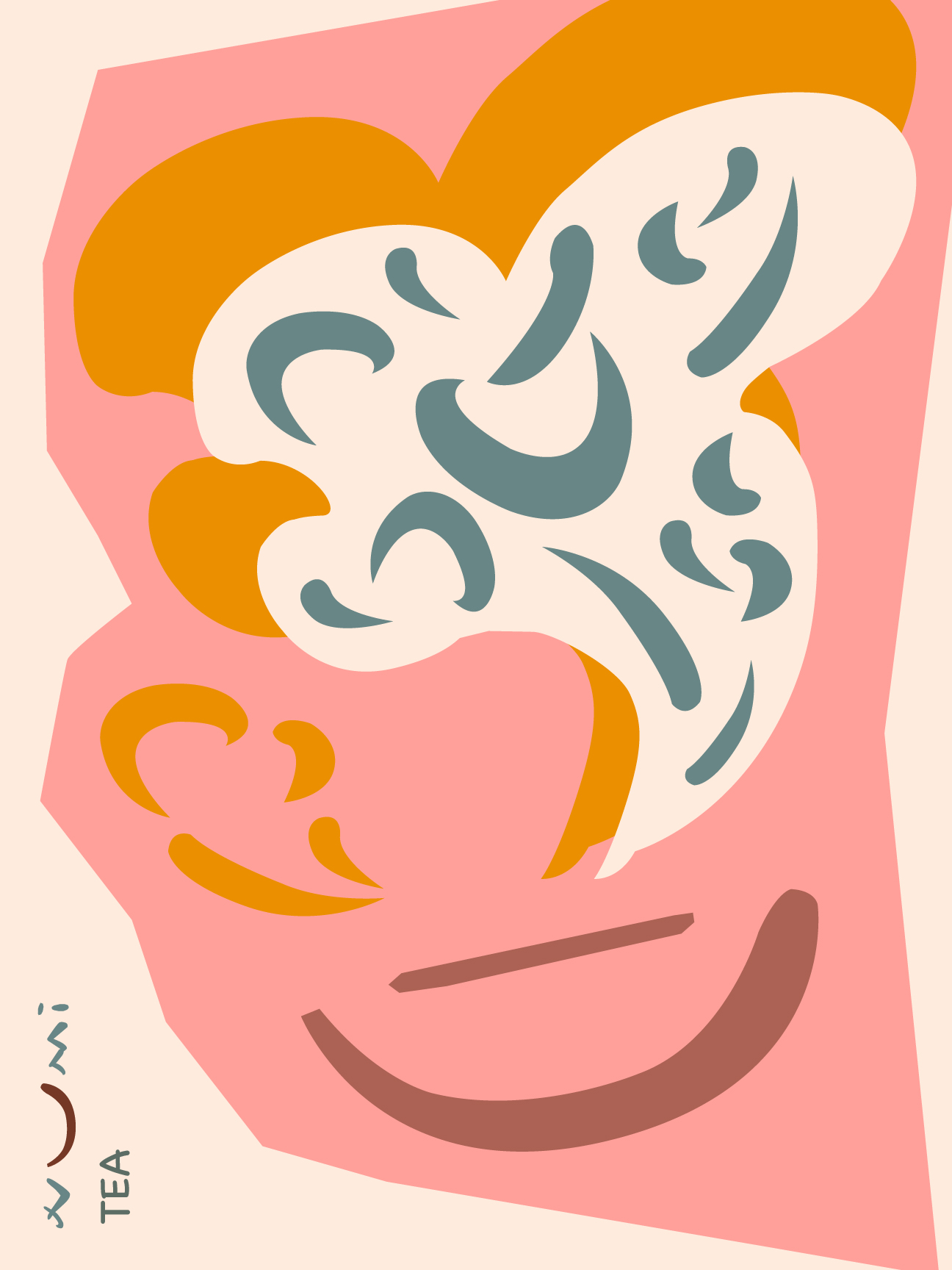
Numi illustrated tea poster
The tea illustration expands into a vertical poster composition.
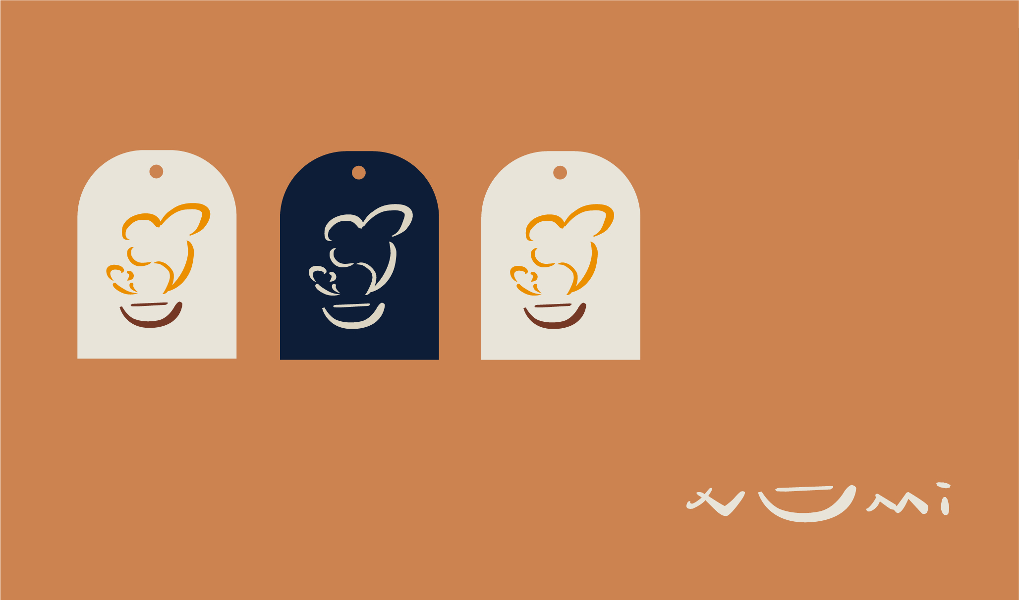
Numi Tea logo applied to three concept tea tags
Light and dark tag variations test the mark at a compact packaging scale.
Numi repeating illustration and graphic applications
Repeated tea forms extend the illustration into a graphic pattern.
Numi concept packaging and stationery applications
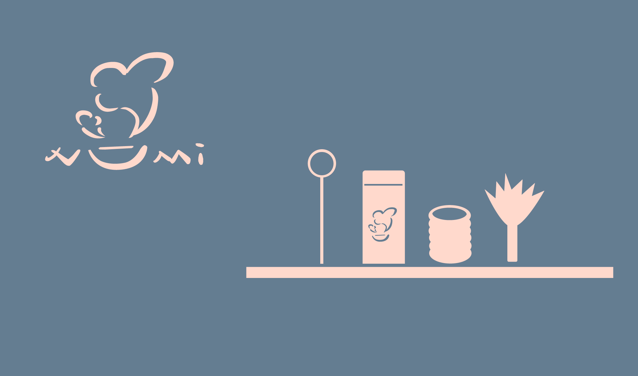
The mark and palette are explored across a coordinated group of concept objects.

06 Numi case study

Carry the same logic to screen

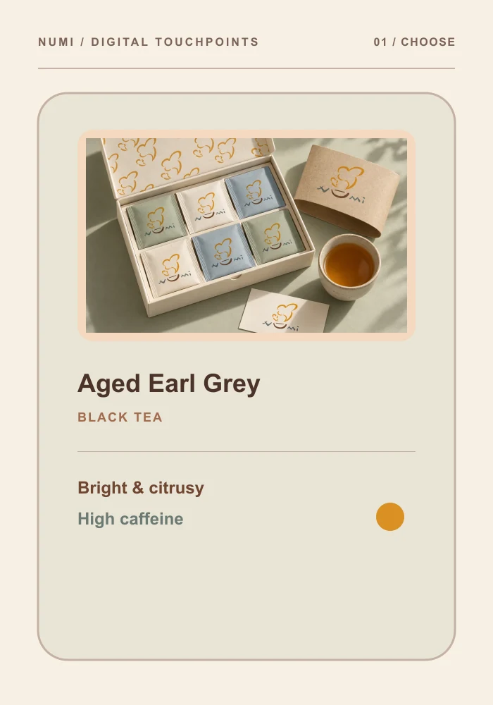
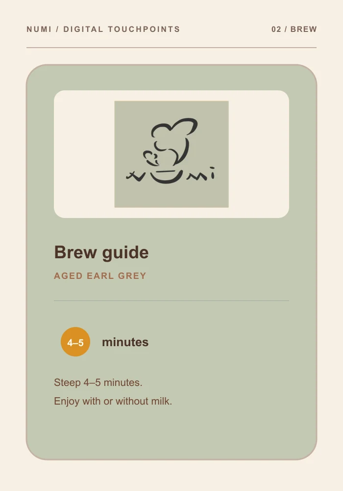
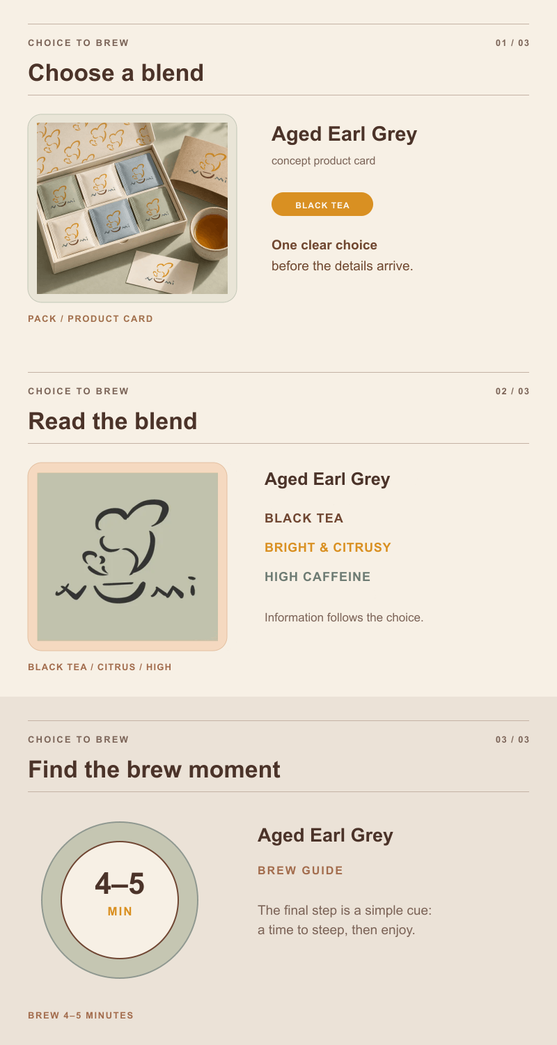
The mobile extension turns product choice into a focused product card and brew guide. It uses the same mark and packaging image, but changes scale and order for thumbs: flavour first, caffeine and taste beside it, brew time close to the action.

This is a concept extension from the identity study, not a shipped Numi screen. The point is continuity: a person should recognise the pack language before learning a new interface language.

Concept extension · mobile product card and brew guide. No live product flow or interaction data is claimed.

Numi mobile product card concept for choosing a tea blend
Concept extension: the product card leads with the selected blend while keeping the mark and packaging image familiar.
Numi mobile brew guide concept showing taste, caffeine, and brew time
Concept extension: the brew guide keeps taste, caffeine, and brew time close to the next action.

07 Numi case study

See it in motion: recognition to brew

Motion connects three moments that static panels keep apart: recognising the pack, reading taste and caffeine, then finding brew time. The choice-to-brew study follows one blend through that sequence, making movement an information bridge rather than a decorative loop.

The identity-system study uses the same principle for the mark: cup and steam resolve into palette and pattern, then settle before the next choice. Both are concept extensions; a useful result would be a viewer explaining what changed and which tea detail comes next.

Numi choice-to-brew motion study moving from tea selection to brew guidance
Choice to brew, in motion The information order moves from choosing a blend to seeing the brew instruction that follows.

08 Numi case study

What to test next

The next pass should turn these hypotheses into observable tasks. The Aged Earl Grey page gives a concrete data set: Bright & Citrusy, High caffeine, 18 bags, and a 4–5 minute brew.

The success criteria are behavioural and specific. No user-testing or commercial results are claimed for this self-initiated concept.

  • Recognise the cup-and-steam mark at pack and favicon sizes.
  • Select Aged Earl Grey from the colour-plus-label system without relying on colour vision.
  • Explain the caffeine level and locate the 4–5 minute brew time.
  • Record where people misread the sequence from pack to brew.

Validation plan only · success criteria describe future observation, not measured outcomes.

Product Design
UX/UI Design
Visual Design
Product Design
UX/UI Design
Visual Design