client
YEAR
PARTICIPANT
services
Illustration, Wireframe, Mockup, Visual Design
Artcenter APP
Artcenter is a mobile application dedicated to facilitating the sharing of artwork, collecting art materials, and posting art inspiration. This UI/UX design project encompasses comprehensive user workflow and wireframe design, aiming to create an intuitive and engaging experience for users interacting with the platform.
User Story
Artcenter caters to two distinct user groups. The first group consists of individuals such as artists, freelancers, and job seekers who aim to showcase their artwork to a wider audience, receive feedback, and potentially offer tutorials to demonstrate their skills. The second group comprises users seeking inspiration, information, and tutorials to enhance their artistic abilities or explore different art styles.
As for the platform itself, Artcenter endeavors to serve as a vibrant hub for communication and sharing within the art community. It also seeks to attract sponsors and advertisers, necessitating dedicated space for advertisements. Furthermore, the platform aims to highlight trending topics and foster artistic trends to engage users and promote creativity.
Functional Map
The app will be designed based on two types of users. There are some main functions:
- Account or visitor model.
- Users can enter the app with or without an account.
- Account holders can perform actions such as collecting, liking, commenting, and uploading images or videos.
- Access to the account center, messaging, and friend system is available for users with accounts.
- Users without accounts can still browse the app and search for information. - Follow and message.
- Users can follow other users they admire.
- Followed users can engage in private messaging.
- Sharing of various content types between users is facilitated. - Collect, like, and comment.
- Users can collect content they enjoy into their personal collections.
- Liking posts and leaving comments under them is enabled for user interaction. - Uploading.
- Users can publish a variety of content types including images, videos, articles, and links to their account for sharing with others.
Flowchart
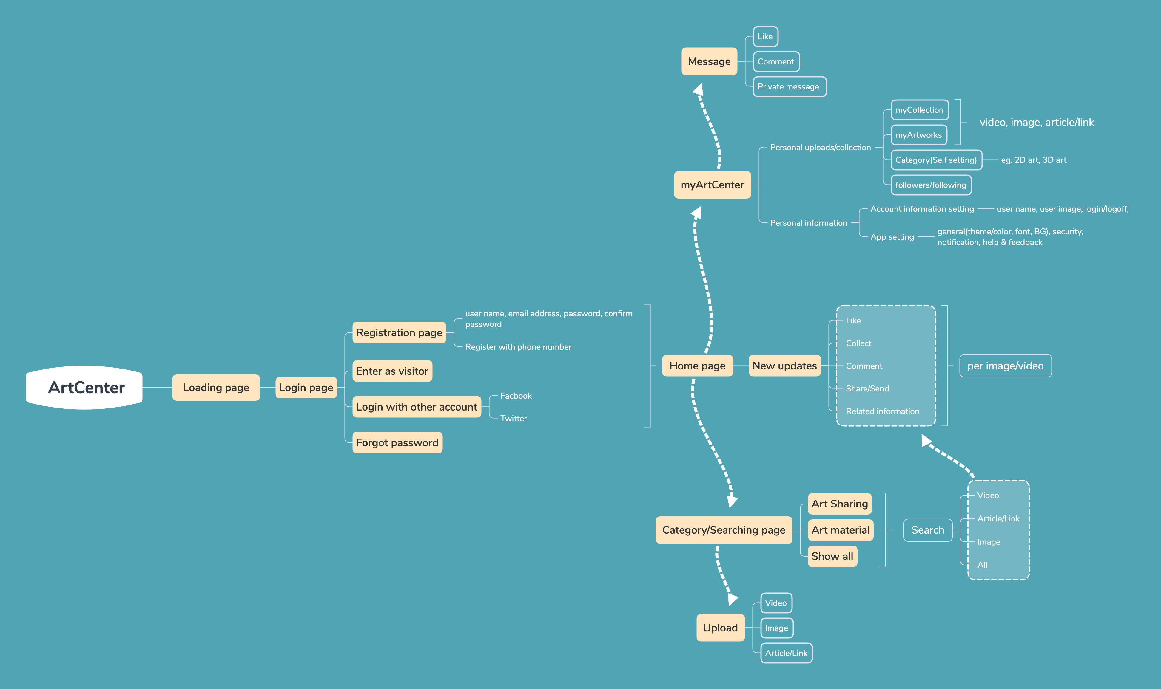
Upon entering the app, users will first encounter an onboarding page followed by a login screen where they can choose to sign in, register a new account, or proceed as a visitor. Subsequently, users will be directed to the home page where they can explore the latest updates and view post details. Within the post details page, users can interact by collecting, liking, and commenting on posts, while also discovering related content.
Navigating to the Artcenter page, users will find their personal collections and artworks, with the option to organize them into categories. Additionally, users can view their followers and the profiles they are following. The upload page allows users to share videos, images, or articles/links.
Furthermore, the app includes a dedicated notification and messaging section where users can check notifications and engage in conversations with other users.
Wireframe
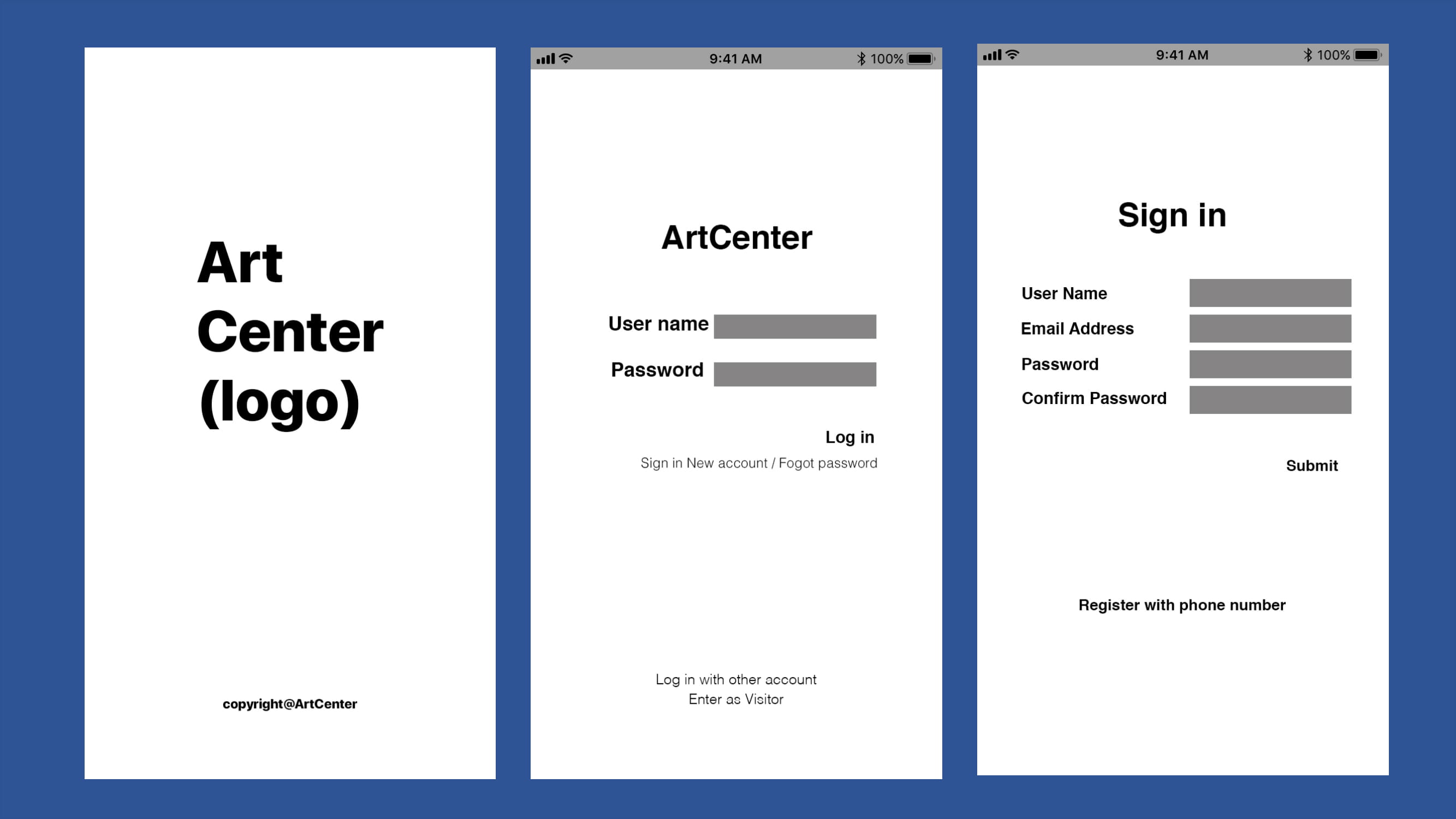
Onboarding page: The onboarding page will display for 3 seconds before smoothly transitioning to the login page. During this transition, the logo will appear with a captivating animation, adding to the user experience.
Log in page: On the login page, users can input their username and password. Clicking on the input fields will activate the cursor, enhancing user interaction. For password entry, users have the option to reveal or conceal their password by toggling an eye icon within the input field. Upon completion, users can click the log-in button, which will dynamically change color to indicate interaction. Additionally, hovering the cursor over options such as "Sign in new account," "Forgot password," "Log in with other accounts," and "Enter as visitor" will cause an underline to appear. Clicking on any of these options will transition the user to the next page, with the option text changing color to provide visual feedback.
Sign-in page: On the sign-in page, users can click on each input field to activate the cursor for input. Upon completing the required information, users can proceed to the next page by clicking the submit button, which will undergo a color change to indicate interaction. Users can also explore other registration options by clicking on "Register with phone number," triggering an animation where an underline appears and the color of the option changes, providing a visual cue for user interaction.
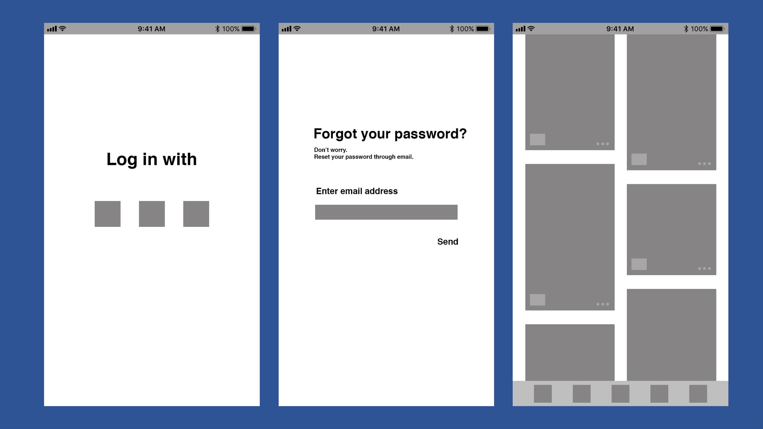
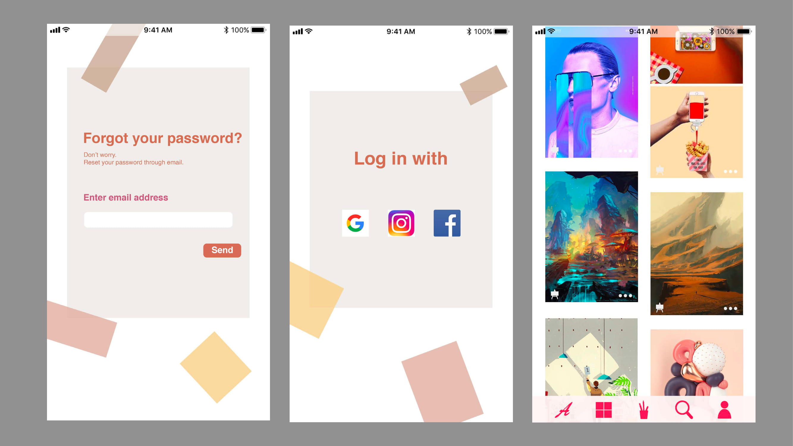
Log in with other accounts: Upon clicking the "Log in with other accounts" option, users will be redirected to the sign-in page of the respective social software platform, allowing them to log in with their credentials. After successfully logging in, users will be automatically directed back to the Artcenter app.
Forgot password: users will activate the cursor by clicking on the input space. By clicking on the "Send" button, users will trigger the sending of a verification code to their email address, with the button changing color to indicate interaction. Subsequently, users will receive the verification code in their email inbox. On the next page, users will enter the verification code to proceed with changing their password.
Home page: users can click on images to access post details and navigate to different pages by clicking on various symbols. Clicking on the three dots button will reveal a menu of options, allowing users to select their desired action with a subsequent click. In the lower-left corner, the collect button will be located. Upon clicking it, users will receive a brief notification confirming successful collection for one second, and the post will be added to their collection.
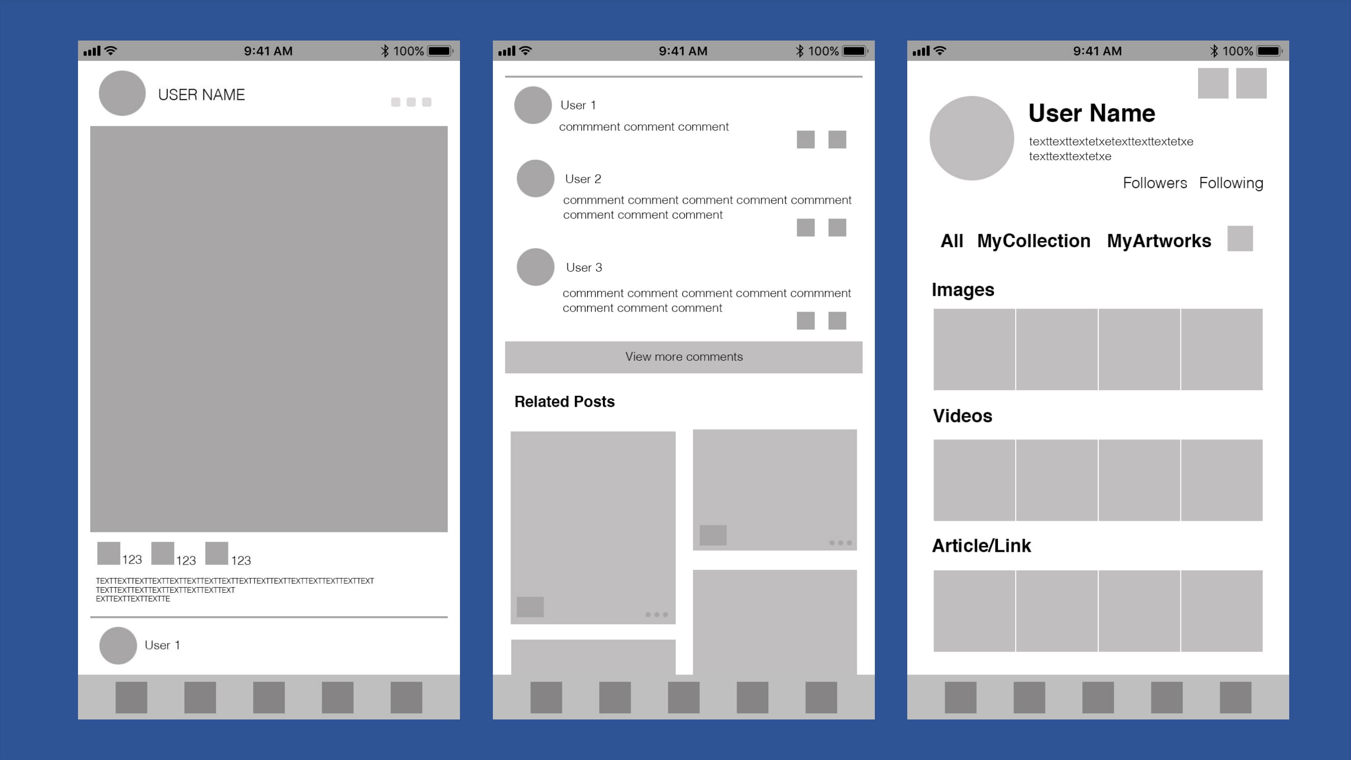
Post details: In the post details section, clicking on the profile photo or username will navigate users to the respective user's Artcenter profile, where they can view all posts and profile information. Additionally, clicking on the image or video within the post will display the original size media or redirect users to the full article content.
Post details 2: In another scenario within post details, clicking on "view more comments" will expand the comment section to reveal additional comments. As users scroll down, more related posts will dynamically populate the page. Users can interact with comments by replying or liking them using the provided symbols adjacent to each comment.
User center(all): Within the user center, all collections and artworks are categorized and displayed. The page also showcases the most recent posts. Users can click on category titles to enter specific category folders or click on individual posts to view their details. Furthermore, clicking on "Followers" or "Following" will redirect users to pages displaying their followers or the profiles they are following.
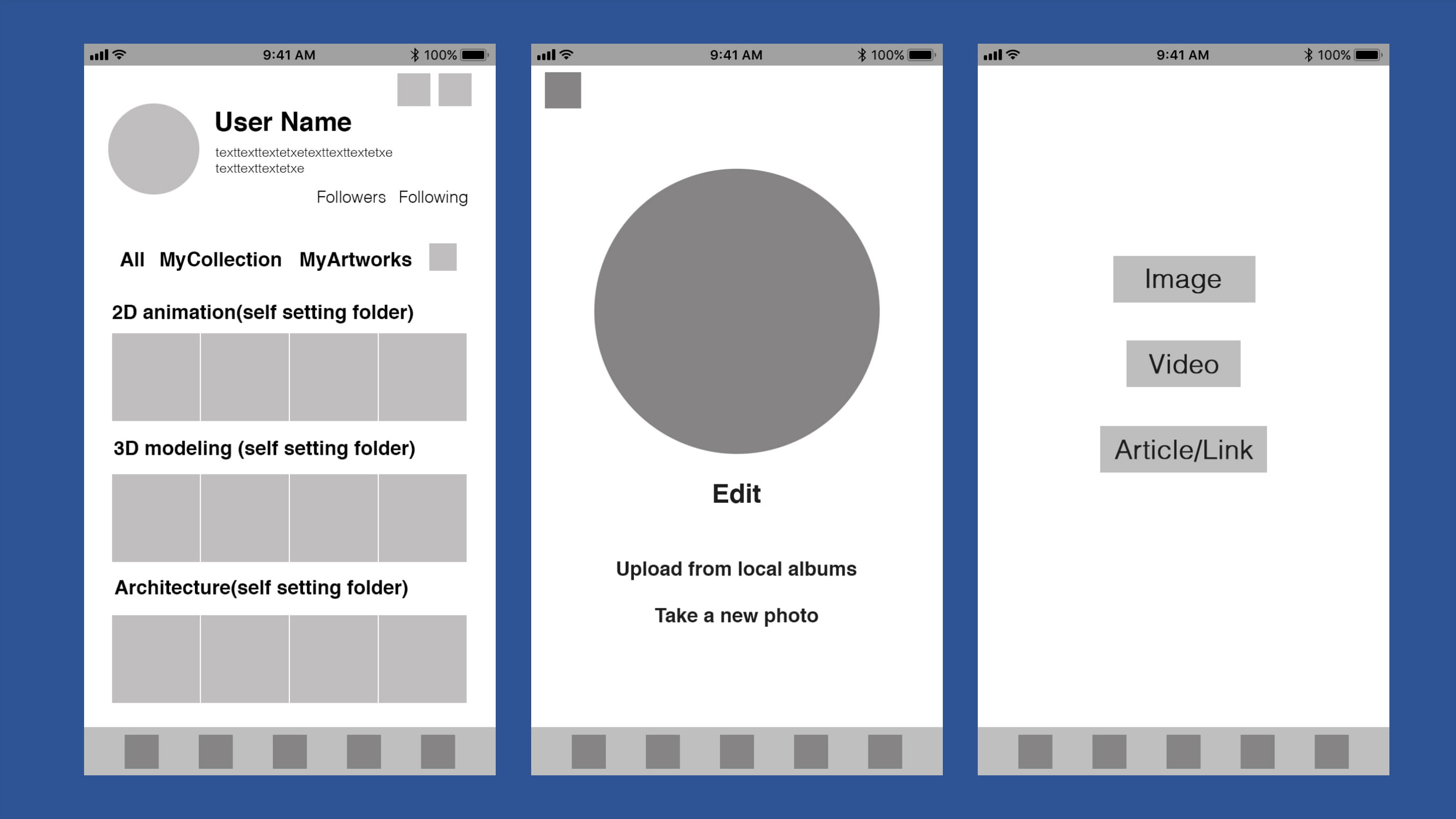
User center page(collection): users can click on their profile photo to access the photo editor, where they can modify or edit their profile picture directly on that page. Additionally, users can add or update their self-introduction by clicking on the text field beneath their user number. This page also provides links to the account settings page and the upload page for convenient access.
Edit profile photo: Within the Edit Profile Photo feature, users are presented with options to upload a photo from their albums or take a new photo using dedicated buttons. When users hover over the text, an underline will appear, and the color will change upon clicking, providing visual feedback. Once a photo is selected, it will be displayed within the designated circular space.
Upload page: users can select different buttons depending on the type of content they wish to upload, with colors changing to indicate interaction upon clicking. This intuitive interface simplifies the process of sharing various types of content within the app.
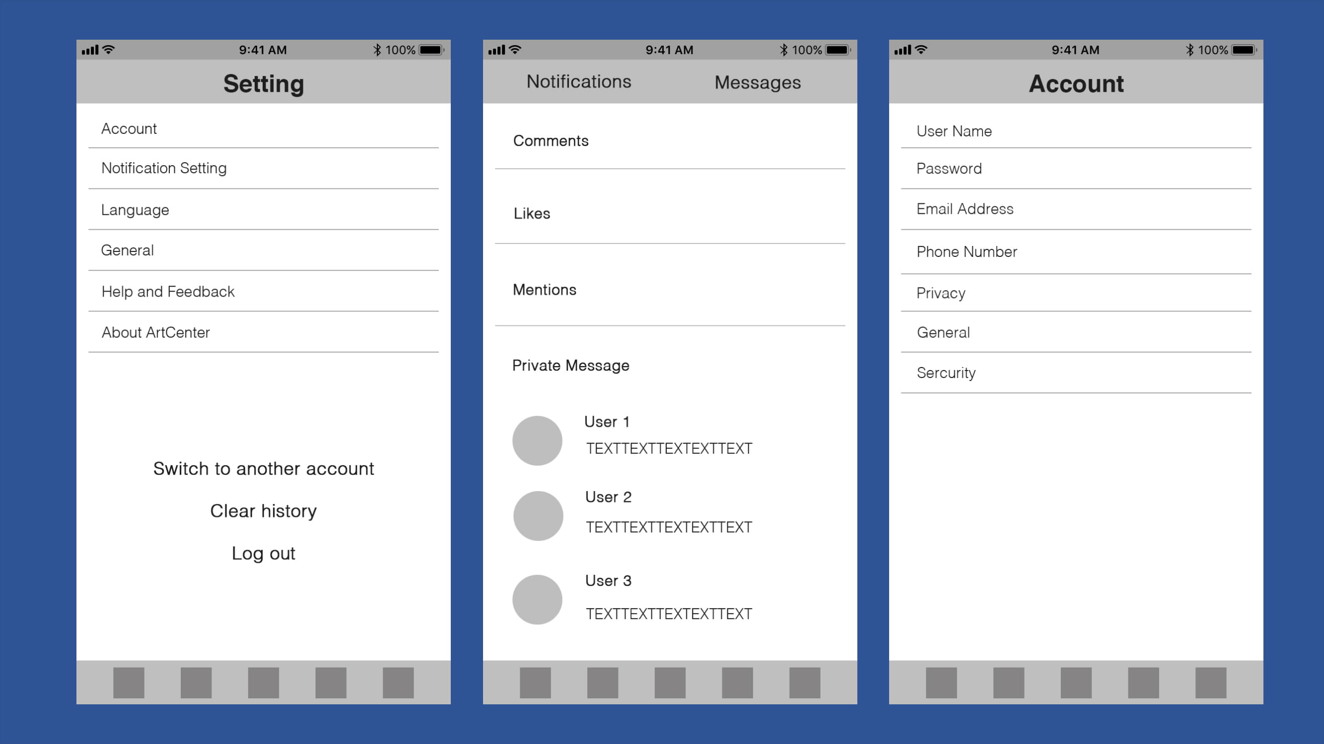
Setting page: users can navigate to different sections by clicking on respective buttons, each leading to a specific page. When users select the "Clear history" or "Log out" buttons, a confirmation notification will prompt them to confirm their action before proceeding.
Messages page: users can toggle between the "Notifications" and "Messages" sections by clicking on the corresponding buttons located at the top of the page. Numeric indicators will display the quantity of new "Comments," "Likes," or "Mentions," allowing users to click on them to view detailed information. Additionally, users can access their private messages and review past chat records by clicking on individual message threads.
Account page: each button corresponds to a different page, facilitating easy navigation to various settings and account management options.
Mockup
I have created mockups based on the wireframe, employing warm colors as the primary palette to evoke a positive and engaging ambiance. Utilizing color blocks reminiscent of colorful paper cuts, the design aims to cultivate an artistic atmosphere, enhancing the user experience with visual appeal and creativity.
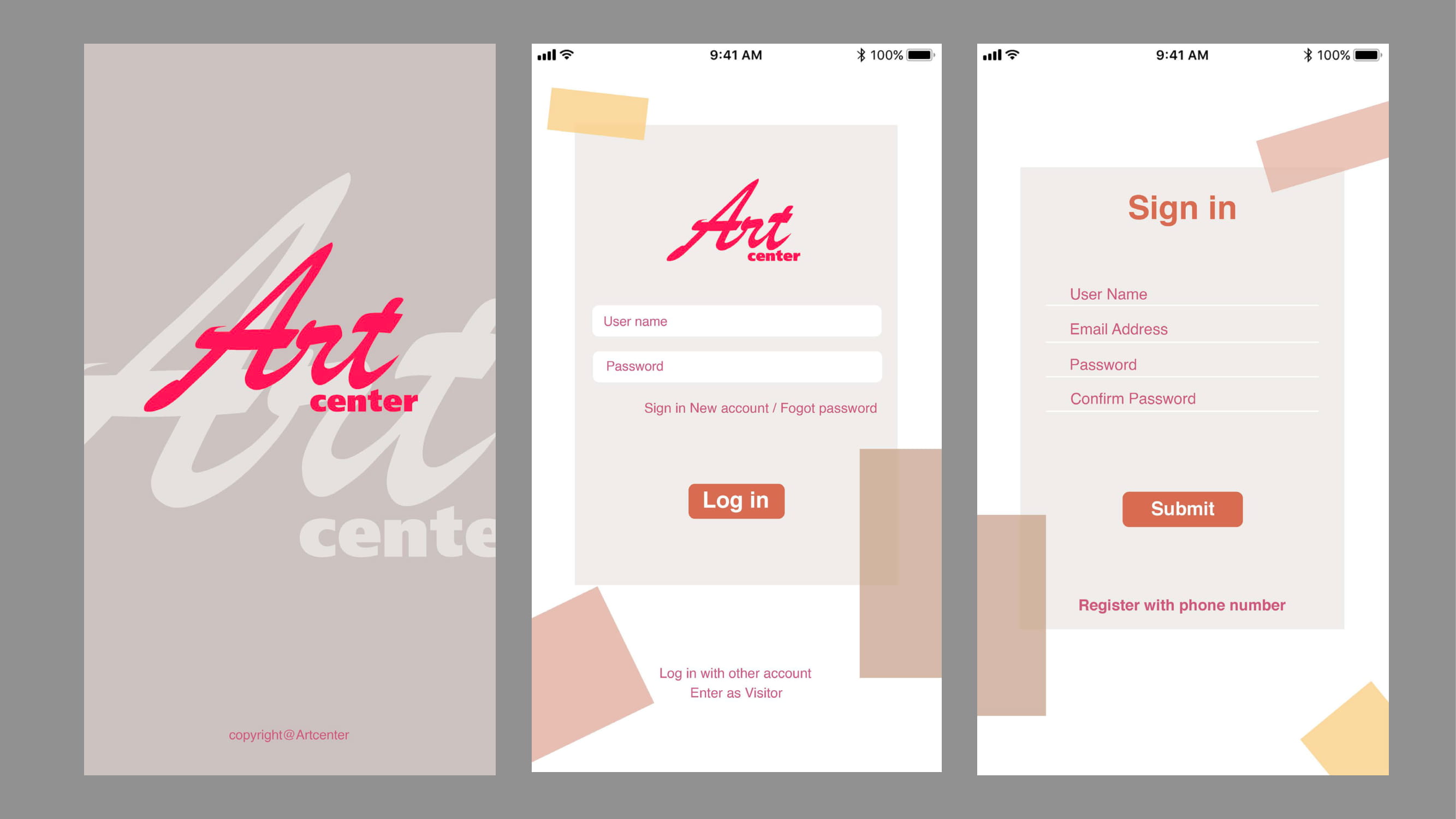
Consistency across multiple pages with slight adjustments fosters a sense of unity throughout the app. Employing colors with low contrast and ample white space enhances clarity and simplicity, while also drawing attention to the content itself. This approach not only ensures a cohesive visual experience but also prioritizes user engagement by emphasizing the content's significance.
Use Water Lilies from Monet as an example, in this post detail, users can see the uploader name and photo on the top part of the screen and the introduction about this post will below the post. A line will separate the main post and comments, another line will separate comments and related posts. The related posts will be posts that have some connection with the original posts.
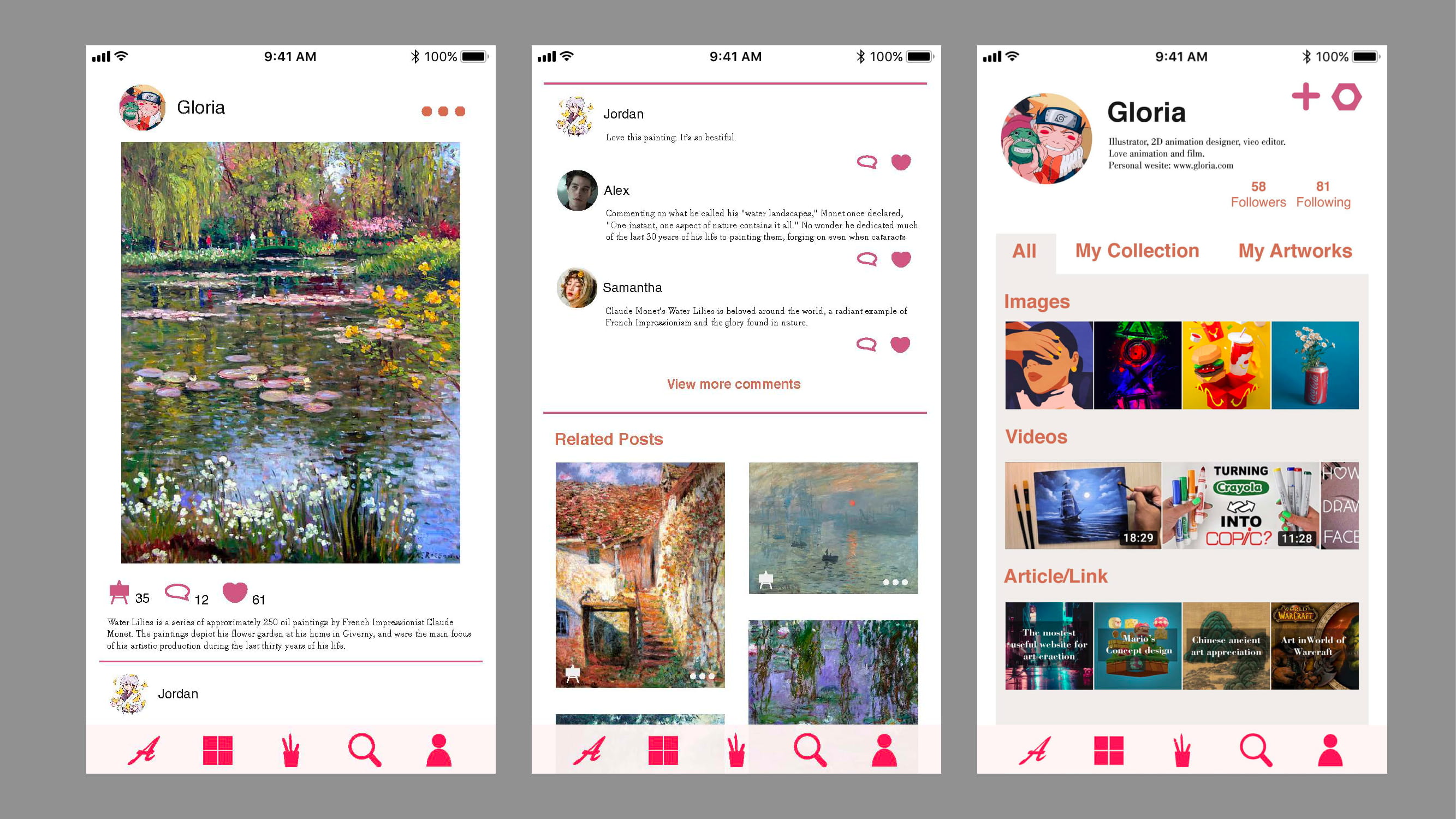
Post Details page:
- In the post detail view, inspired by Monet's Water Lilies, users encounter the uploader's name and photo prominently displayed at the top of the screen. Below, a brief introduction provides context for the post. A horizontal line serves to delineate the main post from subsequent sections.
- Descending below the introduction, users encounter a line marking the boundary between the main post and the comments section. Comments are presented below this line, allowing users to engage with the post and contribute to the conversation.
- Another horizontal line separates the comments section from related posts, which are dynamically generated based on their thematic or contextual connection to the original post. This intuitive design encourages users to explore additional content that complements their interests, fostering a more immersive and enriching user experience.

In the user center, users have the flexibility to organize their collections and artworks by creating custom folders tailored to different types or themes. The bottom bar features five icons that link to the app's main pages, with each icon adopting the same color as the logo to emphasize their importance and create visual cohesion throughout the interface. This design choice enhances user navigation and reinforces the app's branding identity.
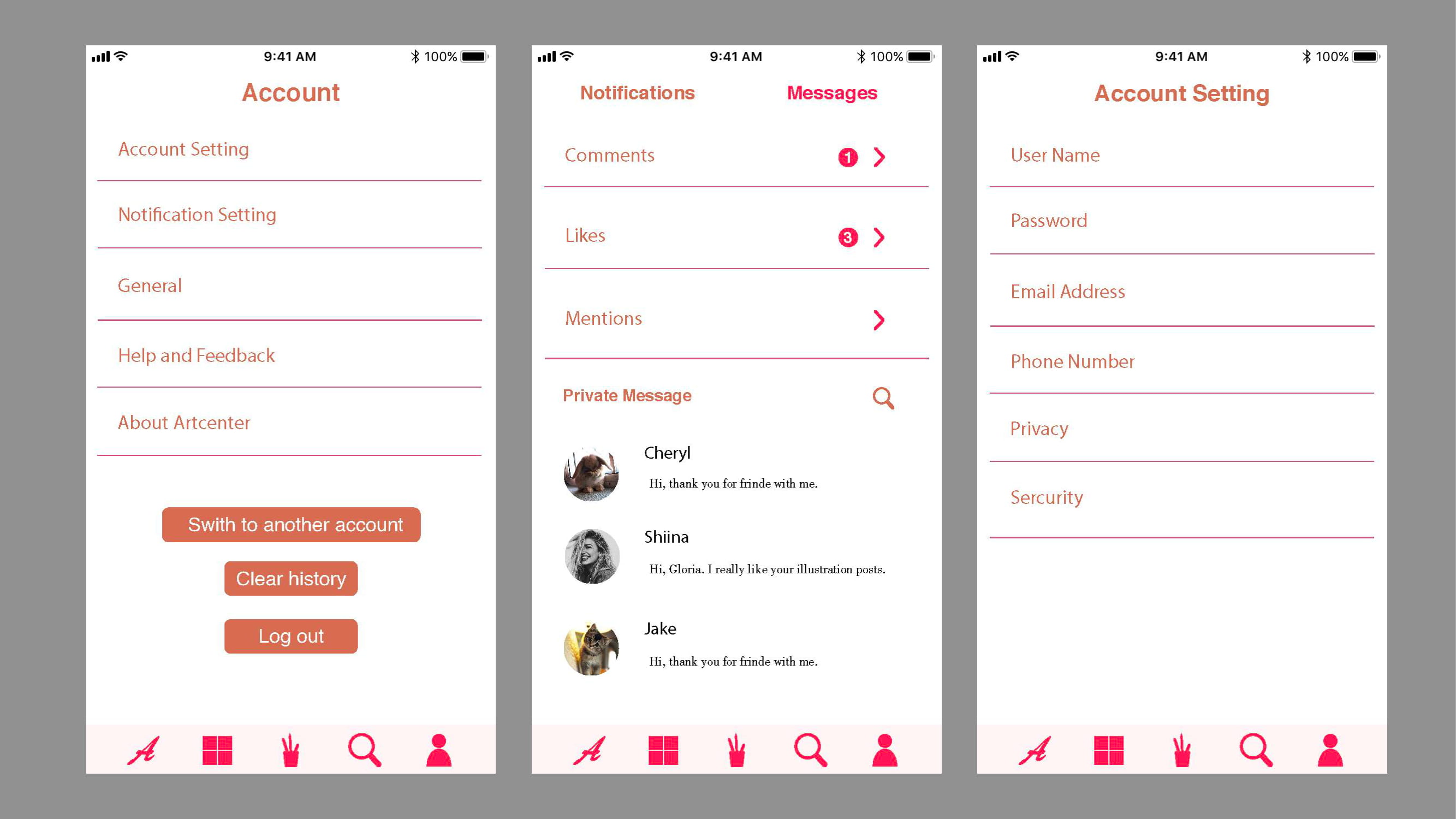
In the user center, users can easily organize their collections and artworks by creating custom folders for different types. The bottom bar features five icons linked to the main pages, each separated by simple lines for clarity and ease of navigation. This minimalist approach emphasizes functionality and straightforwardness, ensuring an intuitive user experience.

